In Part 1, we covered the Slack design team’s initial approach to Threads: a feature that would allow people to reply to messages in Slack. After our first several designs proved to be failures, we had to go back to the drawing board.
The design team had spent nine months trying to build Threads, but it was time to face a harsh reality: our model was just not working, no matter how visually polished the design was. We decided to start from scratch —but beforehand, we took some time to work on a couple of small features that were necessary to support threads and emoji reactions. We also decided to conduct some user testing to better understand why our model was failing.
Message Actions
Before trying our next approach, we added the ability to take action on a message, which fixed the problem of opening threads by mistake, and added an obvious place for threads to begin.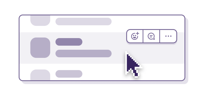 This benefited a few other projects that were happening at the same time, like the aforementioned Emoji Reactions project, as well as the Share Messages project, and Reminders. With inline actions in place, we were able to move on to user testing.
User Testing
To better understand why our model was failing, we decided to conduct a small round of user testing. During those tests, people experienced the same confusion with Threads as the Slack team, but we were able to better identify the breaking points. The main problem was that the design was very complicated, and people didn’t understand it at all. For example, here is what a thread could look like:
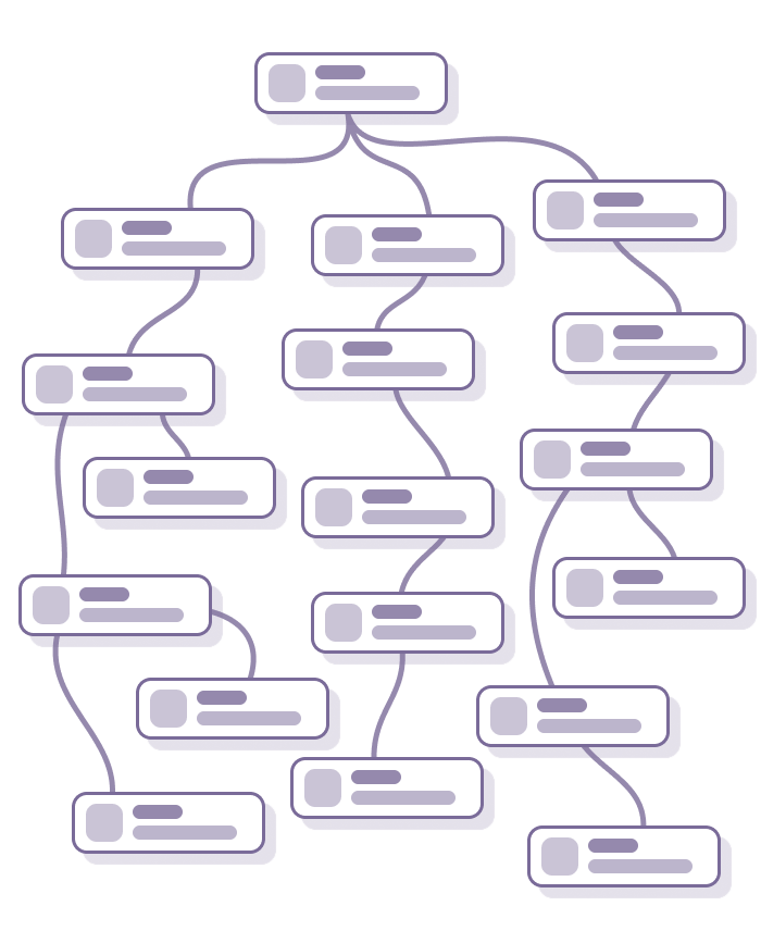 Because you could reply to any message, including replies, Threads quickly became extremely complex. Once we realized this, we decided to restrict each thread to only one level of replies, hoping that this would be simple enough to start making sense.
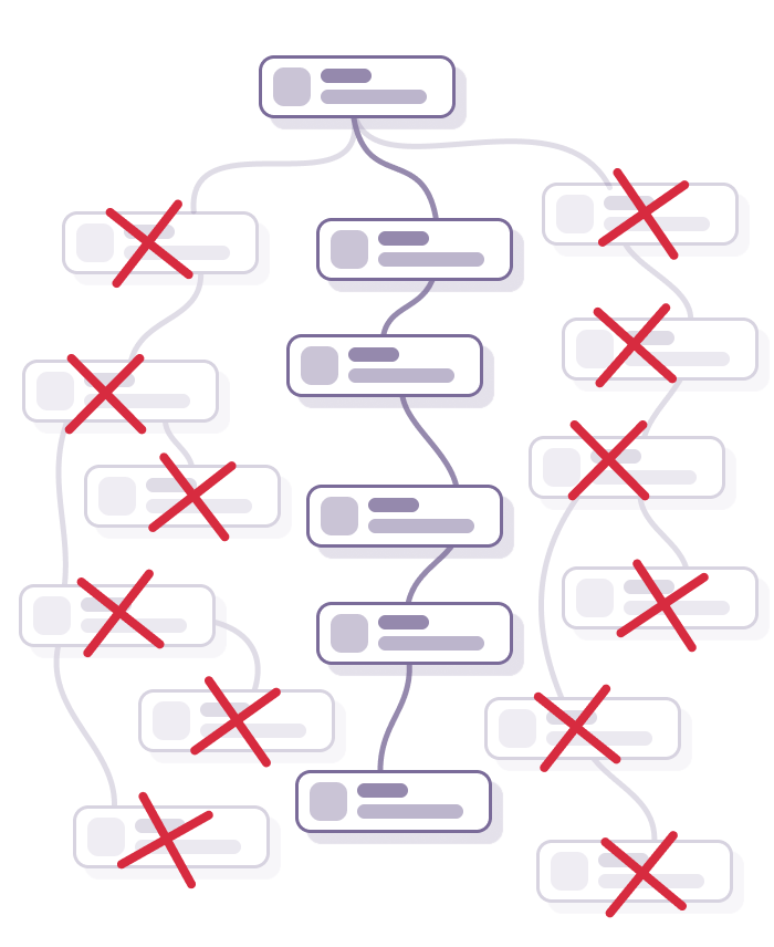
Exploration 4 – One-Level Threads
Reducing each thread to only one level of replies was an instant success on all fronts. The design was simpler, it was easier to build, and of course, easier to understand and to use.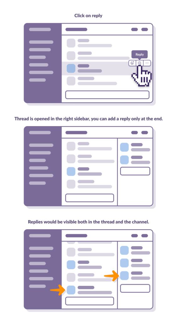
Although people were less confused with this approach, an unexpected problem started to appear: people were using Threads too much and it was making channels very difficult to understand, as multiple conversations wove into each other constantly.
Before Threads, if a user wanted to reply to an older message, they would have had to start a new message with some context, like, “about this topic, I think that…,” which was easy to read. But now that Threads were doing the heavy lifting of providing context, people didn’t bother doing this, making the channel incredibly hard to read without opening every thread in the channel.
We tried a few designs to fix this problem, like preambles before replies to provide better context, or notifications (e.g. “Hubert has replied”) that would be posted instead of replies in the channel.
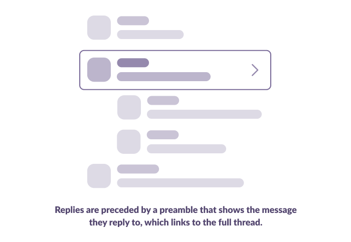
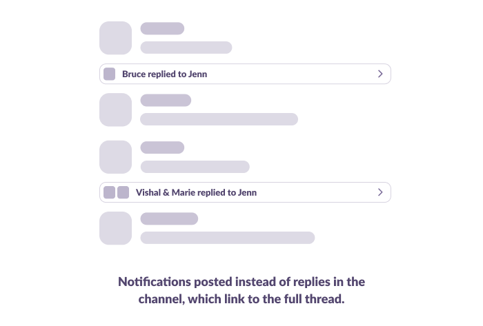 Unfortunately, none of our solutions had any real positive impact. No matter how it was presented, Threads would make you read messages multiple times, as you would read a thread and then read the replies of that thread again in the channel. The feature that was supposed to help reading channels was doing the exact opposite. Once again, our model was failing. Since posting replies in the channel was never going to work, we decided to explore removing them altogether.
Exploration 5 – Sidebar Conversations
In our next iteration, replies were only posted in the sidebar, not in the channel. This was a major simplification of the feature, both in terms of visual design and engineering. But we were facing a new problem.
On all our previous explorations, a new reply would mark the channel as unread, so the user would be alerted when their conversation was continuing. Now that replies were not in the channel anymore, we couldn’t rely on this system, but we still needed a way to let users know when new replies arrived. We decided to move thread notifications to the Activity panel on the top right.
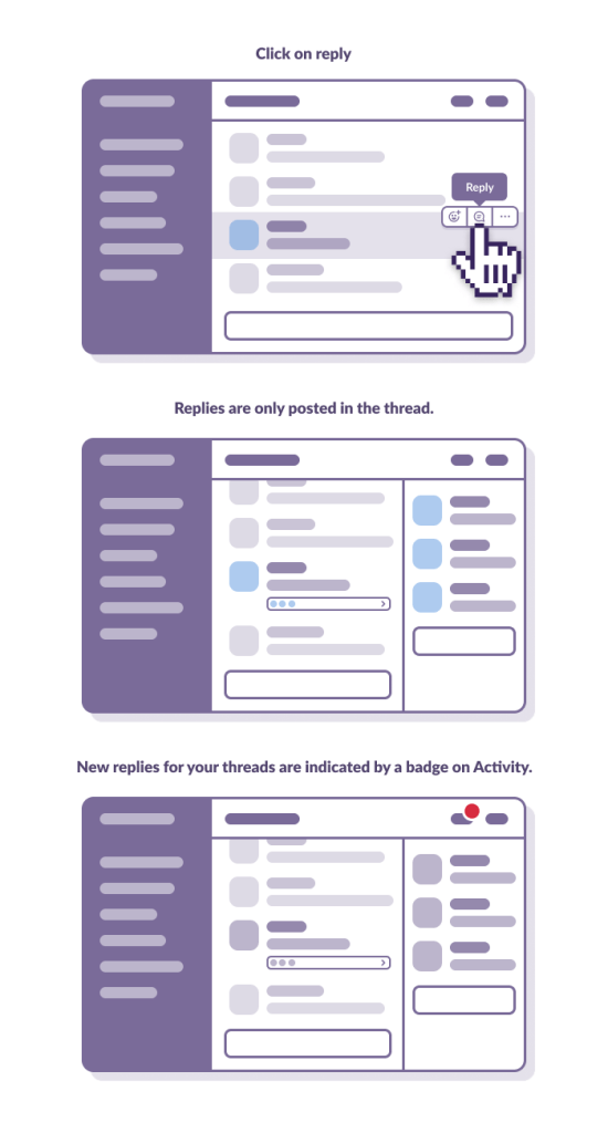
Hiding replies from the channel content turned out to be the single most meaningful change we made while designing Threads. Channels were once again easy to read and focused. People weren’t confused about how to use Threads. Before this change, we would see people using Threads on the last message in the channel even though it would have been exactly the same to just send a new message to the channel. Now, there was a real difference between replying in the channel or in a thread.
Of course, things were still not perfect. We quickly realized that the Activity panel was not the right way to notify people about new replies. It was easy to miss, but distracting at the same time. The notification system was going to be our next challenge.
Exploration 6 – All Threads
For the first time, we didn’t have to turn our previous experiment off while building a central reply notification system (known as All Threads). Even though things were not perfect, they were good enough for our team to use in their normal workday. We took this as a very strong sign that we were on the right path.
All Threads was based on an existing feature in Slack, All Unreads, which displays all a user’s unread messages in a central view. The success of that feature proved we could build views detached from the context of a channel, and it seemed like a logical template to use for this feature, as well.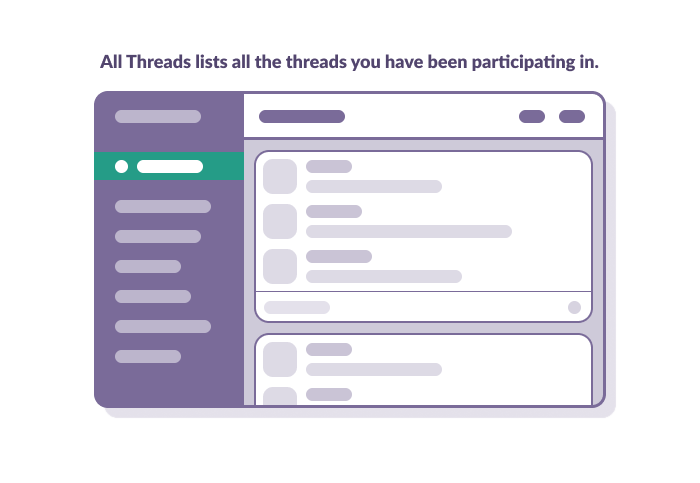 All Threads made it easier to notify users about new replies, and easier for users to browse recent replies. None of our other designs allowed you to go back to older Threads once you closed them, and ultimately, this is what convinced us that it was the best option to start with. After a few days and a few tweaks, the feedback we were receiving was mostly about adding more features to this view — a positive sign! To avoid the risk of making All Threads too complicated for its initial launch, we decided to keep those ideas for future explorations.
Exploration 7 – Broadcasts
The last thing that we needed to address is the fear of missing out that people felt, with replies no longer appearing in channels. For this, we made broadcasts — a way of letting users choose to post their reply back to the channel.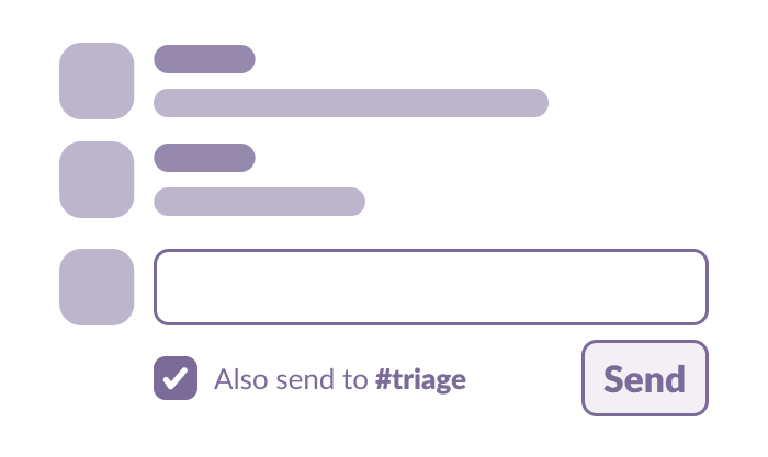 As subtle as it seems, this was the final touch that gave stability to the whole model we were trying to build. The most valuable aspect of Threads was the reduction of extra noise in channels, but in some cases, that was problematic. For a few people, the previous design (where all replies were posted in the channel) was exactly what they needed. By adding the ability to also send your reply back to the channel, we allowed people the flexibility to use Threads in whichever way made sense to them.
Mobile
As Threads were also built on mobile platforms at the same time, each new exploration meant that the mobile version had to be adjusted as well. This was very new for our mobile team, as they were used to receiving projects in a mostly finished state. The Threads project was a catalyst for many of the changes that were made in the way we structure the product team at Slack today, like merging mobile and core product teams. To fully explore the impact of Threads on our mobile process will require a separate (future) blog post.
Launch and Post Mortem
Having an exceptional Customer Experience team was crucial to launching Threads successfully, as they establish a direct line of communication between people using Slack and our product team. They helped us launch the feature in the best way possible, and even replied to hundreds of users who had requested Threads over the years. We went as far back as early 2015.
It almost sounds crazy to think that any of our previous ideas could ever work.
Even though it was a long road to get there, launching Threads was only the first step of the real journey. Launching is always the easy part. Since then we’ve made many adjustments, and have kept a very close eye on the feedback we’ve received.
Looking back at all the work we’ve done, it almost sounds crazy to think that any of our early ideas could ever work, but with every iteration of our design, we were convinced that this time it was the right solution, which made each failure even more difficult to admit. This journey was long, exciting, and sometimes painful, but it helped us remember that failing is an essential part of the design process, and you just have to be okay with it.
Every one of our failing exploration was successful to a small portion of people. It’s impossible to make everyone happy when releasing such an important feature, but after all our efforts, and all our failed attempts, we’re able to face critics with a much stronger confidence about our solution.
