
From time to time we run classic posts from our old design blog that show how Slack was built. This one was originally published in 2016, by former Senior Product Designer Hubert Florin.
On August 19, 2014 at 11:46 AM, Stewart Butterfield, CEO of Slack, created a new channel called #feat-rxns and invited a few members of the Slack team to join the conversation. The purpose of this channel was to build two new features in Slack: Emoji Reactions and Threads. Looking back at this more than 3 years later, it might sound strange that both features were combined into one project, but at the time it did not sound like either of those would be big enough to justify more than one channel. They both revolved around the same idea: reacting to a message, with either words or emoji.
This is the story of designing Threads, and how much we underestimated its complexity. It’s also a deep dive into the design process at Slack.
What are threads, though?
Threads was one of our most requested features, but one thing that we realized quite early on is that “having threads in Slack” could mean a lot of different things. Most of the tools we use every day have threaded conversations at their core: Facebook, Twitter, Reddit, YouTube (and of course, emails). However, they each have a different way to handling this feature.
At the time, Facebook posts each had only one long thread of comments ordered by date. On Twitter, any tweet could have a multitude of direct replies, and those replies could also have replies, allowing an infinite amount of depth. Reddit, too, treated replies and their visibility slightly differently. So which was the right approach for us?
With all these different systems around, we wanted to first understand what people really mean when they ask for threads in Slack. At the time, Slack was not even one year old, and it would have made total sense to build something quickly and see how customers reacted to it. But Slack was working fairly well without threads, so we decided to take the time to figure out a model that would bring the most value to the way people use Slack.
Quick notes about the Slack design process
One thing that we are very proud of at Slack is that we drink our own wine — for every feature that we build, we try it out on ourselves before making it available to the public. Everyone is encouraged to provide feedback about a new feature, regardless of who you are in the company. Often, the most valuable feedback comes from people who have no idea what the feature is, as they will experience it in the most candid and genuine way possible. This system also provides the design team with a bit of leeway: if we’re not sure about something, we just give it our best shot and see how it goes.
This process was crucial for Threads, where it would have been impossible to validate any of our design decisions without seeing how real people used it. We shipped 6 major versions of Threads internally, and got valuable feedback every time. Each release was necessary in order to understand what wasn’t working and what was.
Exploration 1 – The Twitter model, inline.
We decided to start our first exploration of Threads based on the same model as Twitter, because it looked like the most flexible solution. The design adhered to the following rules:
- You can reply to any message, including other replies
- There is no limit to how many direct replies a message can have
- All replies are posted in the channel
Here is an illustration of what we had in mind:
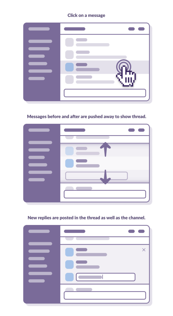
With this system, you could have multiple conversations happening simultaneously in the channel. We liked this first approach because conversation were kept in the channel, so replies lived by the same rules as normal messages: they would mark channels as unread, and mentions would trigger a badge on the channel. All we needed to do was to make sure that replies were clearly labeled so they wouldn’t degrade the normal reading experience.
The main problem with this first version was the “expanding” effect that you would experience when opening a thread. Because we were pushing messages up and down to display the thread inline, it was difficult not to lose your bearings when closing a thread, especially since you would always end up scrolling a little bit when reading the thread, and closing it would land you in a completely different position in the channel. This was so disruptive that it was impossible to judge the rest of the feature, so we turned the whole thing off, and explored other ways to open a thread.
Exploration 2 – Twitter model, overlay.
Instead of pushing content up and down, we next tried displaying threads in an overlay. We believed that by separating the thread into its own layer, it would be easier to navigate the channel’s content.
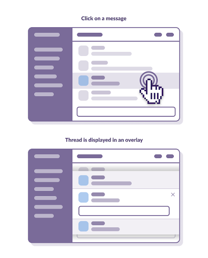
Sadly, this solution fixed one problem, but created many more. Having to constantly open and close the overlays proved to be very tedious, and it was a lot of extra work just to read a channel. Also, making every message clickable was very problematic, because people click a lot, and often for no reason. Overlays were constantly triggered by mistake (whether the user was trying to click out of a menu, a selection, or just randomly clicking while reading a message), which was very frustrating. Eventually, we decided not to persist with overlays, and to move threads to the right sidebar.
Exploration 3 – Twitter model, right sidebar.
Moving threads to the right sidebar was very good news for the engineering team. With a minimum amount of effort we had a new place to view threads, without shifting content or adding extra layers to the interface.
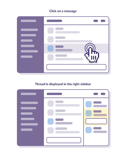
Because we were using a familiar element, the feedback we received started to shift from comments about the user interface to comments about the user experience. It wasn’t about how the feature looked, but how people felt when they experienced the feature. This was a good sign, because it meant that people were starting to use Threads, rather than just looking at them, but the amount of confusion people encountered was quite worrisome. Initially, we believed that if we spent enough time polishing the workflows, the design would eventually start to make sense. Unfortunately, after a few rounds, we realized that the feedback would not change, and we needed to continue to iterate.
As difficult as it was to admit, none of our initial solutions were successful. When a team hits a wall like this, the natural reaction is to question the very necessity of our work. Should we continue? Is this even a good idea? Are we adding complexity for no good reason? Should we just forget all about it and focus on the next big feature? Tune in for the second part of this blog post for the answers.