A conversation between two Slack designers Nikki Nolan and Vivian Urata on why inclusive design should be the new normal. Audio version provided above.
Nikki Nolan: I’m glad we’re having this conversation around inclusive design. To get started, I would love to know who you are and what got you interested in designing for inclusion.
Vivian Urata: My name is Vivian Urata, I am a Product Designer at Slack, working on the growth team.
Early in my career, I attended an accessibility workshop held by Jennsion Asuncion. At the workshop we learned about how people use assistive technologies, as well as how he uses VoiceOver when interacting with software. It was a pivotal moment in my career, because I realized I was only designing for someone who experienced the world like me. I became a designer to make information accessible for all, and this workshop reminded me of my original goal.
In my role then, even though it wasn’t a project objective or a company priority, I made it my own. I started bringing my designs to Jennison and his team. I brought them into the conversations early, before any code was written. I made a pact with myself that, moving forward, any product I touched would include feedback from people who use assistive technologies.
What about you, Nikki? Tell me a little bit about who you are and why you became interested in inclusive design.
Nikki Nolan: My name’s Nikki Nolan, I’m also a Product Designer at Slack. I approach inclusive design both as a designer and as a person who identifies as having a disability. Throughout my life, I’ve felt excluded from different systems because I did not fit nicely into the idea of “normal.”
But despite my disabilities, I am actually relatively new to the concept of inclusive design. I started on that journey about six months ago, when I became the co-lead of our Abilities Employee Resource Group, (ERG), a private group for people here at Slack who identify as having disabilities. I had never come across a resource group like this at any of the other companies I had worked at.
So far, what I have learned is that nobody fits into the category of “normal.” Everybody is different, which is wonderful — but it’s also really important to keep this in mind when we’re designing products.
I am going to lay out some facts I recently read: according to the CDC, there are around 61 million adults in the United States who live with a disability. That’s roughly 1 in 4 adults, that identify as having some type of disability.
That’s a powerful segment of the population — a study published in 2018 found that if just 1% more of people with disabilities joined the US workforce, the GDP could be boosted by $25 billion. This makes designing products inclusively super important.
As I said earlier, it’s very early on in my journey in this space, but it’s been really exciting so far. Every time I learn something new, my mind expands and expands — it’s wonderful.
Vivian Urata: It’s so humbling, isn’t it?
Nikki Nolan: It really is.
Vivian Urata: When you start learning more about inclusive design, the world opens up and you realize there are more opportunities to grow as an individual and designer.
Nikki Nolan: If a designer wants to build products that are designed for inclusion, where should they start?
Vivian Urata: The resources we have listed at the bottom of this article can give you a good jumping off point. Most importantly, you can start by talking to people who use assistive technologies right now. There are more people using assistive technologies than you would think. While many of them have disabilities, plenty don’t. Take “Siri” for example. This technology came out of accessibility and now it’s used by millions around the world. That’s the thing about inclusive design — it benefits everyone!

Image credit: Bee LaRue
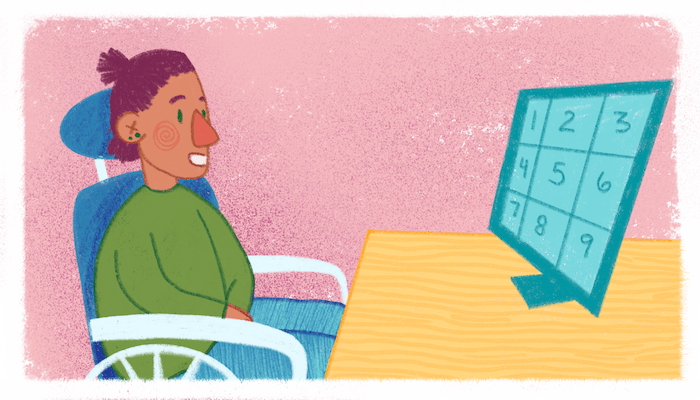
Recently, I talked to someone who uses a mouse by sight. She does this with the speech-recognition software Dragon, with a feature called “Mouse Grid.” With Mouse Grid, her screen is divided into nine numbered sections; she reads a number aloud to identify the area of the page she’d like to hone in on, and the screen zooms in on that section and divides it into nine new sections. She keeps calling those numbers out until she’s zeroed in on the spot on the page where she wants to click. She’s so skilled at this, that whenever she uses a product she is familiar with, she already knows the number sequence that will guide the cursor where she needs it to go.
So let’s say I design a product without having talked to someone like this person. Then, in a redesign, I decide to rearrange its buttons around the screen. I’d be doing a disservice to individuals like her, who have already spent a lot of time navigating the original product I built. Learning about peoples’ lived experiences helps you better design for their needs.
By engaging with people with disabilities, designers can catch usability issues and fundamental flaws in their products. These conversations have shown me ways to improve upon my design solutions, and they’ve given me new perspectives on what’s possible in product design.
As I mentioned before, I recommend starting these conversations as soon as you can. If you include people too late in your decision-making process, it’s harder to fix those problems. Catching accessibility issues early on only makes the product better for everyone.
When I’m designing for inclusion, I first figure out what information I’m missing, I start by asking who isn’t in the room. Who are we currently excluding, and how do we bring those people in? Once they’re included, we can have those conversations and in turn make more innovative and better design solutions.
Google has this concept called the Next Billion Users, where they look at how the next billion people will be coming online and experiencing their products for the first time. In order to design for those people, you need to talk to and understand who they are.
Nikki Nolan: Including people in your ideas and in your process is a really big part of inclusive design.
I recently listened to a book, Mismatch: How Inclusion Shapes Design, by Kat Holmes. She writes about how there are three different terms here that seem interchangeable, but aren’t the same: Accessibility, Universal Design and Inclusive Design.
Accessibility is a quality that makes an experience that supports each individual’s needs and preferences. This is an entire field and professional discipline that focuses on legal standards that companies need to comply with.
Universal design is about designing an environment to be accessible for a wide range of different situations without any adaptation. It’s mostly about physical design, but it can be applied to digital design, as well.
Then there is inclusive design, which is what we are discussing today. Inclusive design still has a variety of definitions, but to me, it is about the process of arriving at a solution. It’s about including diverse perspectives and points of view to ensure that your design works for a variety of audiences. Inclusive design takes into consideration the variation of human diversity from ability — age, culture, gender, language, and any other type of difference or preference a person might have.

Image credit: Bee LaRue
Vivian Urata: I love that. I’ve been working with a platform called Fable. It’s an accessibility user testing platform where you can upload your designs and talk directly with people with disabilities. It’s designed for what you’re talking about: including people with a variety of disabilities and backgrounds into your process. The Fable community includes people who use many different assistive technologies with various configurations. When you meet with these people, they show you how they’d use your product. Their point of view enhances the product in such a big way. For me, learning what I don’t know when I’m designing, and what I need to keep in mind, makes me a much stronger designer.
Let’s go back to a conversation we had about how to build empathy for people with disabilities — specifically, the difference between learning from them and emulating their experiences.
Nikki Nolan: I’ve seen a lot of exercises out there that emulate disability—like doing tasks blindfolded, for example. But I would really caution against emulation, because it’s not the same thing as living with a disability. The best way to gain empathy and understanding is to talk to individuals who actually experience it.
For example Vivian, the person you interviewed who uses Dragon for interaction. She knows what she’s doing, she’s skilled, and she’s already spent the time to learn and work with the technology that best suits her in her day-to-day life. If you were just to go in and use Dragon, your experience would be nothing like hers.
People often use assistive technology as an extension of themselves; they might have spent years learning to adapt, in order to have access to the world in a way that works for them. Rather than pretending to know what that’s like, it’s important to include them, to make sure that people with disabilities have a place in the conversation.
Vivian Urata: Agreed. As I said earlier, including them not only helps you grow as a designer; it also makes for a better product. It’s a win-win in so many ways— so get out there and start having those conversations!
Connect with us on Twitter if you want to learn more about inclusive design at @vivianurata or @thenikkinolan!
Learn more about inclusive design with these resources:
Mismatch – How Inclusion Shapes Design by Kat Holms
Designing for Accessibility is not that Hard by Pablo Stanley
Free Online Courses on Disability Studies by Alexa Fernando
Building Accessibility into Your Design System, Part 3 by Linn Vizard

