Every year, Slack Frontiers, our annual flagship conference for Slack users, is a little different. This year, like so many other things in 2020, it proved to be like no other.
Traditionally we host Slack Frontiers in San Francisco, home of our headquarters and many a tech event. But back in April, for the safety of our attendees and employees, we made the early decision to go virtual. Which meant our usual approach to event building was…well, completely turned upside down.
This is the story of how we completely overhauled our biggest in-person event for the pandemic era, while still holding onto everything we love about it.
Back to the brand

A snapshot of our core values
Before we knew Frontiers 2020 was going virtual, our design team had put together a 60-page event playbook to help us hit the ground running as we built out stage sets, on-site graphics, brand promotional materials, and more. At first, we weren’t sure how these physical guidelines might translate to a virtual event. But then we realized that the way to make our event feel inherently like Slack, regardless of setting, was right there on page 3: our core brand values.
A matter of materials
Though digital and physical spaces have obvious differences, we knew the event’s branding would have to serve the same purpose: welcome people, help them find their way, and make the whole event feel alive. Just like with our in-person events, our first virtual Frontiers conference was held together by the same values: empathetic signage and directions for the confused conference-goer; clearly labeled name badges to create a courteous baseline for attendees to get to know each other; and of course, a touch of playfulness here and there to round it all out.
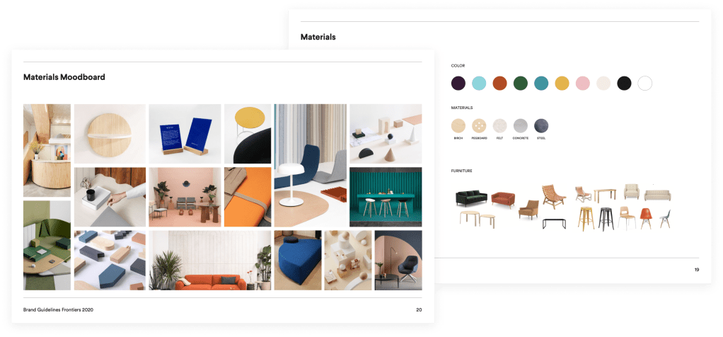
A snapshot of our event playbook and the no-longer-applicable physical elements
In lieu of the textiles and furniture that visually defined the event in years past, we created a dynamic digital pattern from the core shapes of our Frontiers brand. These became ambient animations that appeared between sessions and on the event platform homepage. We also had the ability to completely customize the platform we partnered with for the event, MeetingPlay, re-skinning every experience to incorporate core brand colors (Horchata and Aubergine), fonts and button and link styles. If you attended and recognized some elements from Slack and our site, that was completely intentional! Our internal web design system, Spacesuit, helped inform our event’s aesthetic—along with cues from our platform.
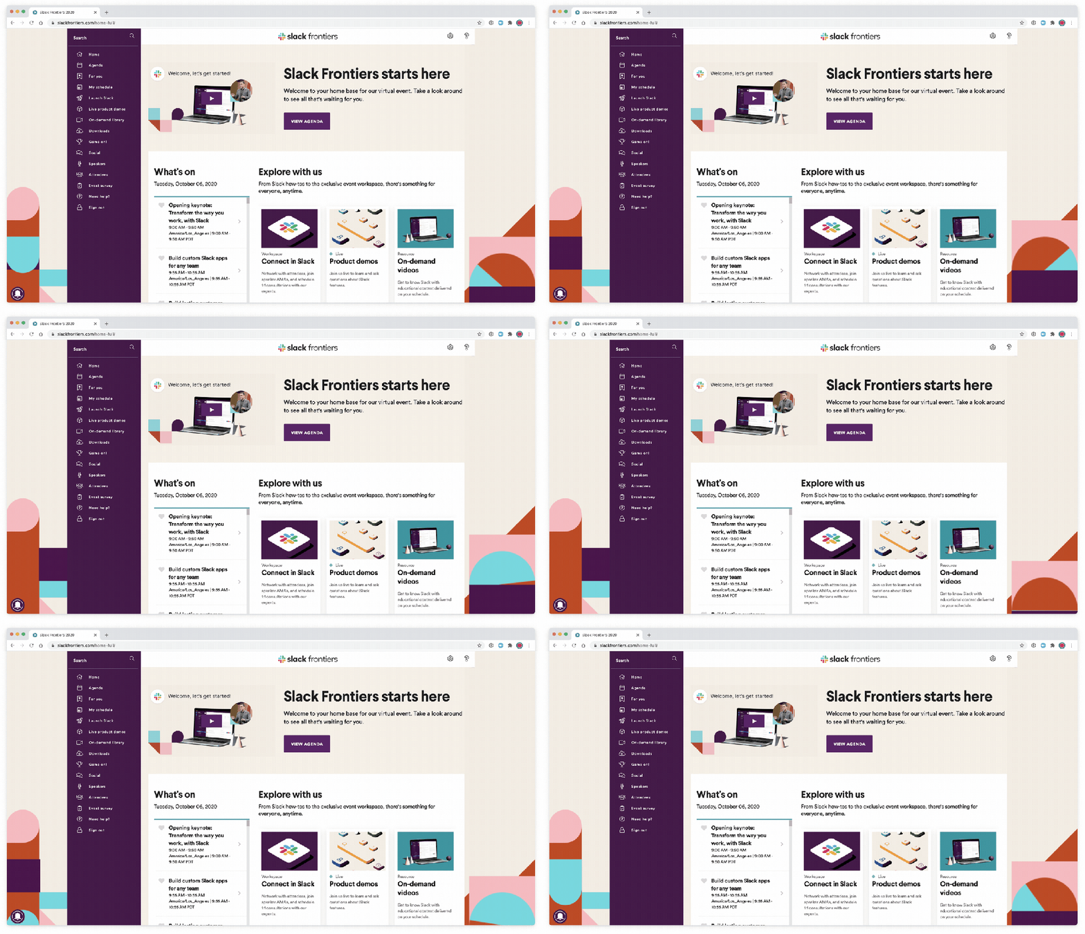
Our event homepage with animations from our team and a visual aesthetic informed by Spacesuit, our web design system
Our writing team relied on the Slack brand voice to ensure every touchpoint made you feel like you were right there with us. In the Slack workspace we were our truest selves, using Block Kit to create digestible announcements, encourage conversation and incorporate necessary (yes, necessary) emoji, just like we do at Slack every day. Within the event platform, we took cues from our product team, making sure every moment—from the opening “let’s get you logged in’” screen to a schedule you could build “all on your own time”—was equally welcoming.
Like you were right there with us
Some of the most beloved elements of events are also the most difficult to replicate digitally: authentic moments of networking, conversation, and connection between attendees.
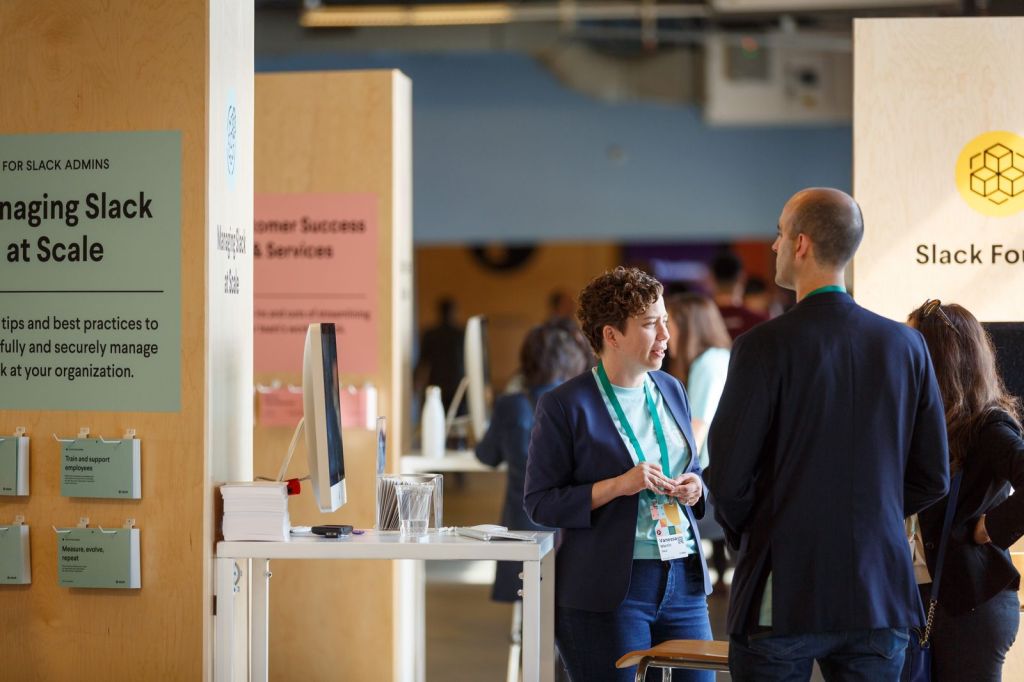
Mingling at Slack Frontiers 2019
For such a challenge, we turned to our Slack values of courtesy and empathy to create an inclusive environment where people could be and express themselves. Instead of last year’s stickers on physical badges, we gave people options to include their pronouns in their profile as well as stickers on their photos from the virtual photo booth (more on that later). We also created a set of “personas” that captured some of the reasons people were attending Frontiers. The accompanying illustrations by Tory Van Wey made for amazing digital stickers, reacji and conversation starters.
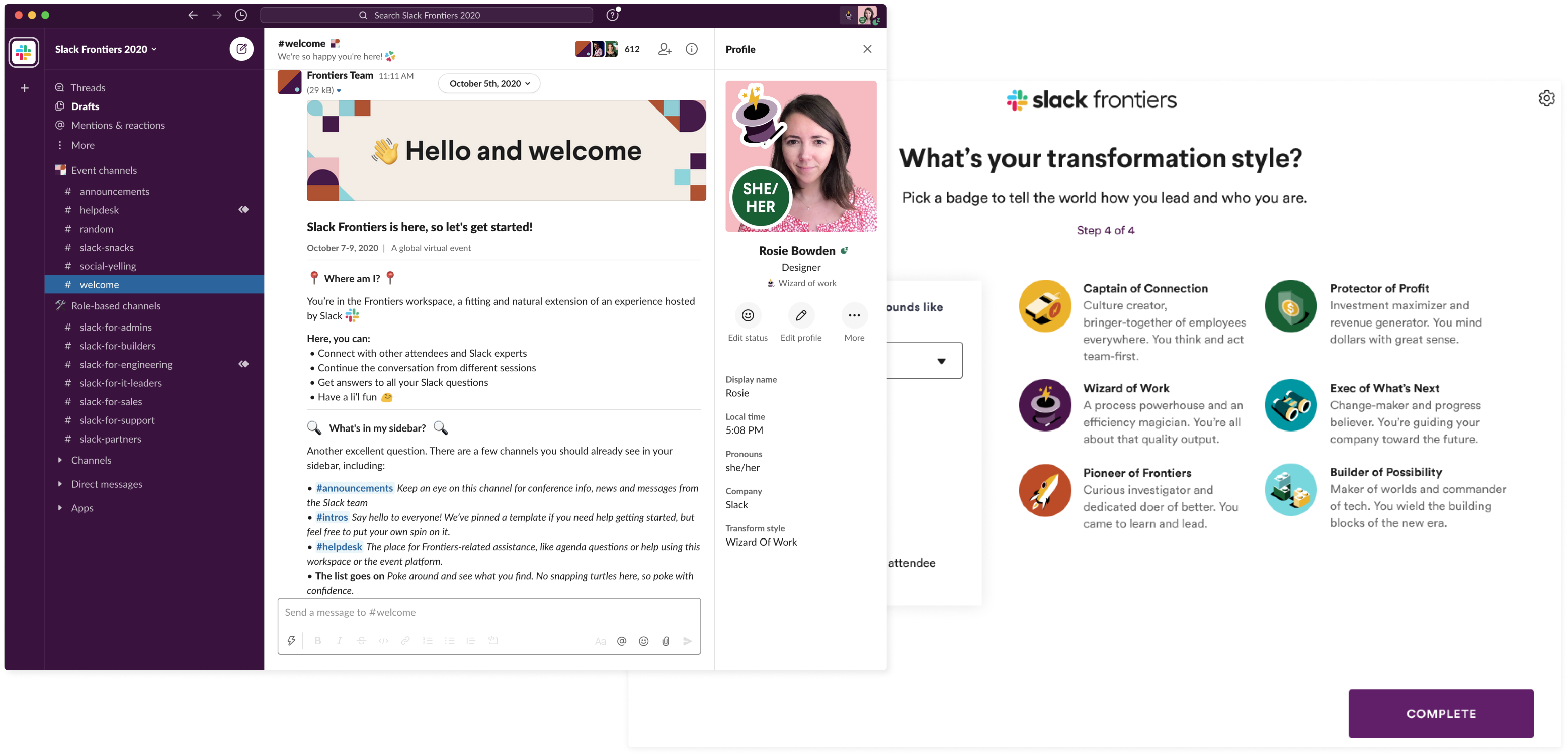
Expressing yourself at Slack Frontiers in the workspace and Transformation Style personas
And for staying connected before, during, and after the event, we already had an incredibly powerful tool: Slack! Our Frontiers workspace was set up around different communities, sessions and education, with channels like #slack-for-sales, #frontiers-ama and even an #attendee-lounge. But no channel was more popular than #social-yelling, the unexpected smash success of Slack Frontiers and much needed outlet.
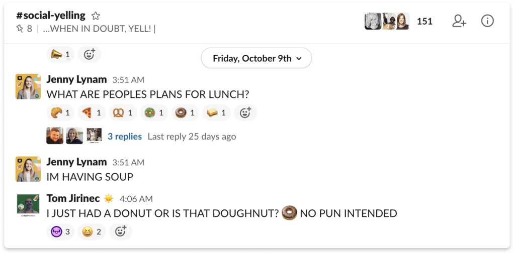
#social-yelling was the Slack Frontiers workspace channel you didn’t know you needed
Making the most of the core agenda
While events are always an interesting design exercise no matter the setting, their core purpose is to help people learn. This year, over 18,000 people registered to learn about digital transformation, how to work better in Slack, and to hear insight from our speakers and customers. It was crucial that we create the best possible environment to deliver on this—but how?
Though we had no live audiences or stages this year, a production partnership with Trademark and our internal video team allowed us to record 40 keynote and breakout sessions and run 23 interactive demos and roundtables. Not quite the same as watching live, but thanks to thoughtful notes on lighting, sound and scenery, we were able to maintain the polish and production value you’d expect at any Slack event.
During previous years we had the advantage of physical space to house learning stations, booths, and on-site interactive experiences where people could learn about Slack. To rethink education for Frontiers 2020, we turned once again to our own platform. Each day, we dropped nuggets of information we called Slack Snacks in the aptly named #slack-snacks channel to teach people tips and tricks for using Slack. We also held AMA sessions, each introduced by branded elements created by our team. Using Workflow Builder in Slack, our team built a workflow that allowed people to easily submit questions of all kinds to speakers and leadership. Our key motivators for these experiences were the values of empathy and thriving: we wanted to ensure each attendee got the most out of their time, in the ways that worked for them.
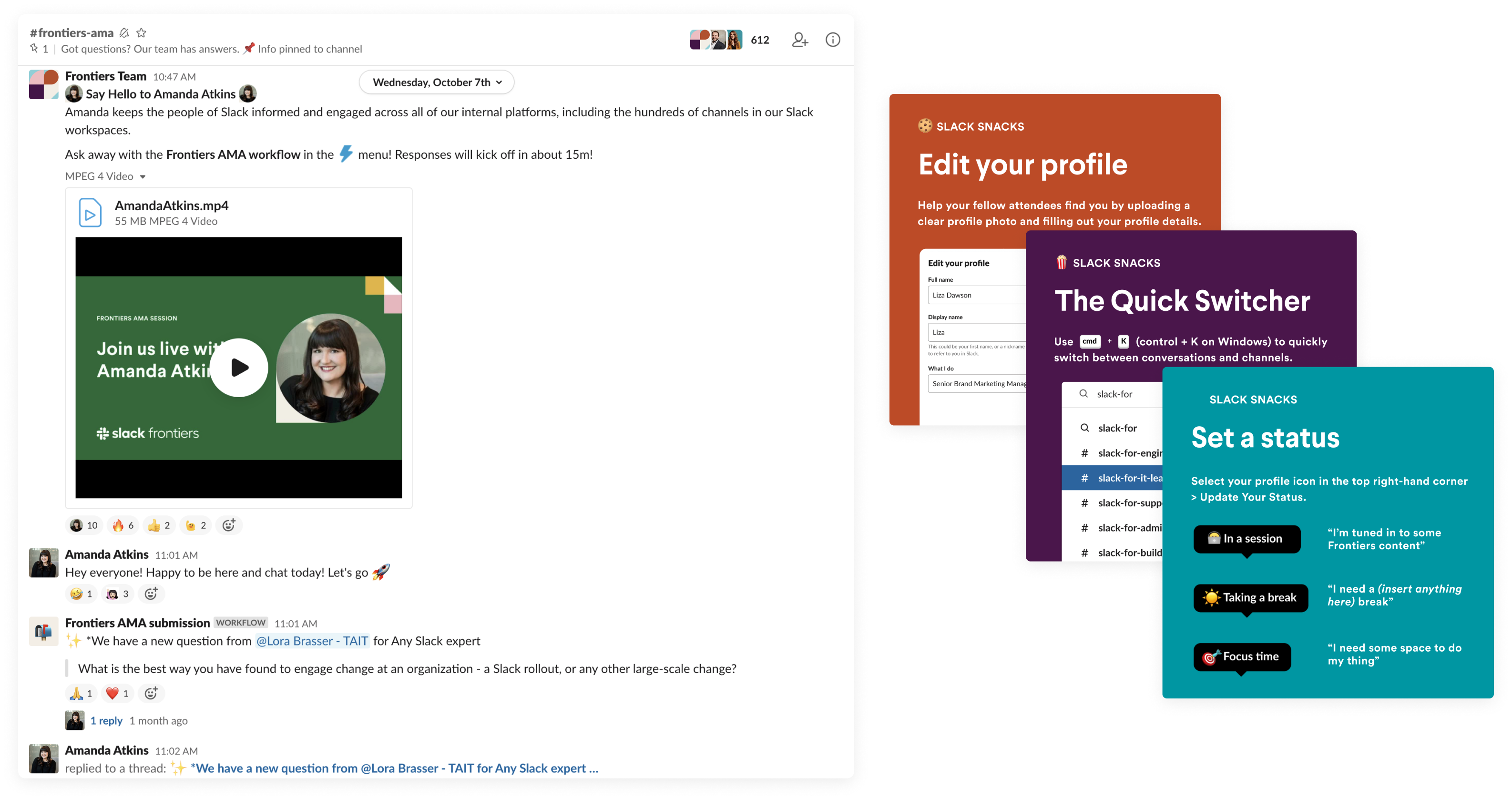
Bringing attendees into the experience with AMAs (left) and Slack Snacks (right)
Spinning up the virtual fun
Events like Frontiers are always exciting in person, but when you take away the bright lights, free food, and shiny venue, it can be easy for the digital version to lose its luster. But playfulness is one of our core values, too, and we were determined to drum up as much thrill as possible for our guests.
One of the best branded, straight-from-the-events-world experiences we cooked up was our virtual photo booth. Here our design team had full creative freedom to design the stickers, backgrounds and frames that attendees—and their pets—could use to customize and recreate the photo booth experience from home.

Inviting everyone into the virtual photo booth; Sweet giveaways for attendees and speakers
Luckily, despite the distance, we were also able to dream up new ideas for one of the most fun event features of all: swag. All of our attendees had access to a downloadable set of our favorite Slack emojis to take back to their team. In place of event food, we offered guests downloadable GIF versions of the tips from the Slack Snacks channel to take home to their team.

A few of the emojis you could take home from Slack Frontiers
Our event platform also offered a gamification experience that allowed attendees to rack up points for various levels of engagement—and though the prizes were limited, they were enticingly exclusive. Eight people won a free pair of our Slack x Cole Haan shoes, while others got their choice of WFH-friendly coasters, plants, and books written by our speakers.
And that #social-yelling channel we mentioned earlier? Initially created as a secret easter egg by Slack staff, attendees found it and made it a hit all on their own. As the most popular channel, it created its own kind of virtual magic we could have never expected or pulled off in-person.
Success beyond the metrics
Designing for an in-person-turned-virtual event was more than a lesson in adaptation and creative thinking. It was a very real demonstration of the power of empathy.
For the first time in its three-year history, Slack Frontiers took place online, removing travel as a potential barrier for our attendees. It was also free, re-broadcast with live staff for three separate time zones, and all content was made available after the event itself. The result was the most accessible Frontiers we’ve ever hosted. The feedback we received about the transformed event was a humbling reminder of what it means to be empathetic: to meet people where they’re at, whether that’s on an emotional level or literally, at home.

The kind of warm and fuzzy feedback that makes it all worth it
It was a great learning experience for our design team, as well. Taking on such a huge, unforeseen challenge showed us that we already had the tools in place to pull it off. With our values as our foundation, we created something that represented Slack—not just the brand, but also the rich, vibrant community that surrounds it.
Psst: Our events team broke down how they used Slack to bring onsite energy to Frontiers. Read about it on the Slack blog

