Rosie Bubb is a Communication Designer at Slack. She designs material and experiences for events — including Frontiers, Slack’s conference exploring the future of work, which recently kicked off its second year. She spoke with Senior Researcher Behzod Sirjani for Slack’s Design + Research blog about her approach to creating spaces and experiences for Frontiers. Content condensed and edited.
Behzod: What do you do at Slack?
Rosie: I’m on the communication design team, and I work closely with marketing. I work most closely with the events team — on big flagship events like Frontiers; on our developer conference, Spec; and on a wide variety of trade shows, booths, and things like that.
How do you take something like Slack, that has an established voice and personality, and figure out how to represent it in design and put your own spin on it?
What stands out to me about Slack is that it feels so human, so I wanted to bring that through in the visuals. When I got here in February 2017, the product already had such a strong voice, and in marketing, copy carried a lot of that. The communication design team was just getting started, so there wasn’t a library of assets to use or even brand guidelines. As the team has grown, we’ve been figuring out our brand voice in terms of visual style.
Events have been a fun part of that. When first I came on board, we were going to do this thing called Frontiers. It was our first user conference, and it was quickly identified as a place to experiment with the brand. With conferences, there’s always a derivative or common thread from the brand — but there’s also room to play and experiment and introduce new colors or new patterns or new elements. Not only that, we’ve been focusing on the Frontiers brand as kind of a sub-brand of Slack, and figuring out how it evolves from year to year.
There are so many things to design for a conference, both physical and digital. What does that process look like?
What’s exciting to me is trying to figure out the core identity of the event, and then think about that in terms of materials and how it would extend to physical space.
I think a good example is Spec, our developer conference. We had a logo, we had colors, we had some patterns. But beyond that, Spec was a conference for builders, so we were looking at raw building materials like plywood, peg board, and building blocks. Thinking about the different materials, or the different finishes you could put on something, how to make something dimensional or have texture — I’m obsessed with that stuff.
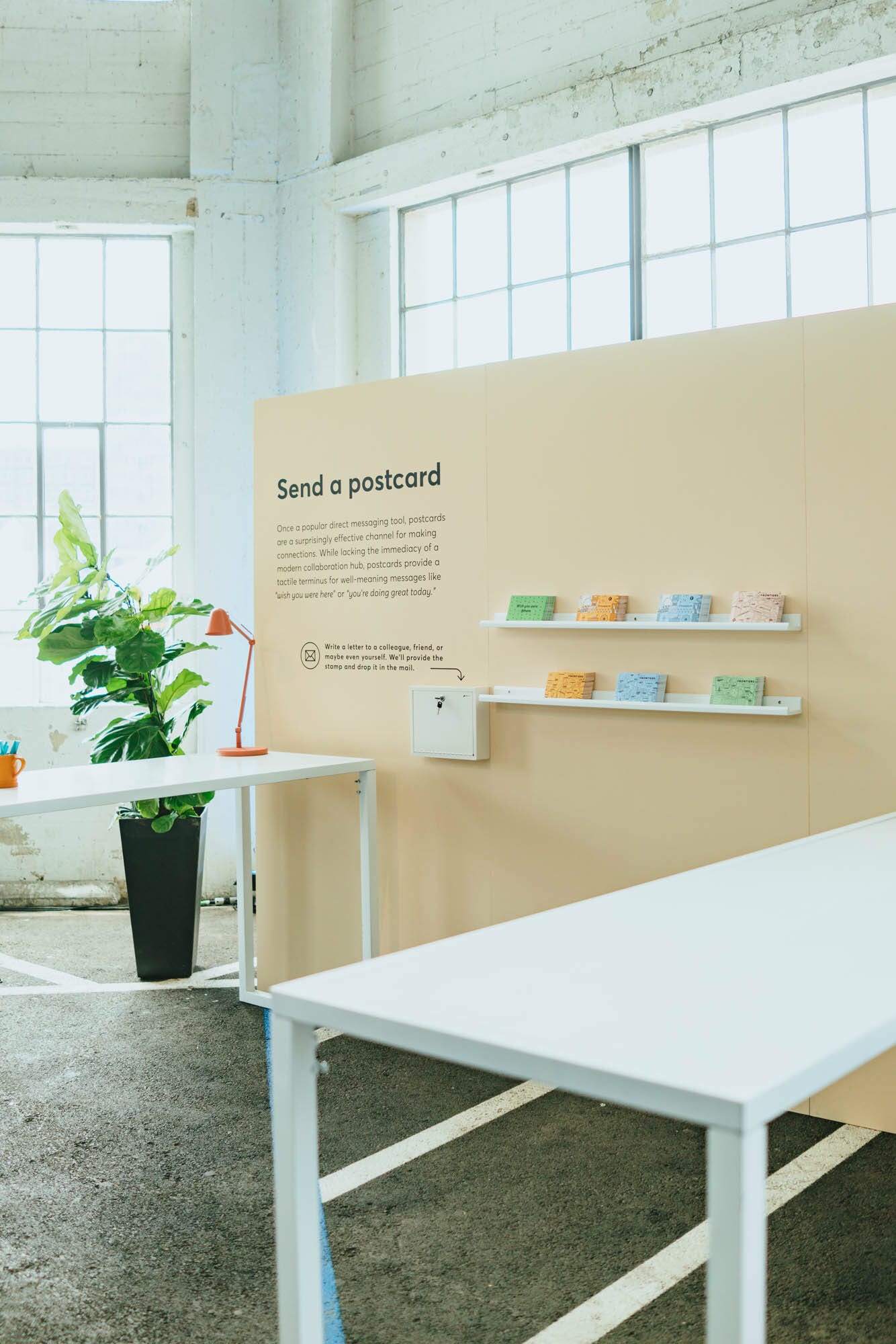
At this year’s Frontiers conference in San Francisco, a postcard station let attendees interact with the event — and offered them an offline way to connect with friends and coworkers.
How do you turn those ideas and materials for a conference into a whole experience?
For Frontiers last year, we worked with the production company and identified areas where we could activate people’s experience through design or some kind of activity. The most enjoyable part for me, as we figured out the space and what goes where, was figuring out what these activations were. It’s an exciting question: How do you take something and make it more than just ambient, and give it purpose and interest for someone as they’re going through the conference?
For instance, we had this huge gallery wall, and we weren’t sure what to put there. Working closely with Anna Pickard, our Head of Brand Communications, we came up with the concept of a map: taking the literal frontier of work and populating it with made-up places. We turned that into something that a conference attendee could interact with.
What’s the core identity for Frontiers this year, and how did you design for it?
We’re building on the programming we delivered last year, about the frontiers of work and the future of leadership — but this year, it’s a roadshow. We’re opening up in San Francisco, then going to New York, then going to London. Visually, I thought it’d be interesting to tie the idea of the roadshow more centrally in with the branding, so you have those references to maps, charts, and navigation. I’m excited about how we took the brand from last year and made it little bit more literal, pointing to actual landmarks and streets and different types of maps.
With Slack the product, we think a lot about voice, tone, and user experience, and how they can inform our decisions. How did you think about these things when putting together Frontiers?
We tried to be super clear, from a design perspective, on what the goal of the event was. We had so many things that we wanted to do, but when it came down to it, it was important to put ourselves in the shoes of a conference-goer and think about what experience we’re trying to give to them. What’s the attendee journey, and how can we support it? Like in Slack the product, if we’re focusing on the user, everything we’re doing is to enhance their experience, to make it a little bit easier or a little bit more delightful. Looking at it through that lens, it’s very much a match for how we work at Slack in general.
———