“Ask our writer. She always finds the right word.”
If you write for a living, you’ve heard this before. I love hearing it. It’s flattering and nice, and a simple way for your teammates to let you know they respect your work.
Here’s the thing: it’s wrong. You can’t always find the right word, because sometimes — more often than we’d like — there is no right word.
Say you’re a UX writer, searching for the perfect verb for a button. We know there are roughly 3,000 words used in daily conversation, and 1/7th of those are verbs. Take 3,000, divide by seven — now you’re down to a meager 429 verbs. How many of those carry the meaning you’re after? How many are even close? If the perfect verb hasn’t come up in conversation, appeared to you in a burst of inspiration, or revealed itself after an hour on Thesaurus.com, then I have some bad news: it doesn’t exist.
Now what? For starters, don’t panic. I run into this problem often, and over time I’ve found myself turning, again and again, to three trustworthy strategies.
💪 Find some elbow room
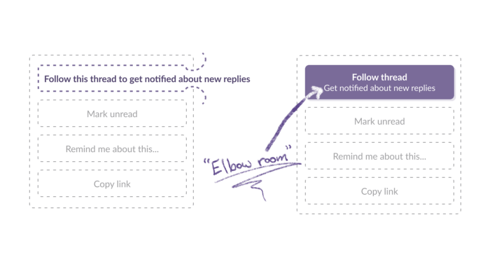
If you don’t have enough space for the message you’re trying to convey, it’s time to get creative. It’s time to make more space. This comes from a simple place: if you can’t convey your message with one word, could you do it with two? Three? How about an extra sentence?
Finding that elbow room is a lot easier if you’re familiar with the components that your design team uses. You should be able to suggest to a designer: “Can we add an alert banner here? How about a tooltip there?”

Getting creative with components
Too often, UX writers think of designs as unchangeable, fixed in stone tablets and handed down from above. But that’s not the case! That’s not a healthy design process.
A healthy design process is a conversation. To get that conversation started, sometimes you simply need to be willing to ask for a little more space.
🍫 Break the message into chunks
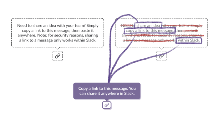
In my first week as a UX writer, I was tasked with taking a whole paragraph of information and squeezing it into a tiny, mouse-over tooltip. It was really hard! But it got a lot easier when I realized it wasn’t a hard task — it was an impossible one. That took a huge weight off my shoulders. Because when you can’t convey the whole message, you get to pick and choose what’s actually important to convey.

Breaking down a tricky tooltip
To do that I like to use three questions:
- What is the thing we’re trying to convey?
- Why should the user care about it?
- And what else might the user want to know?
Once you’ve broken your message down, it becomes much easier to prioritize. You have to get the “what” across — otherwise there’s no way to use the thing. It’s really nice to get the “why” across, too.
The rest is probably not going to make it.
🌍 Take a step back
This last strategy is the biggest. It’s to take a step back, and rethink the interaction entirely.
Writers are often the last line of defense against shipping a bad UX. That means it’s our responsibility to ask the big questions. Questions like: What’s the user trying to accomplish here? What would I expect this interaction to look like? And how else could this interaction work?
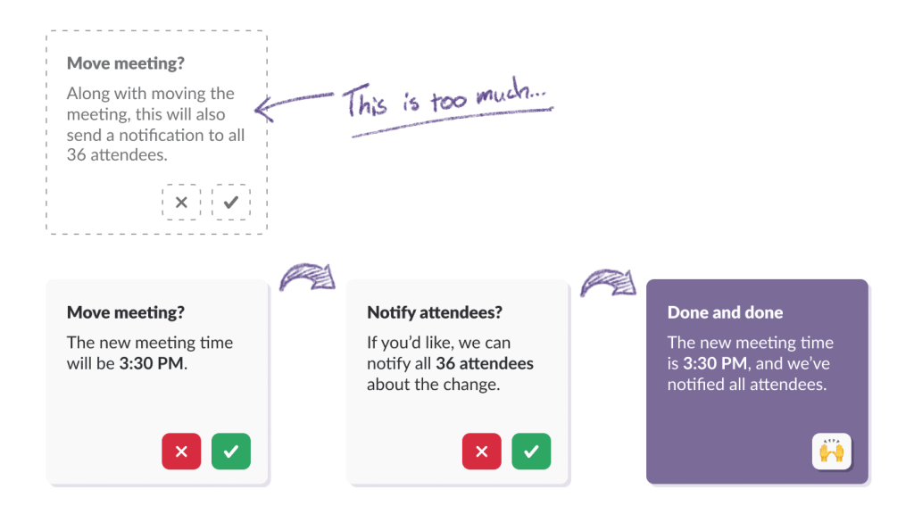
If you find yourself writing copy that you know is clunky — say, if you’re asked to fit three separate choices into a single dialog box — it is your job to speak up. It’s your job to propose something better.

An appropriately complicated flow
You’re going to hear that the thing you’re proposing is more complicated. That’s true. It is complicated, but appropriately so. Oftentimes that’s the difference between a UI that’s usable, or one that’s confusing, dangerous, and hard to trust.
You didn’t find the perfect word
And that’s fine. It’s not always possible to gin up a brilliant piece of UI poetry. Sometimes English lets me down, but with the three strategies above I’ve found I can usually figure something out.
For the times when I can’t, I tend to rely on a secret, fourth strategy: it’s OK to let yourself be imperfect. It’s OK to trust your instincts, lean on your experience, and put something out into the world. If a string’s not working, you’re bound to hear about it — and while the idea of facing feedback from the entire world feels daunting, it’s also a surefire way to learn what works.
