

Design that is inclusive and accessible almost always works better for everyone. But once in a while we reach a genuine dilemma — the more technically accessible choice adds friction or breaks expectations for everyone else. In these moments, someone inevitably asks: Can we just make it a preference?
“Make it a preference” is sometimes an easy way out of a tough decision, but designers should be careful and thoughtful with this approach. There’s a fine line between empowering users to customize their experience and saddling them with a puzzle game to solve in order to be successful. This is especially true when considering the experience of people with disabilities — they deserve a usable experience out of the box, not extra cognitive tax just to be able to do their jobs.
At Slack, when considering whether we should make an accessibility accommodation a preference, we urge designers to consider the following:
The default Slack experience for new users should be accessible.
Preferences should be used to empower advanced users, not to grant basic functionality. If a user needs a certain accommodation to succeed, we can’t make them struggle through an inaccessible experience just to figure out how to turn it on.
For example, when Slack was first built, pressing up from the composer allowed you to edit your most recent message. However, we eventually realized that this was deeply inaccessible and confusing for assistive technology users, and that we or the design should instead move keyboard focus into the list of messages to allow for easy navigation. Because this was such a large and controversial change, we created a preference so that existing users could opt in to the familiar behavior. Today, users can choose between these two behaviors in preferences, but up as a keyboard navigation tool is the new default.

Disability is not a monolith.
There is no such thing as an “accessibility user.” There are many different types of disabilities, and some people have multiple. Even people who share a disability may use very different accommodations and assistive technologies, or have very different preferences and needs. When thinking about how to design and bundle preferences, we have to be very careful about our assumptions.
For example, Slack has customization preferences for screen reader users, and another set of preferences for rendering all emoji as text. While the two often go hand in hand, we don’t presume to bundle them into some kind of “screen reader” mode. Some screen reader users are sighted and would benefit from seeing the emoji. Simultaneously, other fully sighted users might have their own reasons for turning emoji off to reduce visual distraction or migraine triggers.
“Intuitive” is not universal.
It’s our job to design things that are intuitive, but we live in a world now where intuitive is not universal — it differs based on context, tool stack, and operating system. Our users interact with a large variety of software and bring different expectations and intuitions to Slack. This gets especially true when assistive technology is involved.
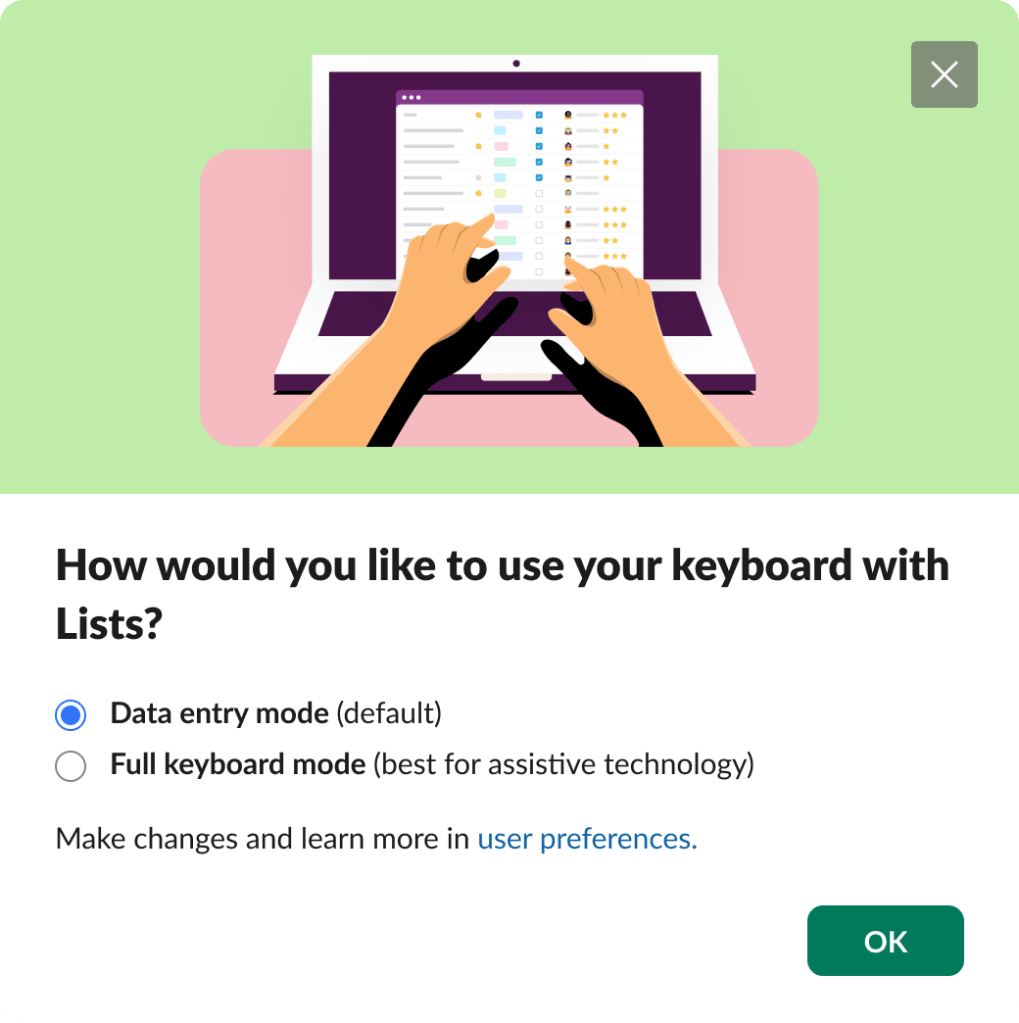
When we were designing the keyboard interaction for lists, a new project management tool built into Slack, we ran into this problem with the expected behavior for tab. For someone using only their keyboard to navigate the web, tab is the default key for moving through the interface, and the intuitive behavior would be for it to take you into and out of lists‘ table view, stopping along the way for any other interactive elements within the cell. However, keyboard-heavy users who were used to Excel expected tab to always move you to the next column. For keyboard-only users, that would make navigating past a table view incredibly laborious, and using some of the richer features of lists fully impossible.
Both groups of users were right, but their needs were fundamentally incompatible. Making this a preference was the clear right choice, but the debate about what the default behavior should be landed us in the same spot, and we worried about how either group of users would ever know to look for this preference, let alone find it. We debated this for weeks.
Eventually, our accessibility consultant, who navigates Slack with a keyboard and screen reader, came up with an ingenious solution: What if we just asked people what they wanted, the very first time they hit tab in Lists lists? Everyone effectively got the “default” behavior they found most intuitive.
In the end, we learned that we can give all this feedback, but until the team sees someone actually using the technology and struggling with it, they’re not really going to get the impact of how they’ve designed an experience. This is why it’s so important to involve people with lived experience and give them a platform to share their thoughts and insights.
Understand the power you wield.
Designing for so many different types of users in a time when things aren’t standardized can feel daunting, but this freedom also presents designers with opportunities to be thoughtful and create best practices with every project.
As a designer, you hold the power to advocate for the most equitable default experience, as well as to challenge your team to think through what it means to make something a default — who you are empowering, who you are excluding. By encouraging those around you to think harder about when customization is useful, and how to reduce the cognitive burden of making someone choose a preference, you can influence major design decisions that will make products easier to use for everyone.