
A few months into my first job out of college as a Business Systems Analyst, I realized I was doing some light design work to help provide some visuals for the project requirements. Six years later, working for a digital marketing agency, I got the chance to shift my career focus into User Experience (UX) Design. During my time there, I ended up working with many consumer-focused clients across different industries including finance, e-commerce, home improvement, and automotive. Then, in 2019, I took another step in my design career and joined the Enterprise Design Team as a senior product designer here at Slack.
While shifting from UX design to product design was a pretty straightforward process, the bigger challenge for me, as a designer, was adapting my design mindset specifically for enterprise software. Here are a few key lessons I’ve learned about enterprise design along the way:
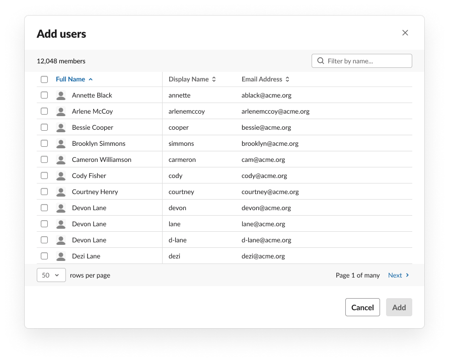
”I don’t need it to be pretty, I need it to be information-dense”
Over the years, digital product design has increasingly embraced a minimalist aesthetic. The use of white space, simplified flows, and focused content design can be used very effectively and can be very beautiful for simplicity.
For enterprise software, however, the minimalist approach clashes with the needs of our administrators. A lot of the design projects we work on involve large sets of data, and as a result, tables are my most used UI element. Our original tables did their jobs, but we often heard the following feedback:
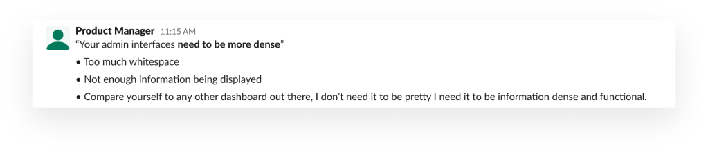
Unlike average consumers, administrators need to see a lot of data at once, to analyze it and make quick decisions. We weren’t meeting our user’s needs because we used a large row height, which limited the number of items we could display at a maximum. As designers, our challenge became about balancing the needs of a specific group of users while still retaining the Slack “look and feel.”
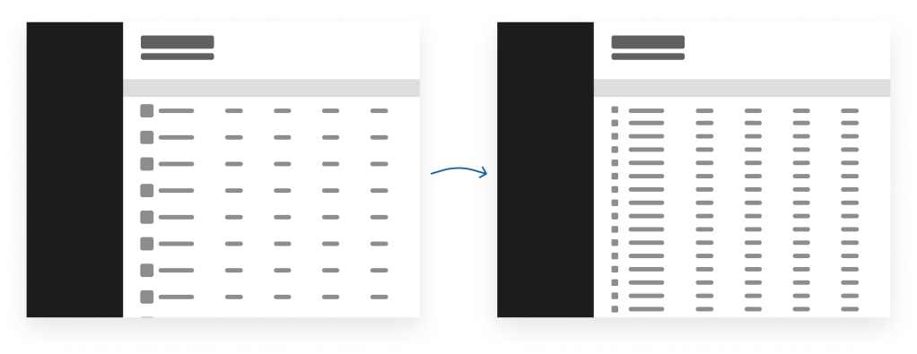
If you’re getting into enterprise software design, you’re going to have to embrace more information-dense pages. Find the balance of space and typography that makes it easy to use while still feeling like an extension of the product. Your users will appreciate it.
Make it clear and predictable
Another thing I had to learn about designing for enterprise deals is that clarity and predictability are essential for these users. As an enterprise designer, I focus on solutions for enterprise administrators to manage Slack. Enterprise admins are the people in your company who maintain, manage requests, and make decisions on how the various software and hardware employees receive will be used. As Enterprise admins modify settings or complete requests, we have to make it clear to them what other elements will be affected when they make a change.
Note that I didn’t say “make it simple.” Designing for enterprise often involves complex flows, and yes, it’s a priority to simplify those flows, but never at the sake of clarity and predictability.
“When we make a change, we need to be very careful, because when we’re not careful, things can happen that will affect a ton of users.” -IT Lead
We’re always developing new ways to make our admin experience more consistent and predictable so admins don’t have to worry about surprises. We’re working on an improved user experience for managing a setting in an organization so that the admin can enable and choose options that work best for their organization. Today, it is a multi-step process to, for example, enable email address for channels and restrict which domains can forward messages directly into channels. The ability to restrict domains isn’t apparent when enabling the feature and admins need to have knowledge that option is available. Our forthcoming updates will combine the separate steps into a single step providing clarity to those admins in security conscious companies to allow specific domains to be used. Presenting the all options up front provides clarity and context for admins to make the best decisions for their organization.
Running feature pilots will keep your project aligned
Sharing work with our enterprise customers can be challenging because design concepts usually includes placeholder content that doesn’t apply to any specific customer. Clients are often only able to offer broad, directional feedback because they need to see how the feature works with their own data. One of my favorite things about working at Slack is that we’re able to release our features to a small set of customers in pilot releases before rolling them out more broadly. One of Slack’s core product principles is “Prototype the path”; this means we believe we can best learn, iterate, and improve on our products when we’re able to put them in our users’ hands. Much like in television, running a pilot for new UX features is a good way to test how our designs work, because users can interact with the feature at their own pace and in their natural environment.
Because our Product Managers work closely with our customers, we have a good sense of their requirements and expectations before we start building. As a result, pilot feedback doesn’t usually veer too far from our current roadmap; it simply allows us to make small adjustments as needed. However, we have conducted pilots whose results prompted us to change course entirely, too, making larger changes to the overall design and structure of the feature.
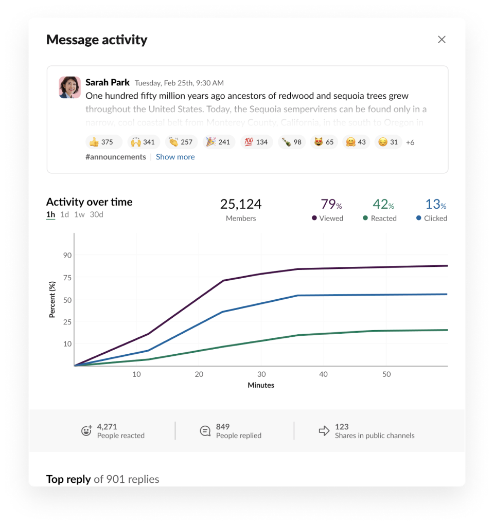
Last year I worked on a feature called Message Activity, which displays analytics and insights for individual messages in Slack. Several of our biggest customers wanted to understand how communications were being read in Slack compared to email. As we were working on the project, we decided the feature would display various metrics as percentages based on the total channel membership. In a pilot of Message Activity, we heard a variety of feedback on that choice:
- “What’s a good percentage for messages?”
- “Saw that 24-26% of my audience was viewing all messages. That was an eye opener.”
- “I want to see the number of people that have viewed instead of doing the math.”
- “Mobile data is important and would be useful to see it explicitly called out.”
- “Not 100% message saturation. I must be incredibly naive. I thought everyone eventually got to everything at some point. Straight up some people don’t see stuff.”
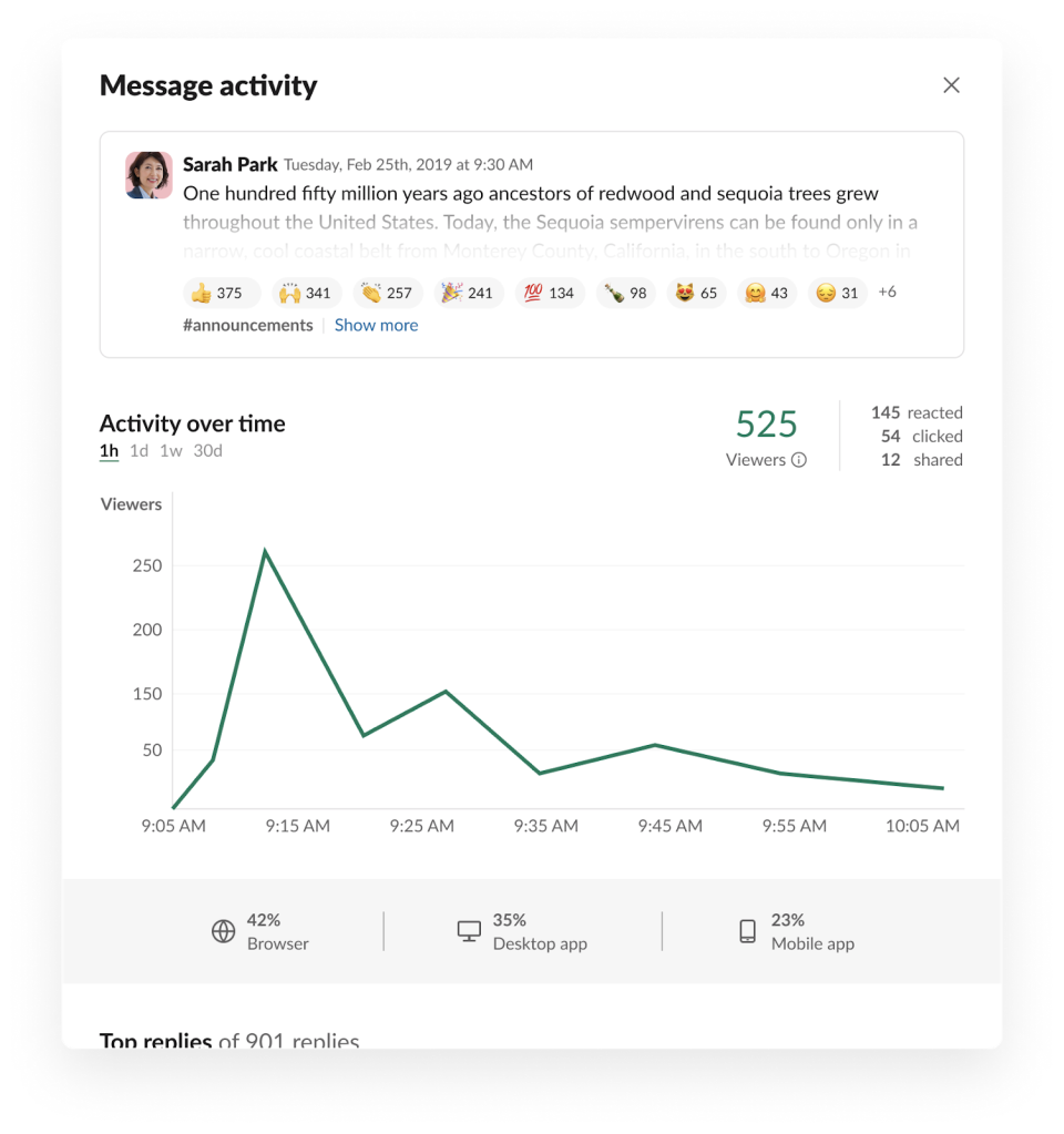
Our plan was to launch in just over a month, but as we wrapped up the pilot, the feedback we were getting was clear: the metrics we were showing didn’t accurately address what our customers needed from this feature. Communications teams needed to easily understand the reach and on which device their employees were reading messages, and the way we presented the data didn’t solve that problem. After taking a couple days to regroup and prioritize the feedback, we decided the next step would be to brainstorm how to improve this feature. Since I work in our San Francisco office and the rest of the team works in New York City, the time difference was restricted our collaboration. We needed a quick turnaround to get this feature ready, so I flew to New York and we all got to work iterating on design and engineering ideas on the fly and were able to come to a quick consensus to make Message Activity easier to understand to improve communications in their organizations. Since Slack offers easy ways to share messages across channels, our team focused on showing total view counts of a message and added a breakdown of device type to help communications teams better understand the reach of messages in their organizations.
Pilot designs
Launch updates
Running pilots gives designers the chance to see how a feature will function in the real world, with a client organization’s own data; you’ll get your clearest, most actionable client feedback this way. When you include a pilot program in your feature rollout process, the team is able to be more flexible and make changes before releasing to a larger set of customers.
Designing for scale
Slack can be used at companies of any size, from small startups to the large corporations, but as a company grows, order and organization become increasingly crucial to its employees’ ability to collaborate. Startups can be more flexible, but large enterprise companies develop and establish processes, governance and procedures that they need to follow to keep things running smoothly. And naturally, with company growth comes more employees, so the people making decisions are increasingly responsible for more and more people. Changing a setting that applied to ten employees might be quick and easy, but what if the decision was going to affect 1,000+ employees? For enterprise software, that’s a very common use case.
As an enterprise software designer, accounting for scale is an essential part of my design process. We provide ways for admins to manage the many parts of Slack like members, channels, workspaces, and apps. In the beginning our primary assumption was large organizations can use APIs to build their own tools to manage at scale — this isn’t right because not every company has the resources to build those tools.
We’re still in the thick of this piece of the enterprise design process. Building a more productive and efficient UI for making Slack easier to manage for enterprise customers means:
- Building smarter: Focusing on smaller foundational components that can be re-used anywhere in our UI. For example, the first thing we built was a data table. Since then, we’ve used that data table in X, Y, and Z features.
- Iterating: Even as the table is being used across Slack for Enterprise, we’re continuing to tweak its design to improve information density.
- Adding features: Improving information density isn’t our only goal. As we understand the needs of admins, we’re working to improve the usability of the tables to add features to manage scale even easier. One such addition is a table header component that supports bulk actions, search, and filtering.
We’ve made some great progress to accommodate scale, and it has been a thought-provoking and challenging process. As we collect more feedback, we’ll iterate and improve our flows to make the experience even easier.
Balancing size and specificity
Enterprise Design has a lot of parallels with consumer design, but its key differences are essential to remember when making the transition. The enterprise customer feedback cycle is more involved, since tools are compared with each other and there’s a wider variety of needs to cover. Information density is welcomed and encouraged; users want more information, not less, so they can make the high-level decisions required in a large organization. As a result, enterprise designers must constantly keep in mind everything from the big picture all the way down to the smallest details. This shift has been such a great learning experience. Every day, I’m designing simple and clear experiences for complex flows and specific customer needs. Though there are still expectations to meet, this job has taught me that enterprise software doesn’t have to be stodgy and utilitarian. It’s been one of the coolest opportunities of my career as a designer to help create enterprise software experiences that are just as delightful as any consumer product. Each day provides a new challenge.