
You spoke, and we listened. While working in Slack, there’s always a lot going on: you may be added to a new channel, mentioned by your manager in another channel, and direct-messaged by a colleague – all while more unread badges multiply in your sidebar. It can be tricky to tell what’s urgent and important versus what can wait.
VIP was a heavily requested feature to help you cut through the noise. But it came with a unique challenge: How might we help users dial up the volume of some Slack conversations in a way that is quiet itself? Solving this dilemma required a nuanced and simple design approach.
Finding the Right Form Factor
Our first step was to identify what ultimately makes a Slack message feel urgent and important. All our insights have consistently pointed to the sender of the message. Messages – whether direct messages, group DMs, or mentions – from key collaborators often carry that critical weight, so we started by focusing on allowing users to designate messages from specific people as VIP unreads.
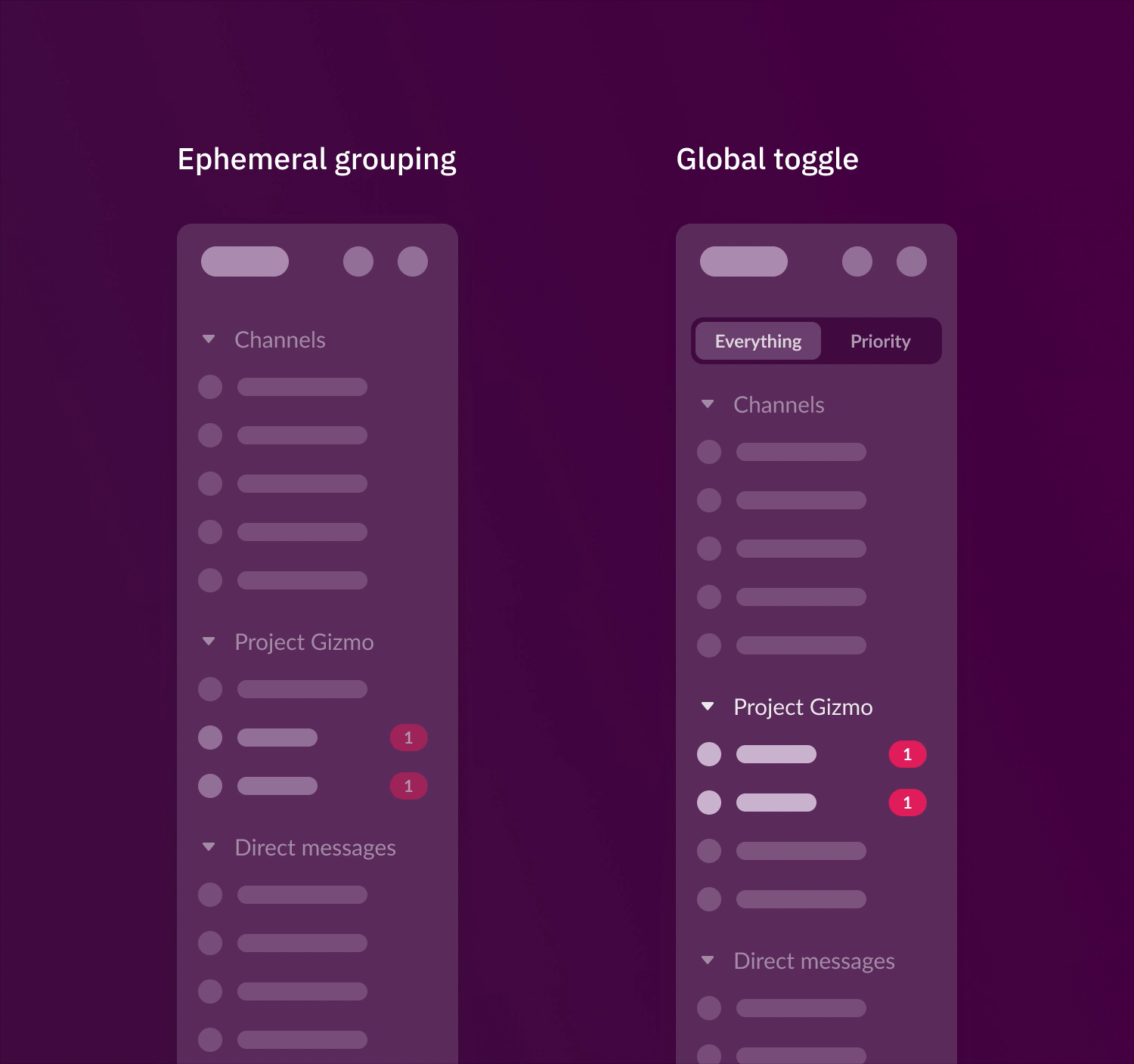
Next came the design question of how to visually elevate these VIP messages. We explored several options within Slack’s existing section structure:
- A new section
- Using unique indicators
- Nesting non-urgent unreads
- Jump-to style navigation

Initial VIP explorations
None of these solutions quite hit the mark. They either introduced the cognitive load of having to actively scan the sidebar or permanently reorganized conversations, which wasn’t ideal for group DMs or mentions in less critical channels that users wouldn’t want constantly prioritized.
This led us to a key realization: the solution needed to be independent from sections. New possibilities emerged:
- Temporarily elevating VIP unreads to the top of the sidebar
- A top-level toggle for “All” and “VIPs”
Through prototyping and testing, we landed on the former. This approach elevated new VIP messages without permanently altering the sidebar, helping users stay on top of what mattered most, exactly when it mattered.
Ideas we prototyped to validate a path independent from sections
Finding the Best Name and Messaging for This Functionality
In retrospect, the name of this feature might seem straightforward, but it was a critical product decision to ensure understanding and adoption. Our initial term was “Priority,” but it felt somewhat generic. Other, more descriptive options like Important, Close Colleagues, Top Coworkers, or Main Collaborators were no clearer, long, and didn’t quite roll off the tongue.
Ultimately, we chose VIP. It was concise, memorable, and quickly conveyed the idea of elevated importance. However, it wasn’t a decision we made lightly. We were concerned about possible connotations and the longevity of the term. In a product that feels as friendly yet complex as Slack, “VIP” could potentially be perceived as hierarchical or not scale as a descriptor. But we needed a term that would resonate quickly and clearly with our growing and diverse user base, particularly within enterprise environments where “VIP” is a more readily understood concept. Naming it VIP represented a pivot in our thinking – prioritizing clarity and immediate comprehension for a wider audience.
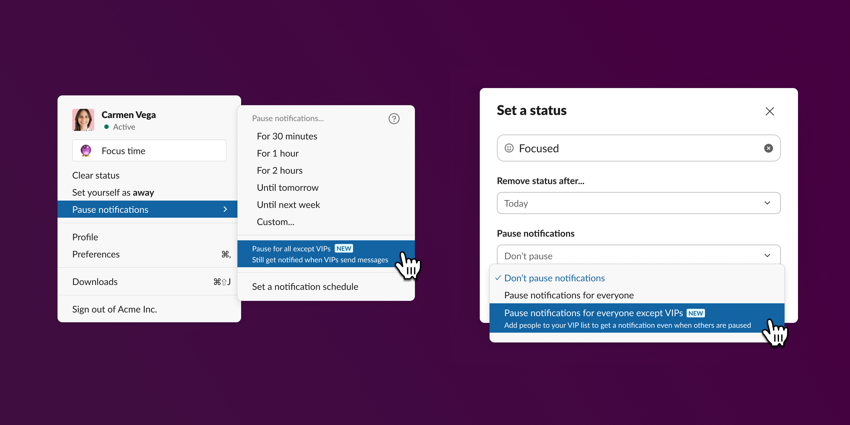
As we internally tested early versions of VIP, it became abundantly clear that we needed to emphasize that this was a notification feature and not an organization one. At a glance, it could easily be mistaken for just another custom sidebar section. If users perceived this as such, they’d think “Why would I set this up?” To avoid this confusion, all communication and language around VIPs was clearly framed as “Never miss a message from an important person!” in every single entry point and touchpoint.

VIPs in-product introduction
Finding the Best Way to Teach You How to Use It
Again, this was a feature that needed to present itself in a very quiet way. We decided against another prominent button or one-time takeover modal that people might dismiss. Instead, we opted to teach users about VIPs contextually, in moments when they were already thinking about their notifications and preferences. This included:
- When users interact with status, preferences, or notification settings
- Using intelligent recommendations based on an algorithm that identifies close collaborators
The latter illustrated value and reduced the initial setup effort for the feature, but we were cautious about overwhelming users with too many VIP recommendations, limiting it to eight to start. However, we observed that many users did indeed select just up to eight people. We asked ourselves if users were limiting themselves due to the number we were recommending. When we increased the list of VIP recommendations, it turned out to be helpful indeed, underscoring the power of relevant recommendations for unlocking a feature’s full potential.
A Quiet Feature with Resounding Results
There’s often a misconception that impactful features need to introduce entirely new surface areas. Our experience with VIPs taught us a valuable lesson: significant improvements can also live behind the scenes. To date, approximately 500k new users add VIPs to their Slack every month and over 45% of users set up VIPs without any educational introduction, highlighting how its core functionality addresses a fundamental user need. The key was in respecting the already complex Slack ecosystem and finding a solution that felt natural and unobtrusive.
The most effective solutions are oftentimes not about adding complexity but about providing smarter controls and leveraging the existing system to deliver meaningful value to our users. To quote Dieter Rams, sometimes “Good design is as little design as possible.”
Carla Gonzales is a Design Director at Slack on the Core Messaging team, where she focuses on attention management and helping users stay productive. Special thanks to Meghan Uno, Emily Straubel, Jon Russell, and the VIP engineering team for bringing this feature to life.