

Think about your experience using other products. What made them feel good to use?
With the launch of Recap — our new Slack AI feature that provides daily summaries of channels you want to keep tabs on but aren’t active in — we knew it had to go beyond just working as expected. Functionality is especially important in AI, where establishing trust and setting expectations is crucial. But for a product that we hoped people would use every day, we wanted to make sure the experience always felt fresh, delightful to use, and, well, Slack-y. That’s where focusing on craft came in.
Slack has always been known for its attention to craft excellence. Our long-standing approach to simplicity, accessibility, and delight are not only key aspects of the brand, but also drive our product investments. To us, Slackyness means making it feel great to return to Slack each time. For Recap, this meant putting our focus on making key moments intentional, playful, and purposeful with delightful copy and interaction details.
How did we prioritize and make time for craft? To be honest, production timelines were tight and under normal circumstances, it would have been easy to deprioritize. But because our goal with this feature was to give people the opportunity to meaningfully change how they use Slack overall, we knew we had a higher craft bar to meet. Through close team collaboration, we learned valuable takeaways about incorporating craft into our design process that we’ll take with us as we work on future AI features at Slack.

Extend beyond your discipline
To make this launch happen, we knew the importance of flexing our different designer-y muscles for this all-hands-on-deck endeavor. While we each have our roles in our respective design disciplines, we carved out a focused set of design responsibilities specifically for this project:
- McKenna: Lead the overall design direction and creative vision, and made the final call when needed.
- Chris: Focused on visual design polish, interaction, and motion design concepts.
- Zara: Concentrated on localizable content and emoji-rich copy variations.
- Naman: Explored a wide range of UI and interaction patterns, focusing on mobile needs.
We also took on tasks outside of traditional design expectations to facilitate excellent dialogue with our partners in Product and Engineering.
- McKenna: Managed project tasks, synthesized leadership feedback, and coordinated design and engineering priorities.
- Zara: Organized research sessions to test multiple message options with users.
- Naman and Chris: Provided usable code for the Slack AI engineering teams.
This division of responsibility helped us ensure steady progress towards our vision. As a bonus, it was even — dare we say it — fun to get to flex skills we don’t always have the opportunity to in our day-to-day work.

Over-communicate during a tight production schedule
Leading a project with multiple designers and vested parties required effective communication. To quell anxiety about making time for craft, especially late in the game, we over-communicated. We developed a template to consistently communicate feedback, priorities, and progress, giving everyone confidence in our ability to get it done.
We ensured everyone knew what we were exploring, why, and where it stood in our priorities. Some craft was critical for launch, while others would follow quickly after. We operated in quick cycles of ideation, rich prototyping, and feedback gathering. Regular and asynchronous feedback helped us understand why we kept or rejected certain explorations, avoiding endless discourse.
Focus on rich prototyping
We also learned how important it is to take advantage of every opportunity for user feedback along the product development cycle, from initial concept testing, to prototyping, to alpha and beta release and beyond. We focused on:
- Providing options for stakeholders: Presenting different options allows stakeholders to better make informed decisions as we align on a path forward.
- Incorporating real data and client experiences: Using real data makes the prototype as close to real as possible, further aiding those informed decisions.
- Creating rich prototyping: Building complex interactions with stateful logic and rich motion makes the product feel more tangible than static mockups.
Each step told us something we didn’t know before, thanks to continued exposure to different levels of fidelity, scale, and diversity of experience. For example, if we had waited to introduce motion design, something typically considered “polish” until GA, we wouldn’t have gotten the feedback until too late that when applied to our airplane emoji, the motion design seemed more akin to aviation disaster than cute celebration.
A key principle for us was to go big, go fast, and go beyond what feels safe. We provided a variety of options upfront, gathered feedback, and made decisions quickly. This allowed us to question boundaries to understand where we might be doing too much or too little, and helped avoid becoming too focused on a single direction too early. We understood that not every exploration would get shipped, but that’s okay. Unshipped prototypes serve as valuable repositories for future ideas.
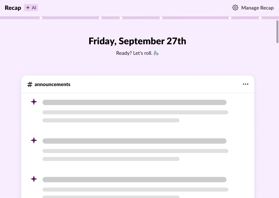
You might end up surprising yourself with which ideas seem excessive on paper, but turn out great in practice, like changing Recap’s background color as the user scrolls.
Differentiate platform parity vs. specificity
Delivering a feature with craft meant thinking about both desktop and mobile. Striving for parity across experiences while embracing platform-specific uniqueness was key.
For example, mobile took the background color change on scroll and the emoji burst animation from desktop prototypes. Desktop adopted the bubbly spring animation from mobile. Some interactions were platform-specific, like haptics on mobile and card scaling on desktop. By respecting and designing uniquely for each platform while striving for parity, we delivered a consistent experience to our customers.
We learned how important it is to think about craft in a product from its earliest stages. On iOS, we felt that it was going to be important to animate the interaction of expanding or collapsing a topic. From the outset, this led us to structure the code in a specific way with that behavior in mind. If the interaction had been an afterthought, it would’ve been done hastily without the same level of polish.
And we’d do it again, too
If there’s one message we want you to take away, it’s this: devoting time, energy, and bandwidth to craft is a worthy investment, even when a team is pressed for time. Not only will you create a memorable experience for users, you will stretch outside your comfort zone and learn new insights for future projects. By prioritizing craft, you give yourself and your team permission to think up the most fanciful, slick, and spicy design concepts that might not have been explored otherwise. This valuable work can and will inspire your partners, enabling them to champion craft, no matter what team they belong to.