Hi, we’re Alison and Zoe, Associate and Junior Designers, respectively, and we just joined Slack in fall of 2021. Our first project here: building guidelines for onboarding emails.
If you’ve ever joined a Slack workspace, you’ve gotten one of these. In fact, every person that interacts with Slack as a product will receive onboarding emails early on, which meant that we needed to design for all users—ever. Big shoes to fill! As designers, we care a lot about making a good first impression, and we’re showing that by making every Slack customer’s first contact with the product as pleasant an experience as possible. Here’s how a couple of fresh-to-the-team designers made that happen.
Consistency is key
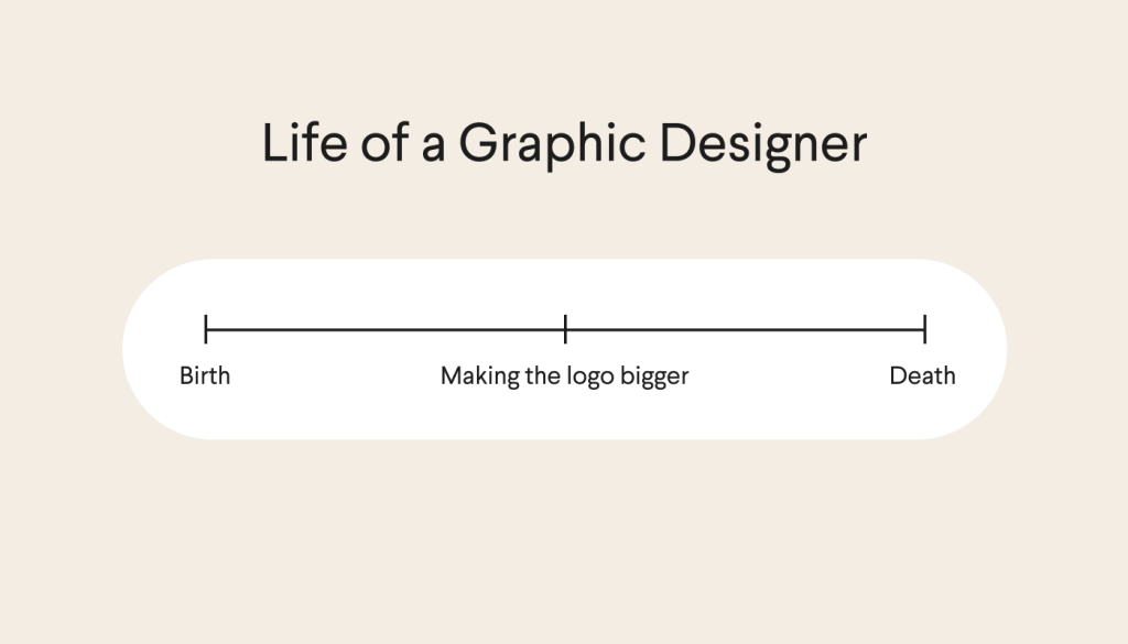
“Lack of consistency”: the words every designer hates hearing most. (Besides “make the logo bigger,” anyway.) If the ultimate goal is building trust in a brand, the way we get there is by demonstrating dependability by showing up uniformly across touchpoints.

When we came onboard, Slack’s existing onboarding emails used out-of-date, off-brand design treatments. And with the marketing emails already having undergone a recent overhaul, we saw an opportunity to create more consistent, accessible communication. With both of us being new to the Slack Design team, this project provided the perfect platform for us to internalize and represent the brand cohesively, while also exercising creative control over the design.
As the Slack brand evolved, the differences between old and new email designs became more and more apparent. The previous email templates contained design elements that were no longer being used in more recent instances, which led to emails with varying types of headers, footers, and button styles. We worked with the Lifecycle Marketing team to come up with a set of email guidelines to help eliminate any inconsistencies, while making sure they could be used across all instances — from marketing to transactional emails.
Mobile-friendly, localized designs
In the process of designing these email templates, we faced several challenges, particularly when it came to maintaining proper sizing and spacing across different devices and different languages. First, we had to ensure our design was mobile-friendly and optimized for the smallest width to fit all phone screen sizes. When considering different layouts during our design exploration, we built a centered version and a left-aligned version, but ended up opting for the latter because it displayed content (particularly text) better, especially on mobile.

Next, we incorporated maximum character counts and widths to prevent stretching elements like heroes, headlines, and buttons that had limited space. For example, buttons have a maximum character count of 50 characters, to ensure the text remains all on one line. In situations where the button character counts exceed 50, we suggest using a text link instead of a button to fit the extra characters. By creating parameters for different text and spacing instances, we limit deviations from the guidelines.
Lastly, it was important for us to come up with localization guidelines. In order to accommodate languages like German and Russian, which have longer character counts, we reduced font sizes by 10-15%. Additionally, we chose specific fonts for languages like Korean, Japanese, and Chinese (Simplified and Traditional), so those translations would match desired font heights and styles across the board.
So what?
This project emphasized just how much sizing and spacing are impacted when designing for mobile. It also highlighted how increasingly important it is to continue adjusting designs to accommodate a number of different languages.

To us, “good design” comes down to making sure every decision can be backed up with clear reasoning. By coming up with a treatment for every potential design case, we are able to simplify the email-building process for the product team and avoid inconsistencies. The guidelines we provide users build a stronger brand presence across emails while ultimately creating a more cohesive representation of Slack.
But it goes beyond the brand. Mobile-optimized and localized onboarding emails will lower the barrier of entry for users, which means that more people have easier, simpler access to Slack as a product than ever before. We think that’s pretty cool.
—
Alison Jeng is an Associate Designer at Slack. In her free time you can find her water coloring and making a weekly batch of granola.
Zoe Berger is a Junior Brand Designer at Slack. Find her writing daily haikus and over-accessorizing at @sadspot.

