Let’s face it: AI technology, especially in the workplace context, is a sensitive topic. On the Slack design team, we know that no matter how large a deadline looms, it’s important to keep humans at the center of the experience. This sentiment is well-worn in a space crowded with well-meaning tech types, so we got specific: How might we use AI to make the work day more pleasant and productive? How might AI help us solve long-standing user pain points that conventional user experiences couldn’t? And, in a rapidly evolving AI market where people expect more from their technology every day, how do we deliver those things fast?
We kept user pain points front and center
One of the biggest challenges in developing AI consumer tech—and in developing new technology in general—is winding up with a solution in search of a problem. Thanks to our Research & Analytics team, we had a head start in understanding which areas people say they’d most value our help with: reducing noise to stay focused, keeping up with messages, and finding information within Slack. In order to start delivering value to our customers as soon as possible, we focused on features that would address those themes first.
Our first launch on February 14th included two main AI-powered features: AI-powered search and summaries. With AI search, people can use natural language to find what they’re looking for in Slack, in a way that feels like asking a trusted teammate a question. With channel and thread summaries, people can quickly catch up on fast-moving conversations, so they can jump back in right away. Along the way, we grappled with questions like how to build trust with and educate users about what’s going on behind the scenes, and how to determine the most helpful ways to integrate these new features into existing ways of working. To answer those questions, we drew on both existing research and feedback actively coming in from internal and pilot users.
Our next launch on April 15th included a feature called recap, whose focus is on helping people reduce noise in Slack so that they can better focus on the important stuff — a TL;DR to reduce FOMO, if you will. Early research indicated that people tend to think about their channels in three tiers (and maybe you can relate): tier 1 includes important channels you’re directly involved in and need to address quickly (ex: project channels, team channels), tier 2 includes channels you like to keep tabs on but generally don’t need to participate in (ex: announcement channels), and tier 3 includes channels you don’t need to keep up with (ex: tech support channels). We learned from prototype testing that with some help from AI, getting those tier 2 channels out of sidebars and having them automatically summarized once a day made people feel they could focus on the high-impact work without fear of missing out. As we continued refining this feature, the results of moderated and unmoderated testing helped us make decisions quickly and improve user comprehension.
We shared ownership and visibility often
When sprinting towards a goal in a rapidly changing environment, it’s critical to get everyone on the same page early. Typically at Slack, we appoint Design DRIs across individual workstreams, but given our unique position with this new technology and tight timelines, we realized we needed to try something different.
We felt it was important to have “shared” ownership and an environment where we could easily jump into each other’s work at any moment of inspiration. We often traded Figma files, enabling each designer to piggyback off of ideas, iterate on concepts with fresh eyes, give informed feedback more easily and effectively, and make faster decisions. We also made it clear to our XFN partners to include us (both product design and content design) collectively, whether it be a quick huddle or a reoccurring sync. While this way of working may not scale as a team grows, it gave us the opportunity to produce high-quality work quickly in an ambiguous space with a fast-approaching deadline.
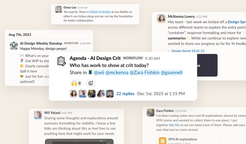
This theme of tight knit collaboration extended to our cross-functional partners in engineering, product, and beyond. We made it a point to “design out in the open” so it welcomed early feedback from other stakeholders. A great idea can come from anywhere, and when so much of the feature is informed by the root technology, the feedback we received around latency, prompt engineering methods, etc greatly shaped how we approached design. While we’ve since outgrown the “shared” ownership model and now have workstream DRIs, we look to extend a lot of the positive themes that came from it. Many teams across Slack are thinking about how to leverage AI, and we’re constructing a strong partnership model that’s based on a lot of the early learnings when designing in this space.
We launched and learned (again and again)
As shared many times on this blog before, one of our product principles at Slack is “prototype the path.” We believe the best way to vet an idea is to build it as quickly as possible, then test and repeat.
With generative AI sending the tech industry into a frenzy and users clamoring to see how we might implement it in Slack, we took this principle to heart. In practice that looked like:
- Design sprints including key stakeholders to get buy-in early
- Rough and ready prototypes to confirm viability
- Research studies first to validate the user need and later to test core interactions, copy, and flows
- Internal and pilot releases to increasingly larger groups of users for quality assurance
Every step along the way resulted in valuable feedback. As designers, we’re used to receiving feedback—it’s just part of the job—but Slack takes it to another level. Our company takes internal “dogfooding” (or the practice of a company using its own products or services internally) very seriously. We not only build Slack, but we use it every day. And what that means is everyone’s invested in the success of a feature… so they share a lot of feedback. This can be incredibly intimidating at times, but, with practice, it can become a superpower.
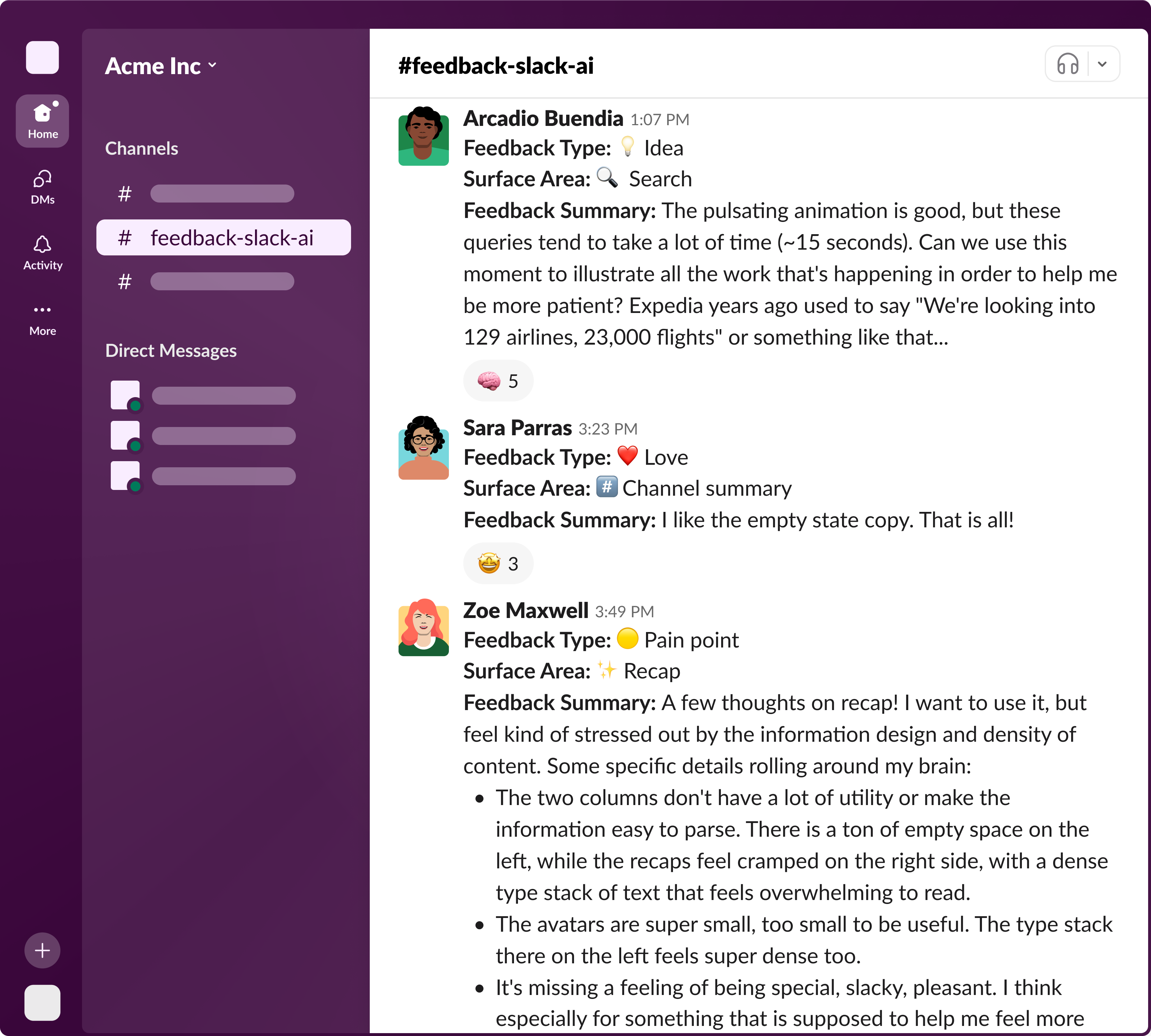
As a design team, we made a concerted effort to respond to every piece of feedback, engage with it, and turn it into something useful. Many of our team discussions were focused on weighing feedback from crits, research, or internal testing against each other.
And we’re just getting started…
It was a tremendous amount of work in not a lot of time, but there’s no doubt that putting users first, sharing ownership, and prototyping the path is how we were able to do it. And we’re not done! We hope these first few AI features will make your working days a little bit more productive and a whole lot more delightful. ✌️

