
Hi, my name is Stella, a designer working on the Slack platform administration experience. My job is to take care of a special group of users, our Slack administrators.
While many think of Slack as a “people product,” we’re also a robust enterprise product. According to Okta’s 2022 Business at Work report, the average number of apps used at an organization is around 89. That’s a lot of apps. Installing apps in Slack saves users time by allowing them not to toggle among various windows and logins. But as an organization, the admins need to ensure sensitive information doesn’t get leaked. They need to review the app requests to approve or restrict the installations.
My goal is to enable admins to perform their important yet complex tasks with the best experience possible. That’s where content design comes in to bolster my work as a designer. They help me turn technical concepts into simple and intuitive experiences for admins.
Here are three principles for success they’ve taught me.
1. Use terms to construct mental models
Whenever we introduce a new feature to help make Slack users’ lives easier, we also need to provide a way for administrators to manage them. The terminology we use to describe a feature often describes how it’s related to others.
Take the term “connected accounts.” This makes a lot of sense for an end user to connect accounts. For example, they can connect their Miro account to their Slack account for a seamless experience from one app to the other.
When designing a management page for admins, however, “connected accounts” means something different. Brainstorming with content designers on the right term for the feature brings this information architecture issue front and center.
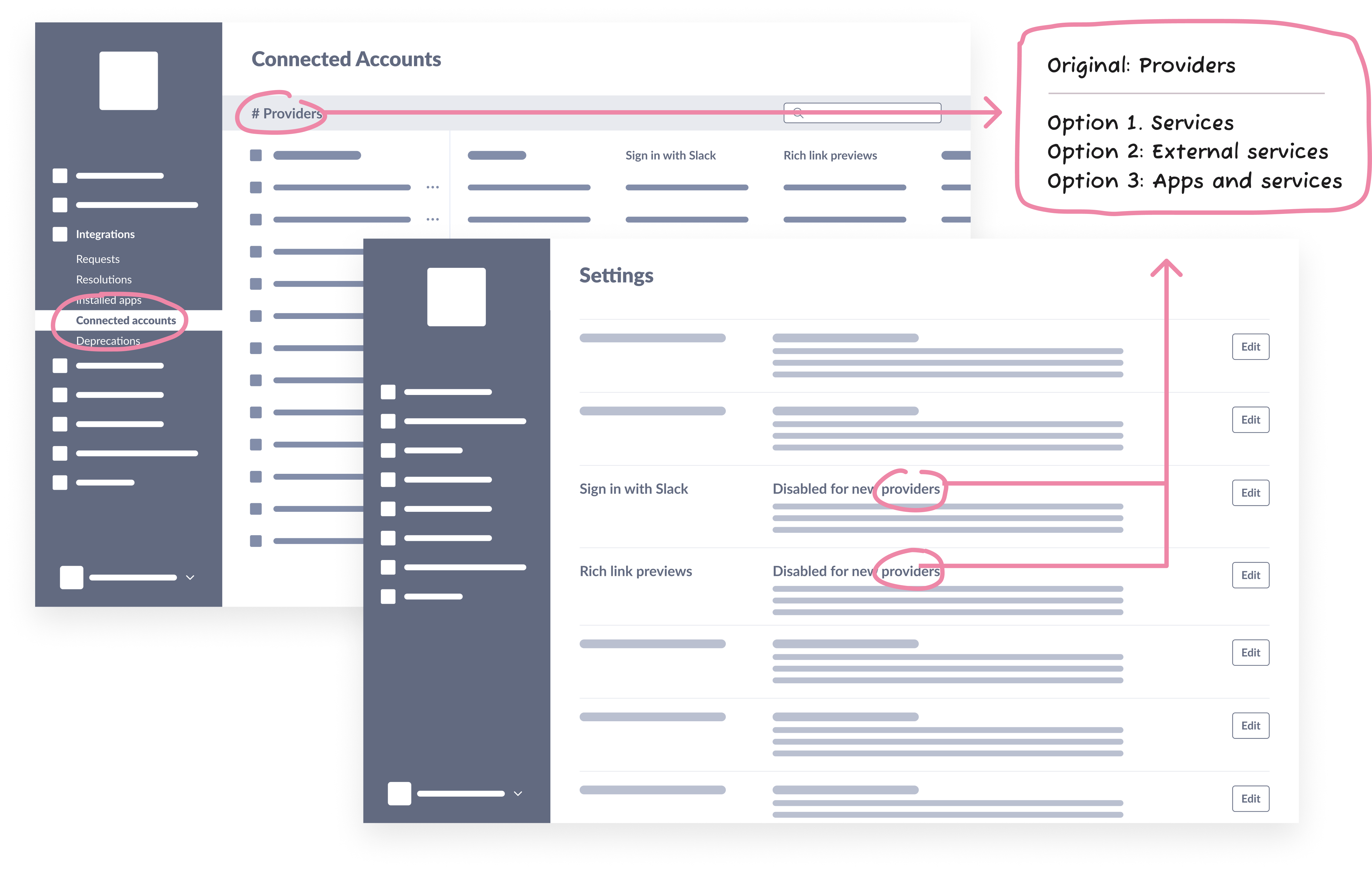
Designs depicting the difficulty of coming up with a term for a row in the connected accounts table for admin management. It can be called “providers,” “services,” “external services,” etc.
To an admin, this feature is just another capability of the apps they’re already managing. Instead of presenting “connected accounts” as a separate concept from apps, we should present it as another part of an app, which is an easier and more scalable mental model.
By determining how we should use words to communicate the relationship of the features, we adjusted the designs significantly to cater to a mental model that will be simpler and more intuitive for our audience.
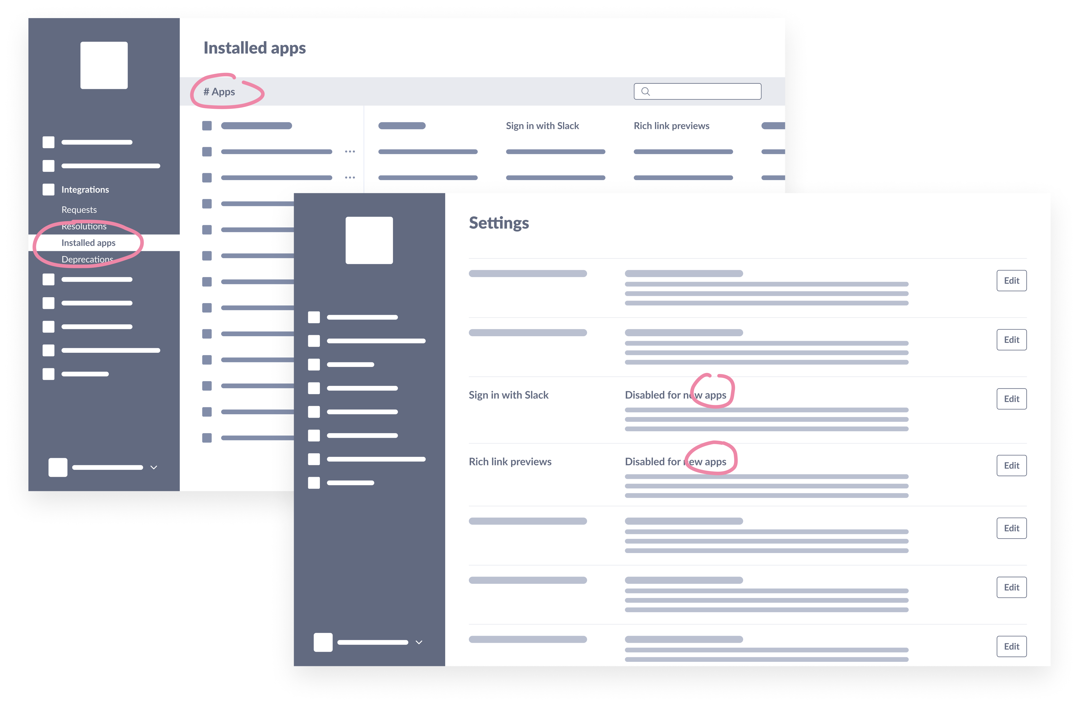
Instead of coming up a new term, we eventually chose not to create a new page for “connected accounts.” Instead we made that feature a column in the “apps” page in the designs.
2. Don’t try to show everything at once
Each enterprise-level Slack organization and its workspaces manage apps a bit differently. While some companies let users request and install any apps they want without any approval process, others are stricter, only allowing apps to be installed on the entire organization or nowhere. There is a wide range of needs.
My team’s goal is to build a system that can provide flexibility without sacrificing security in exchange. We want to provide admins with enough information to equip them to make good decisions, yet not overwhelm them. This is a tremendous challenge when redesigning settings for admins to communicate what options they can have when it comes to app management.
Here’s an example of that. It was so complex that I figured adding more content to explain each feature would be helpful. Unfortunately, the additional explanation made it look more overwhelming!
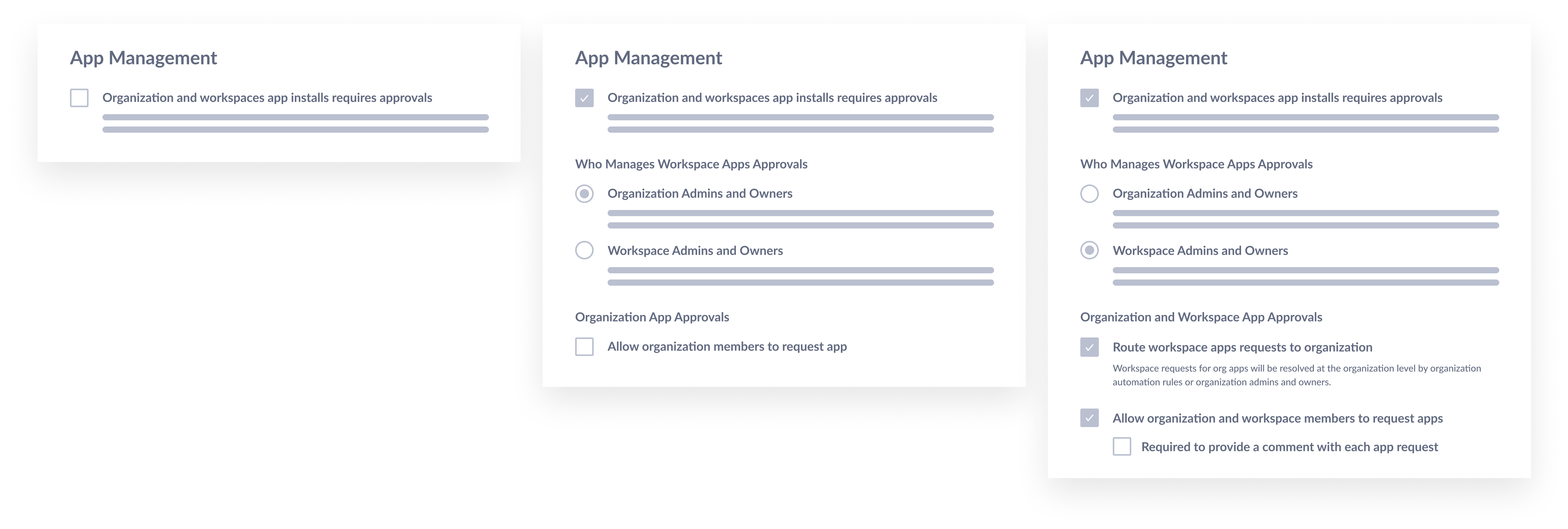
This image shows the “before” design for app management settings. Adding more description text makes the setting choices look overwhelming.
Below is the more refined design after collaborating with a content designer. Instead of trying to explain everything in the product, we cut down the description text and linked folks to a Help Center article to do more deep reading. To take it one step further, we questioned if there were any settings where we can make the decision for the admin and remove another unnecessary consideration.
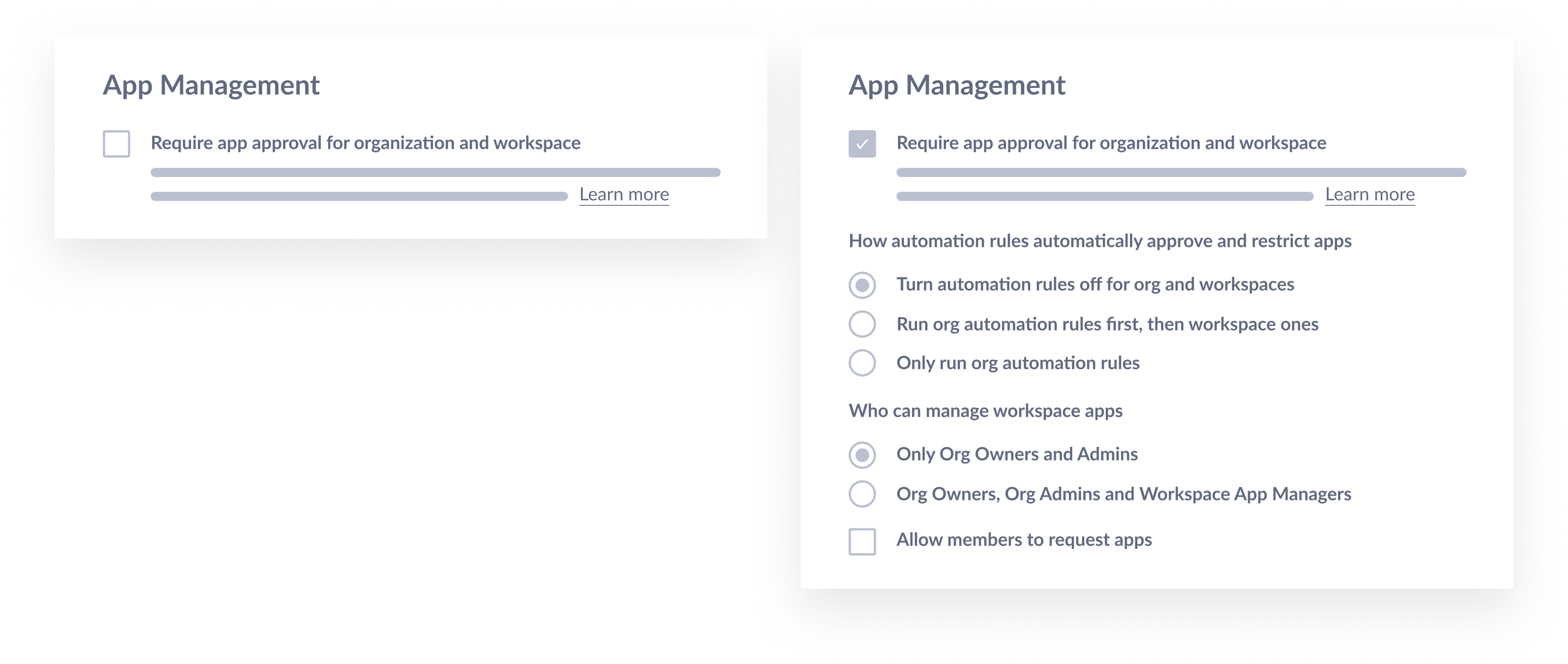
This image shows the “after” design for app management settings. A lot of description is removed for clarity knowing that the “learn more” will take folks to Help Center article for more info.
We also found ways to show the order of automation rules in the interface, so we don’t need to explain so much in the actual settings.
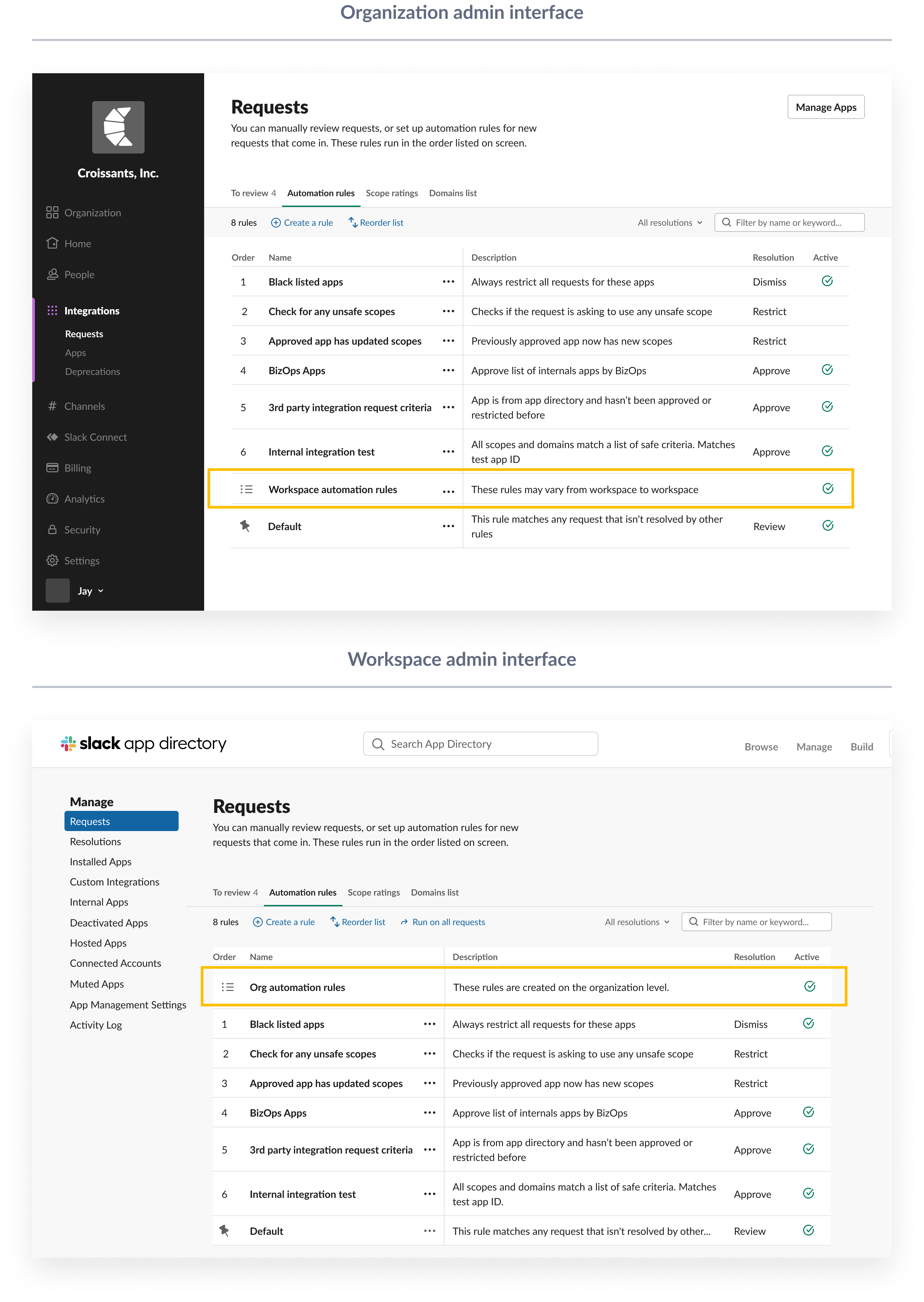
In the interface of automation rules, which is a feature for admins to create rules to auto resolve app requests, we added placeholder rows in the table just to indicate the sequence of order for org automation rules versus workspace automation rules.
The combination of strategically determining which settings to automate, what rules to visually demonstrate, and what text to show versus hide not only streamlines the content but makes the settings far easier to understand.
3. The smallest changes can make the biggest difference
Unlike the static content of an article, content in the software world is dynamic. After considering all the possible scenarios a user can encounter, designing the best place for certain content to live is also easier said than done.
Below is a before and after of a field where we ask admins to input additional information they would like to send to the requestor once a resolution is reached.
The content designer we worked with suggested we shift all important info to the label and descriptor text instead of the placeholder text. Placeholder text is often overridden by what a user inputs into the field. This means putting important information there runs the risk of it becoming easily missed. Another reason we decided to adopt this approach is that it’s better for screen reader users. Placeholder text is not broadly supported across assistive technologies or displayed in older web browsers.
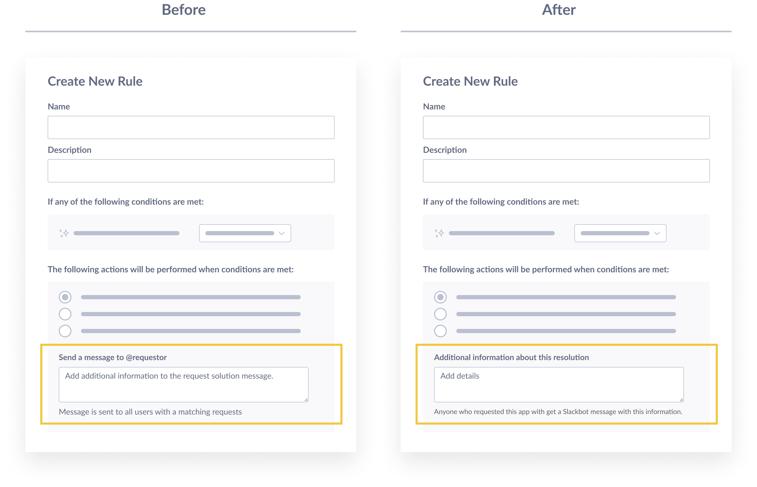
In the “before” design, we have a lot of important info in the placeholder text. In the “after” design, the important info is moved to the field label and description.
A slight change in the content details can create a much better overall experience for a user based on their various needs. Details matter!
Product design doesn’t happen in a vacuum. It takes a lot of iterations to create experiences that are simple, pleasant, and productive to use—at least that’s our goal in Slack.
Working with content designers helps me see new possibilities to raise the bar for design quality. Together, we apply a user’s lens to translate complex features into a simple user experience. We not only complement each others’ work, but we also elevate it, all in service of the hard-working admins that keep organizations running securely around the globe.
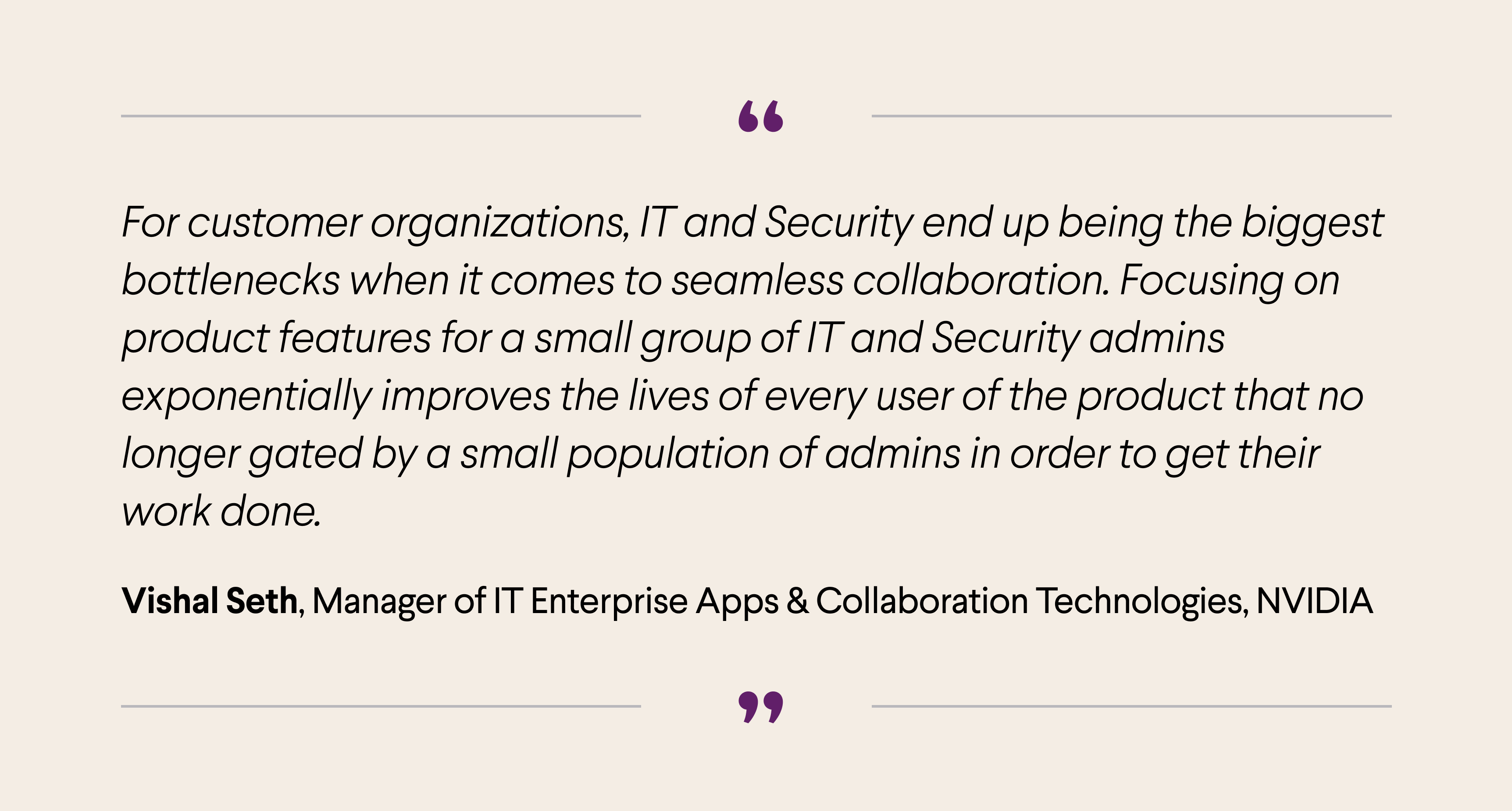
A quote from Vishal Seth, a IT manager from NVIDIA about how important admin experience can be for the overall company.
—
Stella is a product designer at Slack who is passionate about designing enterprise software with great user experience. She strives to bring a new definition of craft in the “boring” combinations of tables, charts, and forms. When she is not working, you can find her Kindling, embroidering, brewing Chinese tea and constantly discovering new hobbies.
Special thanks to Celia Hunko (content) and Dan Fornal (design), the amazing partners who have contributed to a lot of the iterations above.