
Early in my career, as a designer at a small design studio and later at a startup, I frequently prepped for redesigns and design improvements by conducting what I call Fresh Eyes Audits of our customers’ user experiences. The evaluation method, which I adapted from more formal user research audits, highlights usability issues and areas for improvement, helping me to make recommendations based on a clear set of best practices.
Unlike traditional heuristic evaluations—which are based on 10 usability heuristics and require a panel of experts to conduct—and formal expert reviews, Fresh Eyes Audits are a simpler, more accessible usability inspection for non-researchers to critically audit a user experience. Designers can conduct them for design research, leaning on their existing ability to look at a user experience from different perspectives.
Whether you’re the lone designer at a startup or a new designer to a product (especially one without user research help!), Fresh Eyes Audits are a great tool in influencing strategy and identifying areas of focus for your team. It can help immediately by surfacing small usability issues that are easily fixed, or it can help long-term, by contributing to the business case or discussions for future enhancements.
An example of a Fresh Eyes Audit report
When I joined my new product team at Slack, I conducted a Fresh Eyes Audit to familiarize myself with our product area, understand & explore our users’ workflows, identify the biggest opportunity areas, and start productive conversations with my new teammates. New to the team and the product, I could leverage my own fresh eyes and look at the system without the bias of designing it.
How do I conduct a Fresh Eyes Audit?
Depending on my current needs, I use two different blueprints to conduct a Fresh Eyes Audit: one focuses on the UX and usability of an experience, the other on its visual and interaction design. Once you get the hang of the first blueprint, it’s easy to take on the second one. The steps are simple:
1. Define the scope of your audit
Before you begin, decide exactly what and how much this audit will cover. Will it address only major workflows in your product area? Will it take a more holistic approach and analyze many parts of that experience?
If this is your first Fresh Eyes Audit, I recommend focusing on the most important workflow or two. (You can always progressively include more if you have the time.) This can be based on what the team believes is important, what you believe is important, or a blend of both. Usually these can be gleaned from conversations with product and engineering leads, or anyone who is closest to the customer—you, customer success managers, account managers, customer support agents, and/or user researchers.
2. Familiarize yourself with the usability heuristics
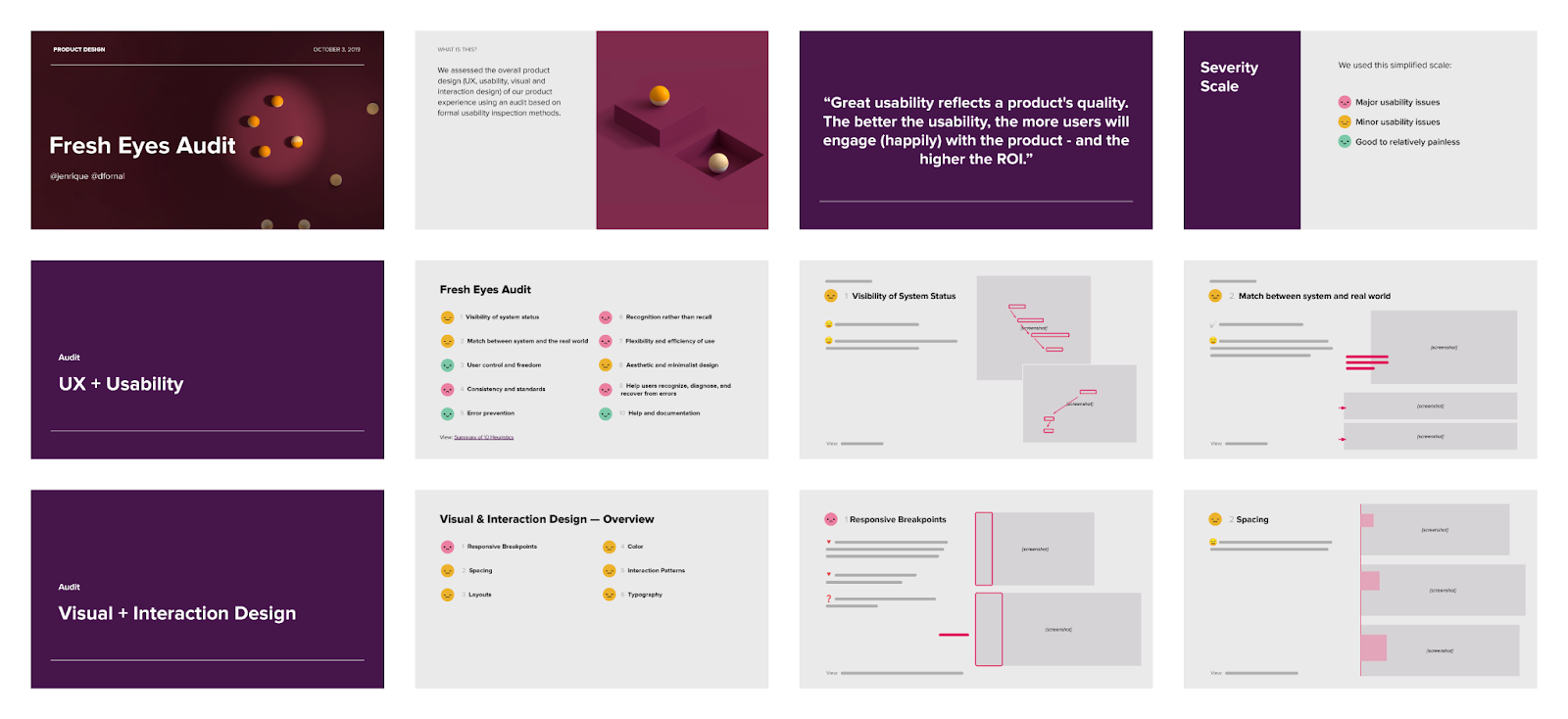
Read the N/N Group’s explanations and take a look at the consultant firm’s examples so you will be able to recognize what to look out for when you start. I use this worksheet, which I print out and use for notes as I go through my analysis.
Download the worksheet to get started on your own
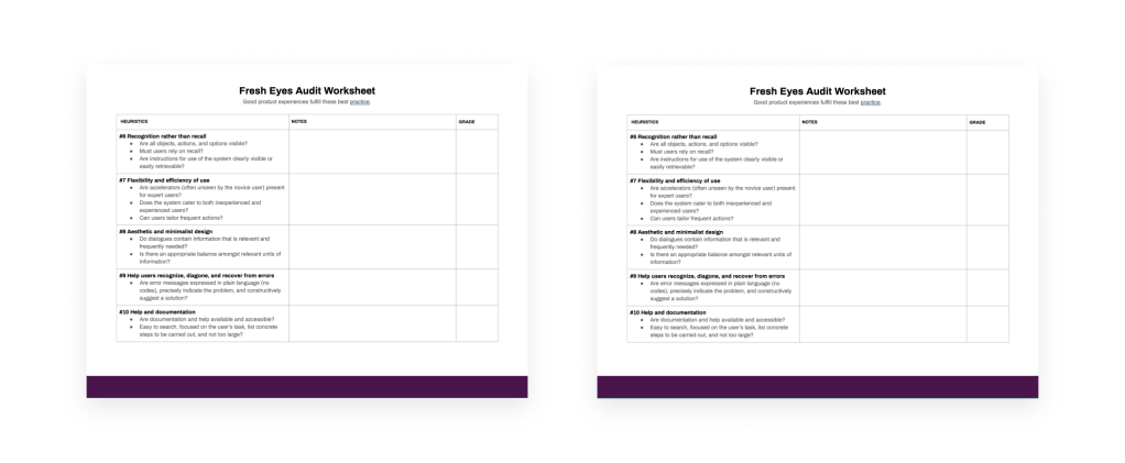
3. Create your rubric for issues
Your scoring rubric can be as complicated or simple as you need it to be. I like to use a 3-point severity scale of emoji because it’s the most accessible and easiest to remember for readers of the audit report.
A very straightforward 3-point severity scale in emojis
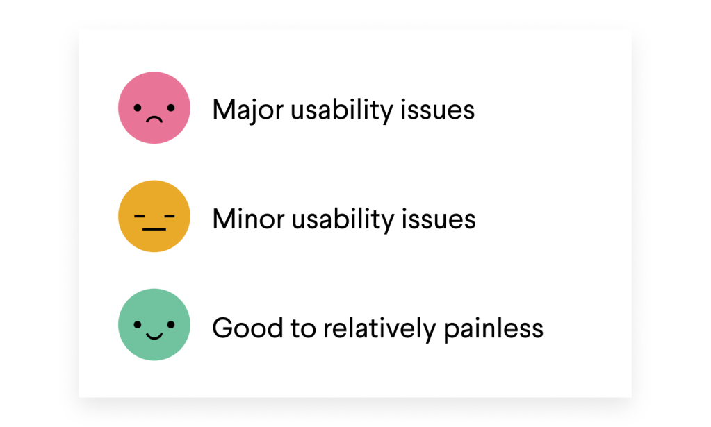
4. Go through each workflow, highlighting positive, neutral and negative takeaways.
Ask the heuristics questions for each workflow. Note if the answers are “no” or “yes,” and take some observational notes supporting that answer.
In the “Notes” section of my worksheet, I usually create a bulleted list of negative, neutral, and positive observations, prepending each one with symbols (down arrow, dash, up arrow).
While taking notes, also take screenshots of inconsistencies, consistencies, notable elements, and any janky quirks that help illustrate the severity rating. You’ll need those for the report.
I like to include visual indicators as bullets in my notes to help me determine the severity rating
5. Grade the overall experience.
To determine the severity rating for each heuristic, I tally and compare the number of observations. It doesn’t have to be an exact science; for me, as a rule, I look at the proportion of observations. For example, if there are more negatives than positives or neutrals, I grade it a 3 (major usability issues).
Present and share your findings
This audit report is an opportunity to educate, to advocate, and to establish your expertise. You are helping your teammates understand how to look at an experience critically through the eyes of users. The medium you use to share results is critical.
Slides are often the ideal way to share an analysis in an easy-to-digest format, because they force you to use words sparingly and use more visuals, including animated GIFs (which are great!).
You might feel most comfortable formatting this in a Word doc. And, you could do it that way! But real talk: unless your work culture absolutely lives and dies by long text documents, trying to engage your team with that format is bound to make your analysis less effective.

A fellow designer added a gif in our Fresh Eyes Audit to engage readers
Again, this audit is meant to demystify and clarify design research (while also showcasing your own ability to communicate ideas). However you choose to present your findings, you will need to engage your readers and compel them to read the document in its entirety. My recommended structure explains the methodology, severity scale, and assessments by category:
- Overview
- Methodology
- Usability severity scale
- Assessments
Fresh Eyes Audits can help improve visual design, too
A Fresh Eyes Audit can also examine the quality of a product experience’s look and feel. This is the second blueprint I mentioned earlier, specifically for Visual and Interaction Design. Instead of using the heuristics, I like to break down the analysis by the following categories:
- Responsive breakpoints
- Spacing
- Layouts
- Color
- Interaction patterns
- Typography
The list can include other aspects of visual design, from the very specific to the very broad—visual rhythm, input controls, buttons, hierarchy, balance, design polish, etc. Breaking down the design into parts like this helps your non-design partners understand how much thought and care goes into crafting user interfaces beyond the initial assumption of “designers just make things look pretty.” It demonstrates that aesthetic presentation still requires a rational framework and expertise is required to piece those parts together.
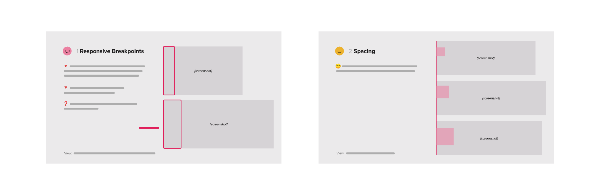
When you can break down what you see as a working designer, it helps your team understand best practices and good design, too
Presenting the results of your audit visually has another, broader benefit: it shows everyone on your team, whether designers or not, how and why small failures in a user experience can pile up, creating a worse overall experience for users. By conducting Fresh Eyes Audits, you’re ensuring that maintenance of even the smallest moving parts becomes a routine part of your team’s process.
No product is too familiar for a Fresh Eyes Audit
Fresh Eyes Audits take a bit of time and effort, and when done right they bring a lot of value to product teams, especially fast-moving ones with little documentation and lots of tribal, institutional knowledge. When you follow the blueprints above, the finished audit report can make clear the list of low-hanging usability issues that the team might have overlooked but can quickly tackle, as well as the areas that are ripe with opportunity to expand and evolve.
———