
In software design we have all heard the phrase “well-crafted user experience.” It may have come up in conversation, in an article or in a job interview. Indeed, conversation and debate about craft, what it is and why it matters, has been a through-line during my 20+ years in tech. I’ve worked at companies that have evolved their appreciation of craft (Google), companies that established their brand with it (Airbnb), and companies that bring craft to enterprise sectors not typically graced with it (Slack).
As we define what craft is and why it matters, we need a framework to help us explore, debate and improve craft in the software we build.
The three building blocks – utility, usability and craft
At Slack, our product principles focus on three elements that contribute to great design: utility, usability and craft. Utility is whether the software actually serves a purpose and has real value. The principle “seek the steepest part of the utility curve” helps us decide how and where to make our design bets so we deliver the maximum value to our customers. We measure our product’s utility by its ability to provide enough value to encourage repeated use.
“Don’t make me think” is about whether the customer can actually use the software to get their job done. We want customers to do their work in Slack without thinking too hard, so we design it to be intuitive and easy to use. We determine how usable Slack is by talking to and studying how our customers use our product, measuring task completion and monitoring support tickets.
The last element is craft, or how the product feels to use. The product principle we follow to ensure a high level of craft is “be a good host.” Not only do we want our software to be dependable and understandable, we want the overall experience of Slack to be delightful. Well-crafted products produce a positive emotional response (they feel natural and pleasant to use), while poorly crafted products create a negative emotional response (they feel unintuitive and unpleasant to use). The emotional connection we create with craft accentuates product utility and usability and creates passionately loyal customers.
When all three elements — utility, usability and craft — are combined, we have the elements we need to create best-in-class product experience. When one of those elements is missing, we risk creating unsatisfying and frustrating experiences.
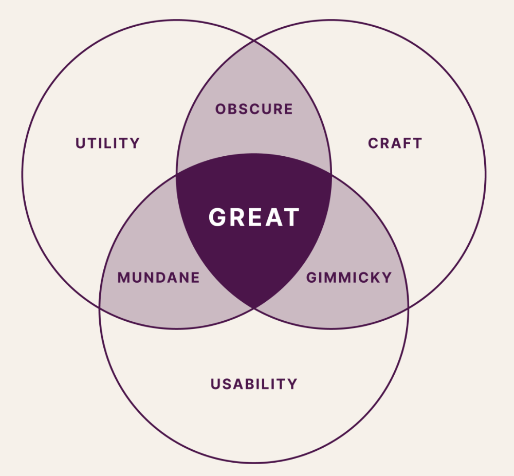
Venn diagram showing the intersections of utility, craft and usability and highlighting the need for all three to create best-in-class products.
Here’s another way to think about how these three elements support each other: like Maslow’s hierarchy of needs, there is a hierarchy of design qualities. As a baseline, the software must be functional. It works! It’s reliable, performant and free of bugs. At the next level, it should be usable. It serves the intended purpose and gets the job done. Finally, at the highest level a product is pleasant to use. The way to achieve this apex level is with craft.
Think of a chair. A stump is a perfectly functional and reliable chair. A green plastic lawn chair is even usable. You can take it around with you. It stacks. But the Eames rocker — now that’s a great chair! People covet this chair. It’s made of premium leather, the wood is beautiful and it’s incredibly comfortable. It’s downright pleasant to sit in, and that’s because it’s incredibly well crafted.

Image showing a tree stump, plastic chair and Eames rocker, illustrating the difference between fine, good and great design.
What is craft?
Visual & industrial design
Craft combines the elements of visual design (color theory, typographic standards of excellence, appropriate spacing, information density, the clarity of an icon set, etc) and elements of industrial design. When we bring ideas from industrial design into software, we create an experience that feels more like the real world, making the digital more tactile. One of my favorite examples of this is how setting the alarm on the Apple watch mimics the experience of winding the hands of an analog alarm clock, haptic feedback included!
Animation
Animation is the way the software moves. Does it snap immediately from point A to point B, or does it transition smoothly? Is there an easing to the start of the transition and then again at the end of the transition? Motion is another factor that makes an experience feel more like the real world. And even further, more like the best quality objects in the real world. Think about cabinets that have a soft close. They feel much better than those that just slam shut.
Voice
And then there are the words we use to make the product sing, as well as making it easy to learn and use. Slack has a unique voice and tone for enterprise software. It’s a necessary and important part of our brand. Our voice is clear, concise and human, like a friendly, intelligent coworker. We’ve used this voice this from day one in our product and in our marketing, help and brand content. Our voice defines us, it’s as much a part of our personality as any other part of our UI. A powerful new example of voice is how it’s used in AI, like the voice used in GPT-4o. It has an emotional quality that fundamentally transforms our experience with computers.
Interactivity
We also care about interactivity. This is the responsiveness of the software to input. Roll over a button. Does it feel alive? Click a form field. Does it respond in some unique way? Tap a toggle to start a huddle. Does it feel special to do so? Interactivity is what separates software from other non-responsive media like movies.
The five elements in action
Let’s take a look at an example of utility, usability and craft coming together to form a great design. One of my favorite examples is the Pegman in Google Maps. Pegman isn’t just fun. It helps people understand that the map view changes to street view wherever the little Pegman is dropped. But it feels great because it wiggles as you drag it. It adds a real physical component to the experience that blends perfectly with the realism associated with street view.
GIF of Google Maps and the Pegman feature showing how dropping the Pegman changes the map view to street view.
A recent example of this within Slack is a new feature called Catch Up. We know a lot of Slack users use the mobile app to review their messages when they’re on their commute, grabbing lunch or simply stepping away from their desk.
Our goal was to provide a way for people to get a snapshot of their entire (often busy) Slack sidebar without getting lost in the weeds. We could have presented this information in a myriad of ways, but chose a swipe approach — swipe right to mark messages as read, swipe left to keep them unread — to make the process feel more tactile and specifically crafted to take advantage of mobile’s touch interface. Not only is Catch Up functional and usable, it makes the tedious process of checking another inbox simple and fun. We’ve seen great feedback from users, making Catch Up one of Slack’s fastest-adopted features ever!

GIF of the Catch Up feature in Slack mobile showing the swipe approach to message triage.
Why it matters
People deserve well-crafted software. We expect our physical working environments to be top-notch and ergonomic. Why shouldn’t our digital working environments be useful and pleasant? Craft is our responsibility. It demonstrates that a company cares, which elicits customer loyalty and trust. Even more important, well-crafted design helps people make good life decisions about critical things like health and finances.
Where to start
Craft requires commitment, and can be hard for some leaders to prioritize because it requires investment in resources and time. So, where do you start? First, bring your key decision makers along in the journey. It’s important that they buy into the value of craft. Use this article and the resources we’ve shared below to convince your leadership team to invest in it.
Craft takes time, so include time for it in your scope and bake it into your schedule. Another approach we use at Slack is prototyping our way to a high level of craft. That’s because it’s impossible to get the experience right on the first try. The nature of craft requires iteration. It’s all about refinement, honing something again and again, and never settling until it’s just right.
Good luck on your crafting journey!