
While Slack fields many requests, the creation of a feature to add people to a direct message was something our design team heard frequently. When we first started to roll up our sleeves and explore how to build this feature, it didn’t seem that difficult. After all, you could already add people to channels. It would be easy to add people to a conversation, right? Well, for our users it certainly should be, but if it were that simple for our design and engineering teams, this article would be over already (it’s not).
In design, there are projects that are high visibility and high-value, but aren’t exactly the “sexiest”—and this was one of them. Before we embarked on this journey, we knew it would become a more complex project because we decided to design this new feature across multiple platforms—desktop, mobile, and iPad—all at once. This is a design choice other companies often opt not to make because despite yielding a better, more seamless outcome, it requires additional resources and time many organizations simply do not have. Designing across multiple interfaces concurrently is certainly a bigger task than designing separately, and requires more intentional and efficient collaboration with teams across various departments.
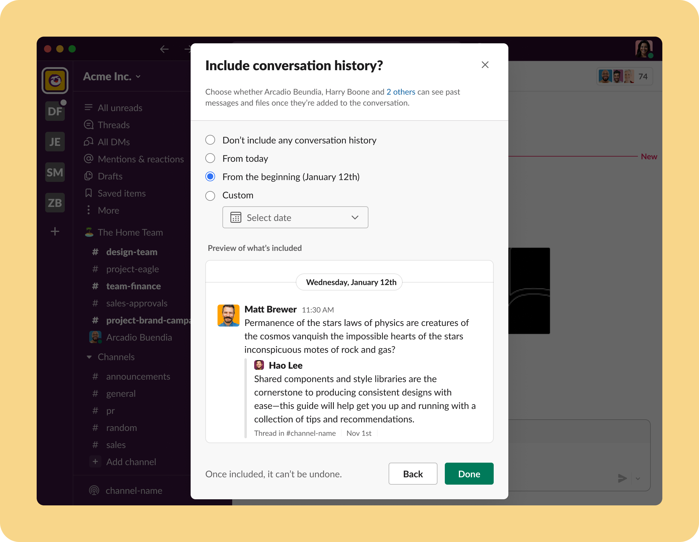
Choosing how much of your conversation history to include, the second step in adding someone to a conversation
Taking on a complex design project means acting as a liaison among many different people with many different skillsets. Here are a few things my team and I learned as we brought the new “Add to MPDM” Slack feature.
☝️ Don’t underestimate the power of being organized
The feature you’re designing should be intuitive, and your Figma organization should be, too! It helps your teammates consume information better and know when to tackle certain objectives. Our Figma design file was organized by platform and stage of the project, with each page illustrating user flows. Each user flow was also tagged with “WIP,” “Needs Content,” or “Ready to Build.” That way, engineers knew what was ready for them to tackle, what was collecting feedback, and where we were still iterating. By constantly taking stock and reporting back to each other via Figma, designers weren’t making changes and causing confusion as engineers simultaneously referenced these user flows and completed their work. It was also pretty cool to see how designs evolved throughout the process.
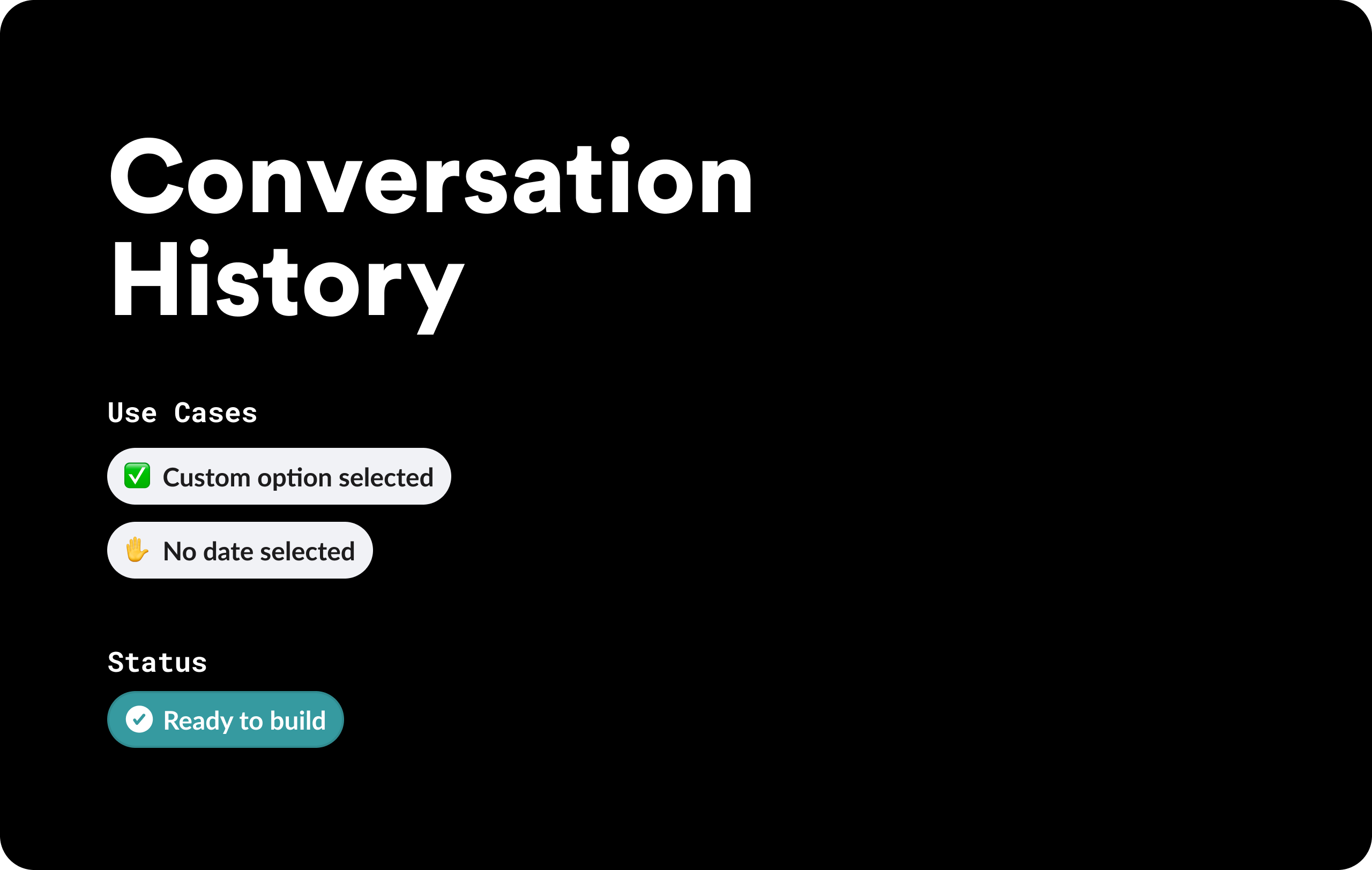
A cover page that illustrates the status and use cases of a specific design flow in Figma
I’m not going to lie. It seems pretty time consuming to organize in depth and sometimes it was tedious, but this labor of love became good practice in communicating the vision and goals of the feature. Without file organization that was constantly kept up to date, we’d spend countless hours in meetings and Slack channels trying to bridge the gaps of miscommunication and not actually feel accomplished or enjoy creating designs and prototypes.
✌️ Don’t be afraid of small real estate
Throughout this project, we worked on multiple designs simultaneously while emphasizing mobile first. While this means managing time spent on design work and collaboration with cross-functional partners, it’s essential to think about how each part of the feature works on mobile, tablet, and desktop platforms and to design with that intersection in mind. As more and more people travel and work remotely, “on the go” usage has outgrown desktop. The increased usage on mobile highlights the importance of having a top-notch “on the go” user experience. Plus, you’re more likely to retain users with an intuitive, mobile-friendly experience.
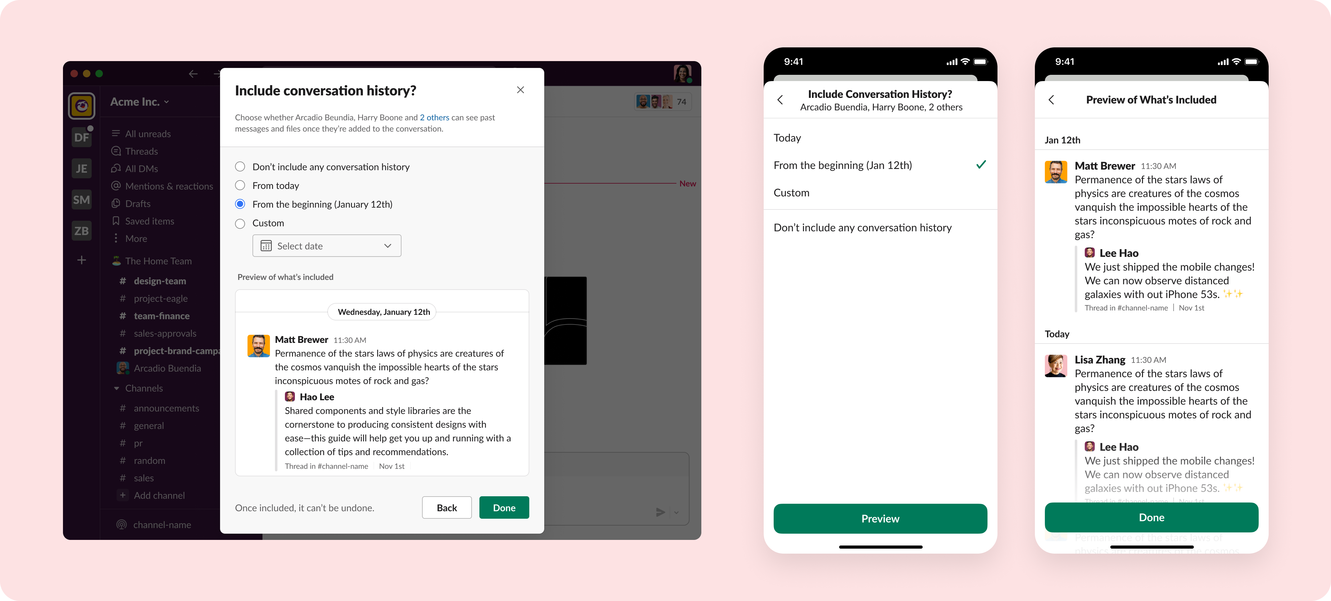
Illustrating how the single step of choosing your conversation history on desktop may need to be broken into two steps on mobile but remain consistent
Thinking about mobile first also forced us to discover what’s truly valuable due to limited screen real estate. This doesn’t just mean finding what will fit on the screen, but rather what the end user’s goals really are and the most efficient way to provide that.
🤟 Take a moment to celebrate
After the last few stressful years, we all probably feel we’re much better at work than we are at play. For my team especially, Slack is the way we work, and there’s always a lot of work to do. Throw in the pandemic, the heaviness of the modern world, and our more isolated ways, and it’s no question as to why celebration doesn’t feel as common as it was pre-2020. However, pausing to celebrate a major milestone is an important opportunity to acknowledge all the hard work that went into a project and to strengthen relationships among colleagues, even with those who weren’t part of the build. It could be as simple as a virtual team happy hour or as elaborate as taking a trip together. Success is a joint effort, so don’t just move on to the next item on the roadmap. You did it! That’s more than enough reason to celebrate.
From one designer to the next, give yourself the time needed to do your work well, and more importantly, give everyone else that expectation. You and your engineers are working on a product feature together—not as individuals in silos—so you’d be surprised how communicating early and often (while holding space for everyone do their job) increases the odds of getting it right with fewer iterations. Creating a new feature is no easy feat, so celebrate every major milestone, even the un-sexiest of ones. I hope your collaboration results in a product win as big as ours; take it from a few of the many delightful Twitter reactions as we received!
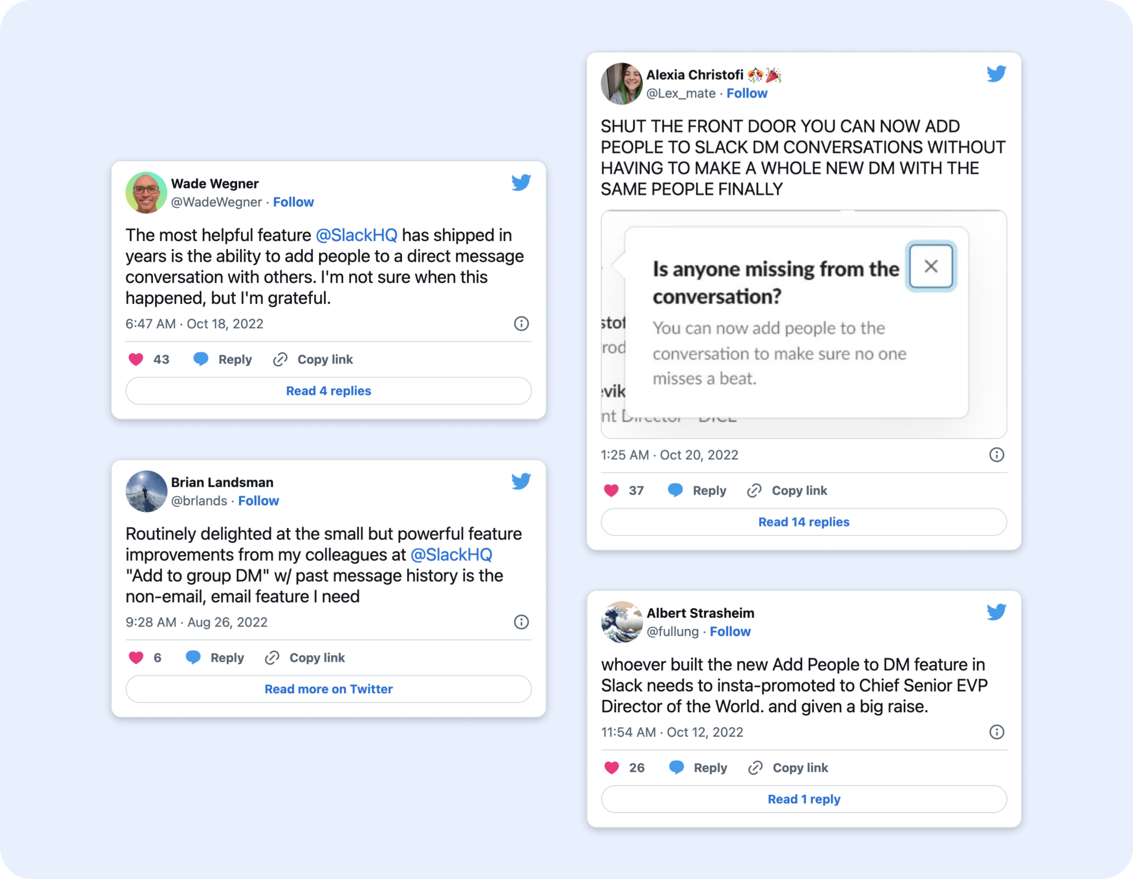
A few tweets expressing gratitude and excitement for the release of the Add to MPDM feature
—
Mina Chandler is a Senior Product Designer at Slack who loves making user experiences intuitive, beautiful, and accessible. She’s also passionate about retail therapy and Formula 1.
Special thanks to McKenna Lowry, my fearless design partner.