Designers are natural communicators — we communicate complex product behaviors via layouts, colors, interactions, and more. Yet workplace communications are still so hard. I’ve lost track of the times I’ve misled teammates with poorly documented design explorations or received off-planet feedback at a design critique. Through my mistakes, I’ve found that thinking about workplace communications as a design problem has helped me to become a more effective communicator—and made communications more fun in the process.
A designer’s job is 100% communication. In design, we say users are never at fault. Similarly in communications, the recipients of our communication efforts are never at fault. It’s our responsibility to accurately and efficiently convey what we mean. Good communication is the bedrock of success, from smooth-sailing projects and healthy team dynamics, to even career advancement.
Defining the problem
A problem statement keeps you focused and on track to develop your “solution”. The good ol’ 5Ws is a classic problem definition exercise.
First, the “why” — why are we communicating this? Specific goals work best, like
- I want buy-in on this design proposal
- I want feedback on an interaction flow
- I want my team to adopt a user-centric mindset
From there, we answer:
- Who needs to be involved (someone specific, a whole team)?
- What content need to be communicated (design specs, research results)?
- Where should communications happen (face-to-face, electronically)?
- When should communications happen (early in the week, later in the day)?
Applying your design principles
Equipped with your problem statement, you can dive into the messy, iterative world of solution land. You can never go wrong by allowing your design principles to guide you. For example, I incorporate
- empathy: Where is the other party to coming from?
- clarity: How do I make this easy to understand?
- a touch of fun: How can I make this enjoyable?
Every communication “problem” comes with its own unique considerations. Here a few examples.
Indirect communication: specs, documentation, design files
Much like a website, content like specs, documentation, and design files are all forms of indirect communication: information consumed by some colleague at an unknown time. By organizing indirect communication in advance, you can promote autonomy and prevent task duplication, thus saving time in the long run. Indirect communications should have
- obvious hierarchy: Put important information first, use descriptive headings, and provide summaries so people aren’t forced to read everything.
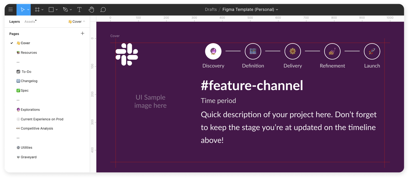
- clear navigation: At Slack, we have a standardized page organization for Figma files that makes it easy for people to find what they are looking for. A table of contents and an index can make navigating product documentation easy on others.
- concise information: Make all information easy to skim by using visually coherent formatting, like bullets and tables, and direct language.

Slack uses this template for all Figma files, to make it clear at a glance what state a project is in.
Meetings: one-on-ones, design critiques, stakeholder updates
Meetings can be tricky territory for communications, as are growth projects for design. You’re trying to push a business metric, but you also want to give a user what they want. The approach to both can be the same: align the different motivations present with
- research: Understand your audience to better frame your points. Your chances of getting a green light on a project proposal, for example, are much better when you can tailor it to a stakeholder’s priority metric.
- a hyper-specific goal: Asking for feedback is one thing, but asking for feedback on how successfully, say, a button animation conveys state change, will get you much better information. It’s natural for a conversation to stray, but always redirect back to the goal.
- experimentation: You’ll never know what’s “better” without trying. Maybe round-robin updates aren’t generating the right conversations. Instead, try another strategy, like setting a topic-based agenda.

My team followed a strict agenda to meet the goals set for our first remote design sprint.
Ongoing dialogues: DMs, emails, sprint tasks
We increasingly rely on back-and-forth digital communications like DMs and emails to maintain synchronous workplace communications. While convenient, they afford opportunities for lapses in communication to multiply. We can prevent miscommunication by treating these ongoing dialogues like designing an onboarding flow, a delicate task to introduce a user to your product. In both, you want to
- Be short and direct: Make your message easy to digest and respond to.
- Establish a shared vocabulary: Stay on the same wavelength as who you’re talking to by summarizing key decisions, mirroring phrases, and giving abstract concepts, like a design direction, catchy names or labels.
- Be pleasant: Quips and sarcasm can easily be misinterpreted over digital channels, while an overly formal communication style detracts from building workplace ease. It’s a more casual medium, but it’s still work, so be the professional You that you (or your manager) is proud of.

At Slack, we use emojis as bullet points to make content fun and easy to digest.
Practice makes perfect 🤞
This framework can feel like more work, but with a little elbow grease, these strategies can become automatic habits that gives your work that special ✨. The most important thing to remember is that workplace communication shouldn’t be a mechanical transaction. Great communication (dare I say like great design?) comes from the heart. It helps you build positive rapport and trust with your entire team.
Communication is a two-way street, so if you’re working on improving this skill, ask for regular feedback from your team and manager. Happy communicating!
———
Kristin Au is a Senior Product Designer at Slack and design mentor on ADPList.
