Slack is primarily designed for team communication in channels. Channels are where work happens: It’s where teams exchange ideas, get feedback, and share files. It’s a constant stream of conversation that keeps everyone on the same page.
But plenty of important information in Slack exists in formats other than messages. Think about how often you find yourself opening a doc or PDF or a spreadsheet to get your job done. The ability to quickly cross-reference information in files to resolve issues, answer a question or make a group decision is key to making communication in Slack.
And yet, the fact that most information in Slack is recorded chronologically makes it highly susceptible to the flow of channel conversations. The most recent message ends up feeling like the most important one, even if documents you shared a few hours (or days!) ago are still relevant. Searching for a file in Slack is possible, but success depends on being able to recall information about that file — where it was shared, or by whom. We wanted to build a better way for users to access information once it was uploaded to Slack.
Prototyping the path to a cohesive solution
As it often happens, while this problem seems simple from a user perspective, it would involve two entirely different teams at Slack to solve: the Information Architecture and the Files teams. Rather than staying focused within our distinct surface areas, our teams came together to make these improvements as a single team with a shared goal. The power that comes from solving challenges like this collectively, across silos, cannot be overstated. Not only does it prevent us from shipping our org chart, most importantly, it allows us to be more efficient in editing and testing product changes. Dependencies are made obvious and proposed solutions are more holistic from the start.
Of course, coming together as two teams can also be potentially disruptive. Individual teams will inevitably have unique ways of working, and focusing too much on abstract discussions can chip away at the group’s overall momentum. At Slack, we’ve developed a strategy to avoid overthinking and get directly into concrete ideas, a product principle we call “Prototype the Path.” It means that the best way of finding the best solution to a problem is by prototyping multiple approaches with the expectation that you’ll have to shift gears quickly as you work.
Our first prototype: a pinboard for Slack
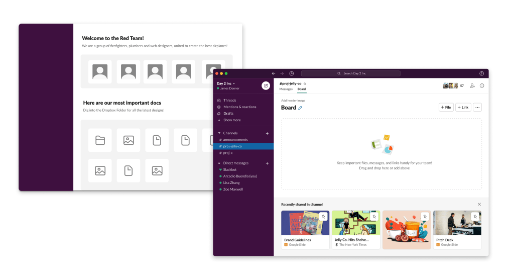
Our first idea was a digital version of a thing we used to have around the office: a pinboard. We already had pinned messages, so why couldn’t we create a new, stable space where teams could collect the most important content, including files, in a channel?
Boards, as we called them, could hold any kind of content in a clear and compact format: documents, links, images, videos, formatted blobs of text, even specific Slack members. Items could be re-arranged, added, and removed, and anyone in the channel could edit it. We even explored the concept of boards being allowed to open other boards. From a single board, you’d be able to branch into a deep, interconnected structure.

But as much as we loved this in theory, the team’s initial prototype introduced some unanticipated problems of its own:
- The cold-start problem: Getting started with the feature required too much effort. While a beautifully filled board looked great in our designs, the most common first-run experience was a somewhat sad, blank page. This felt like a daunting experience to add on top of channels. We tried a few techniques to make it easier to create a useful board. Looking to modern document editors, we considered adding template suggestions. We also briefly explored using clever guesses to automatically create useful Boards, based on frequently shared files and frequent contributors. But this ultimately felt forced, and moreover, it defeated the central purpose of the feature: custom, easy curation.
- The reference problem: Even once you did set up a useful Board, how would your team know to look at it, and where would they find it? We considered adding tabbed navigation within channels or opening the Slack right side pane, but these would be significant adds incommensurate with the basic user need to find a file. Other options included posting updates in channel and adding to the top bar, both of which would add unnecessary visual noise for users. Faced with these issues, it occurred to us: This feature might not need to be a full-page solution at all.
An elegant, basic solution: The Bookmark Bar
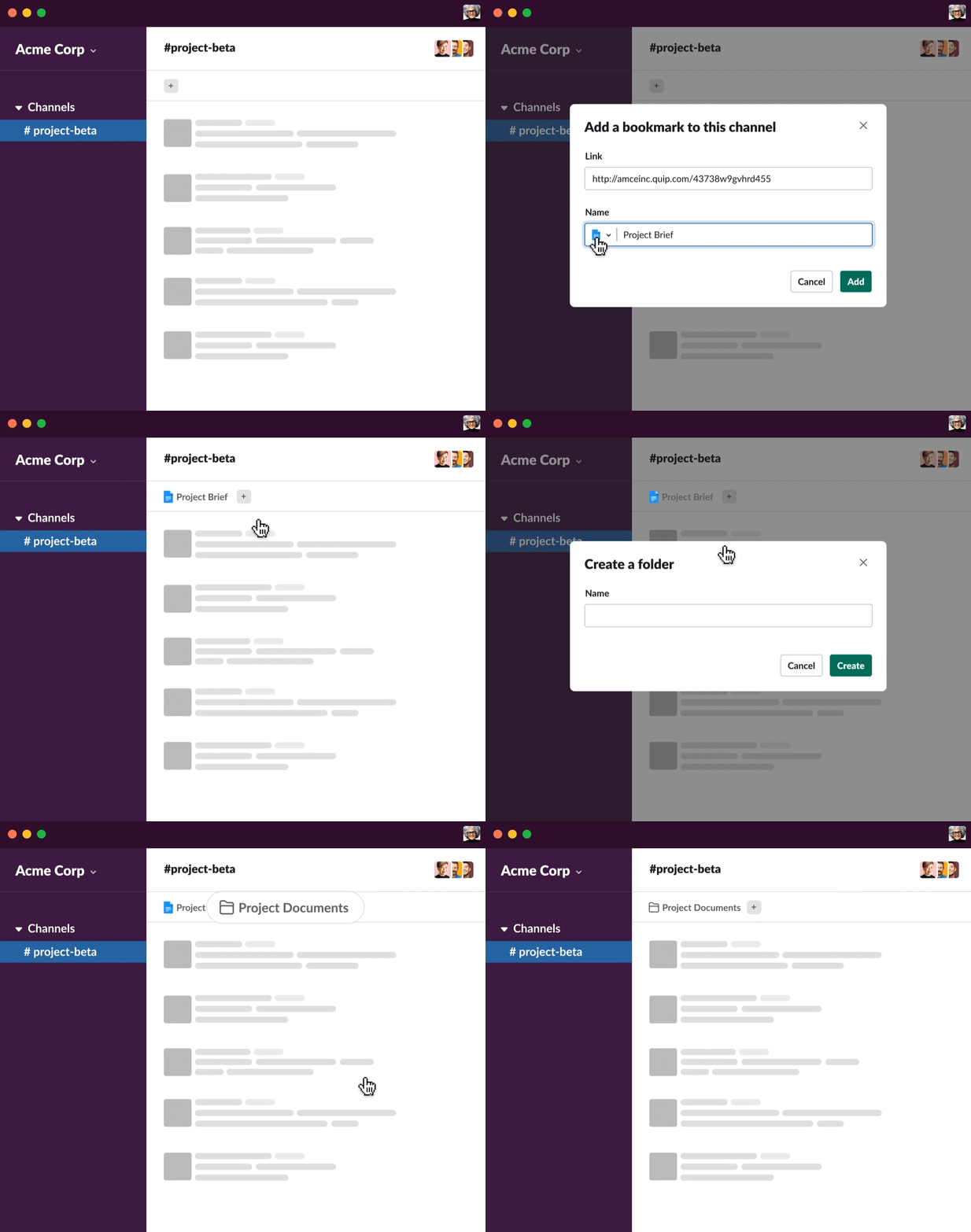
To avoid a complex new page that would ask the user to learn new UI behavior, we decided to approach the problem with an emphasis on simplicity. What could we create with just a set of links? Perhaps, that was sufficient in itself.
For links and files, we zeroed in the core of the problem: Users want to quickly access a file uploaded to a channel regardless of when it was shared. Our solution: the Bookmark Bar. In addition to adding very little friction to a user’s existing use of Slack, the Bookmark Bar was a better solution than pinboards for a number of reasons:
- It uses the widely understood concept of bookmarking, an action users already understand.
- It requires a lightweight interaction that easily blends with the existing Slack experience.
- It allows the organizational efforts of even one person to benefit the entire channel.

Simple solutions, not simplistic ones
The Bookmark Bar has consistently grown in usage since we rolled it out, which suggests that it’s become a valuable addition to how users get their work done in Slack. Working on this feature was a reminder that bigger is not always better — that knowledge workers often prefer solutions that are better suited to their workflow, even if those solutions are lightweight. Simple is not simplistic. When adding new capabilities to our product, we should always consider solutions that add great value to users, without adding cognitive cost.
—
Carla Gonzales is a Principal Product Designer at Slack on the Foundations Pillar, focusing on files and interoperability.
Zack Sultan is a Product Design Architect at Slack on the Foundations Pillar, focusing on Slack’s IA on desktop.
Special thanks to Matt Hodgins, the forefather of the Bookmarks Bar.

