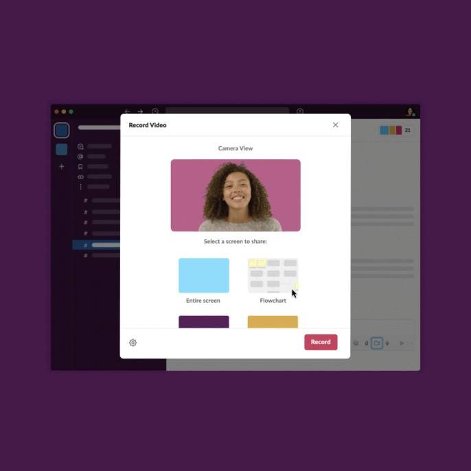
We recently announced the rollout of audio and video clips in Slack, which allow anyone on Slack’s paid plans to send audio, video, and screen share messages. With clips, you can quickly capture an idea, celebrate team wins, or present your work in a more personal way. Clips are transcribed, captioned, and searchable, so they’re accessible and available to everyone on your team. At Slack, they’ve already transformed how we work together as a distributed team and align as an organization. You can learn more about ways to use clips with your team here.
But—as is often the case when undertaking the design of a new product feature—what’s being rolled out now is a very long way from where we started.
The (very big) problem
Last year, as we, like many, adjusted to the reality of working from home, we began to recognize all the things we had taken for granted about office culture. Morning coffee and small talk in the kitchen helped our teams bond and stay connected. The natural cues of body language, tone, and expression helped people align in meetings. Whiteboarding sessions allowed us to bounce ideas and collaborate on complex topics. Inter-office travel gave distributed teams a chance to meet in person, establish new relationships, and celebrate milestones.
Next thing we knew, we were several months into the absence of these things, with no clear idea of when we might get them back. We were coping, like everyone, reaching for new tools to help us in the interim. We were also keenly aware that Slack had an incredible opportunity to make those tools, to help the millions of people already using our product to meet the same challenges. Slack’s mission has always been to make people’s working lives simpler, more pleasant, and more productive. If there was ever a time to double-down on that promise, this was it.
We had a handful of questions to start. How could we, and by extension our customers…
- spend less time on synchronous video calls?
- share ideas and collaborate with teams distributed across time zones?
- recreate the serendipity of in-office conversations?
- make sure that everyone on the team could access conversations?
- see, hear, and feel connected to one another?
Some of these questions inspired Slack’s new Huddles feature, which offers lightweight audio-first discussions right in channels and DMs. You can learn about how to solve problems aloud with Huddles here. Others led us down a different path.
Beginning with Stories
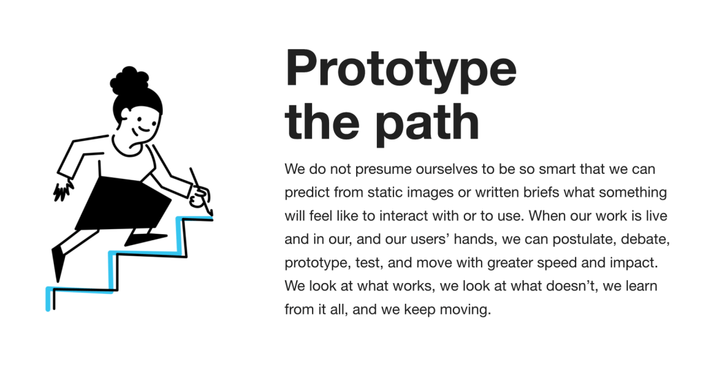
At Slack, we avoid fancy vision decks and poetic strategy docs in favor of a single principle: “Prototype the path.” We don’t presume to know how to improve work for millions of unique people. Instead, we start by shipping rough, early code prototypes to customers to get feedback, and then refining the product gradually over time.
In late 2020, when we were working on solving these issues, several large tech and social platforms had recently rolled out “Story”-like features — a way to post short, temporary video updates, similar to those pioneered by Snapchat and Instagram. The response from users was mixed at best, drawing both biting satire and ambivalent shrugs. Still, it’s easy to see why the format was so heavily copied: a billion people already know how it works.
For us, time was of the essence, and we didn’t want to waste it deciding where to begin, or arguing about how a new product would work. By starting with the familiar “Stories” idea, many constraints were already defined for us. It was fun, even, to geek out on design craft, coming up with ways that Slack could take a well-established idea and make it really shine for our users. Besides, wouldn’t it be nice to see each other in Slack? Could we replace a lot of typed messages with something more human? Could we skip the synchronous calls and share videos asynchronously?
Within a few weeks, we shipped the new feature: the ability to share short, ephemeral videos, pinned to the top of a channel.

In short: we had fun! It felt lovely to see people’s faces and hear their voices. Some highlights of these early prototypes included Sales folks sharing updates and wins with each other, and social channels adopting them to share videos of their dogs and kids:

Felt cute, might delete later
Still, the feature wasn’t quite self-explanatory in a work context. It was hard to say what channels it would be appropriate for; originally, we thought people might use it to replace standups or status–update meetings, but for many teams, text—with accompanying links and files—was still a more natural fit than video for that use case.
The ephemeral, disappearing nature of Stories also meant they didn’t end up in the history of a channel, so they were easy to miss—which posed a significantly bigger issue for work than for social. It didn’t seem worth the work of creating these videos if they weren’t going to stick around; this made people hesitant to use them for announcements or important information. We also found that people felt a lot more pressure to polish their Stories when they were for a work context: “My work from home setup is too messy!” 😫, “I say Um a lot.” 🙄, “Do I need to put on makeup for this?” 🤔
In the end, we decided that the mechanics of Stories, while appealing in social contexts, weren’t fundamentally suited for workplace communication. Still, by starting with what people know, we learned a lot — and were able to evolve it into something more useful.
Refining utility & accessibility
From our first experiment with Stories, we iterated gradually. We added videos to the channel archive, added an audio-only option, and changed the entry points and notifications for these new types of messages. We released new revisions internally on an almost-daily basis, listening to feedback and tracking how different parts of the company used the feature.
We soon realized that, for these new message types to work, they had to be as useful as a regular Slack message. Much of our attention had been focused on the “capture” part of the experience—how to record and attach the new media types in a way that felt lightweight and straightforward. But equally important was the “playback” experience: the feature had to meet people’s existing expectations of accessibility, searchability, and overall ergonomics within the Slack platform.
First, we added closed captions and transcripts, allowing people to read along with a video or skim the transcript to decide if they wanted to watch or listen. We indexed these transcripts to make audio and video content searchable alongside other Slack messages. We added a wide range of playback speed options for those who wanted to listen to the content slower or faster. If you prefer to listen to your colleagues with chipmunk voices, 2x playback speed is there for you!

As with so many accessibility investments, these changes were popular. They allowed people to engage with video and audio on their own terms, with varied options for consumption and reference that enhanced the overall usefulness of the feature.
Second, we iterated extensively on how video is displayed. We settled on a desktop inline player for quick listening and watching (with an optional transcript popover), and an expanded modal view for large videos with thread context. In the modal, the transcript can be viewed side-by-side with video and screen share messages. We also made the experience inclusive by letting people respond however they felt most comfortable: video, audio, and as always, text.
We also leaned further into screenshare messages as a primary use case. In the wild, we noticed our colleagues across teams were opting to record videos with screenshares as an alternative to calling a meeting or writing messages in text. People in a variety of roles were using screenshare messages to present slide decks, demo new engineering builds, talk through design options, and make How To tutorials.

Learning from our customers
As we refined the feature, we felt we had something useful, but we wanted to make sure our customers thought so, too. Using Slack Connect, we invited some of them to try it out. This helped us find pain points and tweak small issues (not to mention get feedback on contentious design choices like the 3-minute limit on videos, which we introduced to encourage brevity and keep team productivity up). We also got to learn how and where these teams were finding new value in the feature, in places we might not have seen internally:
“As some of our project teams span 22 hours of timezones, we have used them to communicate asynchronously, e.g. instructing teammates for when they are awake and then reporting on progress for when the project manager is back online.” – Nicolas Moës, The Future Society
These customers’ feedback also showed us that, as we progressed on video and screenshare messages, we had neglected audio messages. At the time, you could technically create an audio message by recording a video message with your camera off. It worked, but it wasn’t intuitive and the playback felt clunky; more importantly, it didn’t match the expectations customers had for audio messages based on how they used them on other platforms. In this, we were abandoning one of our core product principles: don’t reinvent the wheel.
So we went back to it. Our research indicated that people who preferred audio messages over video and text were primarily using them on the go — speed, in both recording and sending, was a major factor in the experience. And demand already existed: Some of our most beloved international customers who had been asking for audio messaging capabilities in Slack for a while, were already using other communication tools to send them.
We decided this feature needed a clean slate: we separated out a dedicated entry–point for audio, designed a mobile-first capture experience, and elevated audio messages as a new primary type of message in Slack. We also baked in features like transcripts and playback speed to make the experience more powerful.
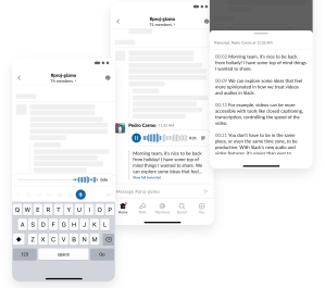
As ever, hearing directly from our customers as they used our prototypes ensured that we were solving real problems for the real people who use Slack.
A digital-first way of working
Through the process of developing clips in Slack, we learned a great deal about what makes our own teams tick in this new digital-first way of working, and we hope that shows in the product itself. As Slack has become our customers’ virtual HQ, we designed these new features to give people the flexibility to communicate in whatever way works for them. Video gives people the ability to be creative and expressive when sharing their work. Folks on the go can record a quick audio clip rather than typing out a long message. Searchable transcripts and captions provide utility for all sorts of people, from those with hearing impairments to those working in a coffee shop—even those who just need to skim a summary between meetings.
We have so much more to do. We’re prototyping new ways to use audio and video for flexible modes of collaboration, as a replacement for synchronous meetings, and as shareable containers for teamwork. We are excited to build on what we’ve started here — and we hope you like it. ❤️
Anna Niess is a Sr. Staff Product Designer leading design for strategic projects across Slack.
Pedro Carmo is a Sr. Product Designer leading mobile design for Slack’s Virtual HQ products, like Huddles and Clips.
Johnny Rodgers is a Principal Engineer who enjoys working with Product and Design to imagine the next generation of Slack.
At Slack, we value courtesy, craftsmanship, and good humor. If you do too, learn more about what we do, or better yet, join us!
Do you have design-related questions? Our team can help! Ask your question here or tweet at us with the hashtag #heyslackdesign.
