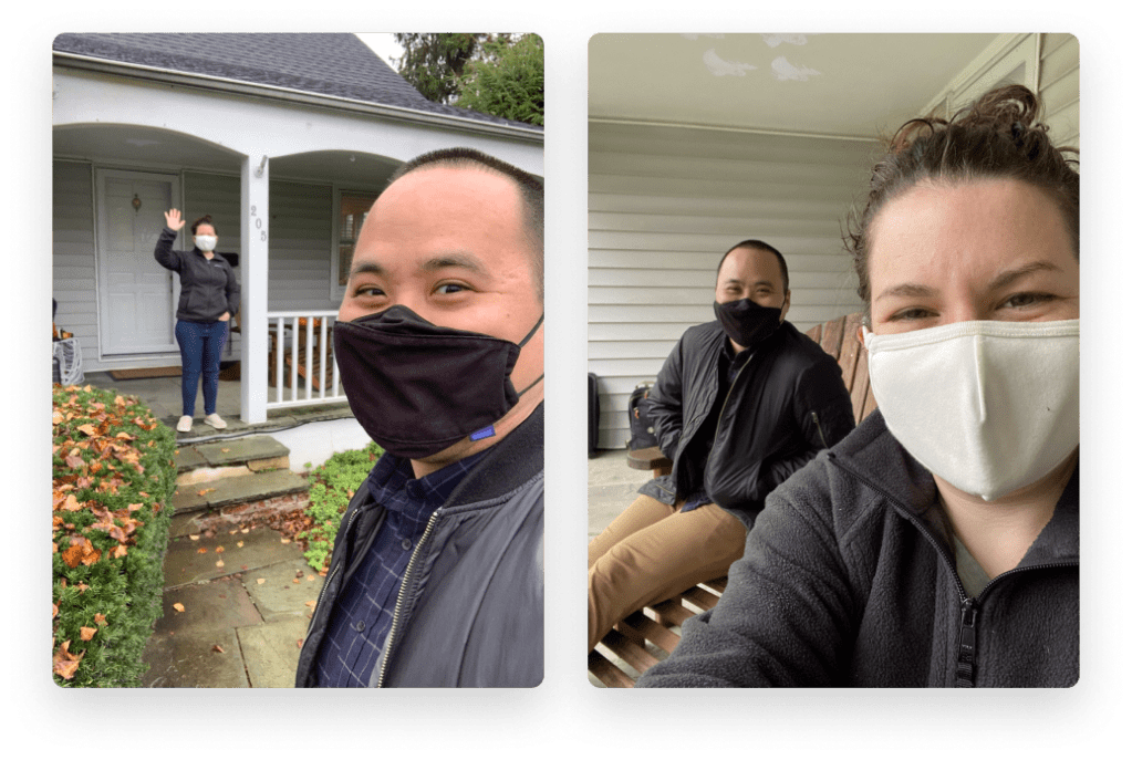
Product designer McKenna Lowry and content designer TJ Lee were on completely different pages when they were tasked with redesigning Slack’s search filters. To get it done, they had to remix how content and product design collaborated.
TJ: Changing jobs in the midst of a global pandemic wasn’t super high on my bucket list. But when the opportunity to work at Slack came along, I had to jump at it.
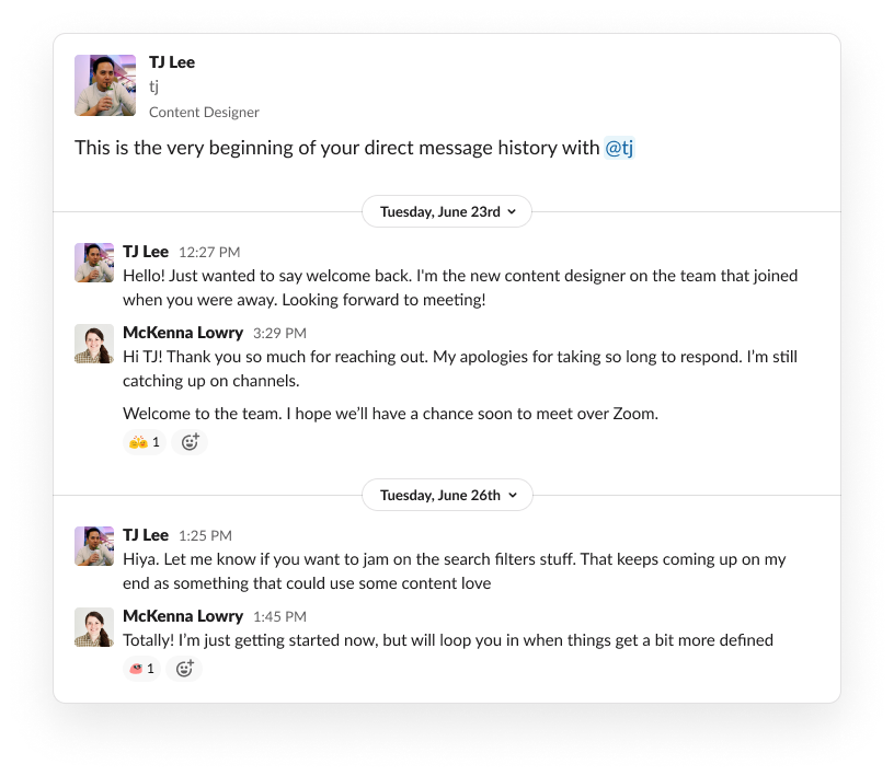
So back in May, I onboarded with Slack’s Search & Discovery team. On top of the steep learning curve of doing it all remotely, onboarding came with all of the usual challenges of working with new people. I knew how to do content design at a tech company, but I didn’t know how it would be done at Slack, I didn’t know how it would be done with this new design partner, and I certainly didn’t know how it would be done in the middle of a pandemic. Plus, here I was on the West Coast while the rest of the team was in NY. We were going to need a bigger boat to hold all the different apps and strategies that we would utilize.
McKenna: I was on maternity leave when TJ joined the team, but before that, I had been working on the Search & Discovery team at Slack for nearly two years. My time on the team had largely been spent making more of Slack searchable (👋 channels and people), explaining why certain results appear, and making Search a simpler experience.
TJ: When I first came aboard, people told me she was the design expert on Search.
McKenna: 😊 Not long after I returned, I was given an assignment and told that I’d get to work with our brand new content designer on it. That meant that within minutes of meeting TJ, we were embarking on our first project together: a full redesign of our Search filters.
The challenge
McKenna: I was pretty psyched about the project. Redesigning our Search filters to make them more accessible was something I had wanted to work on for some time. Seems simple enough, right? The user problem we were trying to solve was straightforward, at least:
“I know what kind of thing I’m looking for. Help me find it more quickly.”
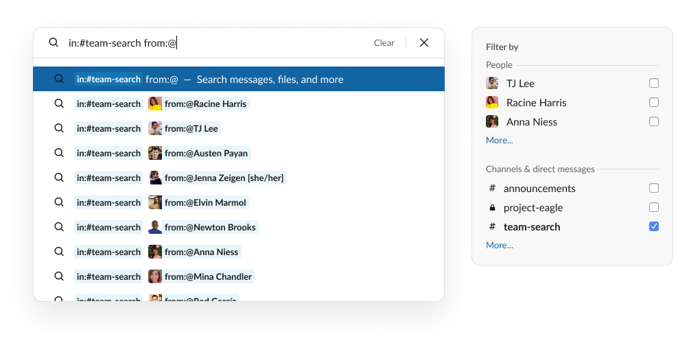
What was not straightforward were the available mechanisms users had to refine their search results. On one hand, a person could click to add different filters, to build a search query, or from the search page itself. On the other, a more experienced user could type in modifiers (for example, in:#channel-name and from:@jill) to run the same search query. One could also try a mix of these approaches. Multiple entry points, search modifiers that didn’t match advanced filters, open-ended user flows that needed to have symmetry forward and back — a complicated challenge!
TJ: And a perfect example of how in-product words can and should work in total harmony with the user interface (UI) patterns from the start.
McKenna: I had worked with content designers on our team before, but it always involved on more direct and clear asks, like “What should this button say?” or “Can you make this string sing?” This job was much bigger and much less defined. Plus, I was adjusting to being a working mother of two, during a pandemic, stuck in my basement at home. And TJ was new to the team. And he lived in a different timezone. I wasn’t sure how we’d make it work, but we had no other choice. We had to just jump in and figure it out on the fly.
How we did it
McKenna: After years of hearing from users about what didn’t work and what was missing entirely, I knew what needed to be done and just got to work. In the morning I’d churn out iterations of user flows and UI for review with my product and design teams before my onslaught of meetings in the afternoon. I left notes like little breadcrumbs for TJ to follow when he signed on later that day. And during the second half of the day, he would make progress on the copy.
TJ: Content designers rely on a standard tool kit of activities and deliverables. I added to the competitive audit McKenna had already started of search experiences in other products. I was combing through the relevant Figma files, adding my own copy suggestions throughout. I read all the internal documentation (Google, Dropbox Paper, and otherwise) I could get my hands on. And because nothing helps a glut of docs like creating another one, I even created my own docs to be commented on by teammates asynchronously.
At first, we would only meet once a week, to “get aligned.” (As though that could happen in 30 minutes!) But it wasn’t working. I wasn’t making significant headway. It was hard to feel plugged into the team, which made fully participating difficult; when I did, I felt like I was going at it alone. Just count the number of “I’s” in the above sentences! Finally, like the exasperated studio audience of an informercial, we both cried out, “There must be a better way!”
McKenna: He’s not kidding. There was a lot of head-banging.
TJ: And a lot of staring at an empty Paper document.
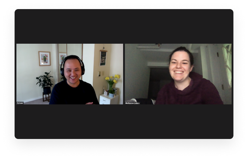
McKenna: We finally admitted that this was not a project that could be led completely by either discipline. Because modifiers and filters were so entwined, if you made a slight change in one place, it almost always had an effect elsewhere. The interactions and copy were too reliant on each other, and we needed to work in tandem on them. So we stopped everything we were doing and blocked out 3 entire hours to jam on it via Zoom.
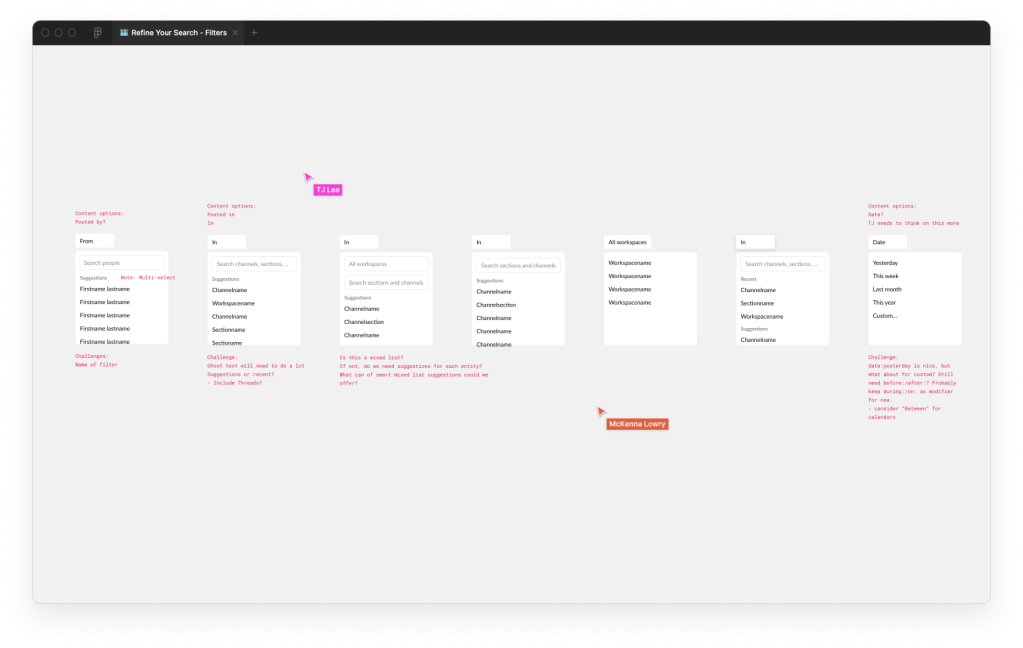
The time flew—in a good way. Working together in real time, we were able to weigh the pros and cons of each change through the lens of our own expertise. We deliberated and decided a course of action for each one together, accomplishing way more, in that first session alone, than we had previously. Even though there was still a lot to do once those three hours were up, now we had a road map for how we could finish it together.
The solution
TJ: Ultimately, we committed to a handful of specific strategies that helped us crack open this project.
1. Regular “jam sessions”
Since we couldn’t just “get into a room and whiteboard” while working remotely, first we scheduled a series of 2-4 hour Zoom calls, during which we would consult a common doc (Figma, Paper, etc.) and just hash it out. Sometimes that meant debating and sketching, sometimes that meant working in silence and checking in to ask questions or update each other. Doing this helped us come to decisions faster—we no longer had to throw comments over the fence for the other person to see hours later.
2. Regular feedback
Like at any good design org, there are plenty of critiques to go around at Slack. A content-only or design-specific crit is an invaluable source of feedback, even if the feedback is coming predominantly through a content design or product design lens. We shared our collaborative work often in our respective circles, and trusted each other to relay that feedback, even if it didn’t totally relate to the other’s specific duties.
At Slack, we also have a type of meeting called Big Studio, which gives designers an opportunity to share work with all of the design managers across the company. A lot of teams present work with an emphasis on either product design or content, but because content and product design were so intricately interconnected in this project, we gave equal prominence to both in our share out. As a result, our leaders were able to understand the project more comprehensively, and thus offer us meaningful, holistic, and nuanced feedback.
3. Shared leadership
Our most useful tactic—and perhaps more unusual—was that we took turns driving the project. Unlike other projects where either product design or content design took the lead from start to finish, this one required us to continually swap who was in the driver’s seat. Sometimes McKenna needed to build out a Figma prototype for a review, while I proofread and removed any outdated copy. Other times, I needed to revise a table to map out all the different terminology we were using while McKenna waited to match the interaction patterns to my updates. We didn’t just take turns, either; we communicated clearly and explicitly about who was in the driver’s seat at any given time, for how long, and to which destination.

An exciting, reproducible partnership model
TJ: So can everyone run to use the thing we built?
McKenna: Alas! While our part of the project is complete, the redesigned filters experience is still being built! Once it’s done, it will be tested—likely with some tweaks from both of us—before the fruits of our labor are truly ready for prime time.
TJ: Regardless of the final product, we’re still ready to use this same strategy for subsequent partnerships, whether they be across time zones or at a desk 6 feet away.
McKenna: In the meantime, I heard you were coming out East. Should we finally meet in person??
