
Slack’s accessibility team recently launched a series of changes to make navigating around Slack more reliable and efficient for keyboard-only and screen reader users. While our accessibility had significantly improved over the last few years, we were still hearing from blind and low-vision users that moving around the interface felt disorienting and noisy. One user likened it to trying to find a specific object in an open, busy gymnasium. Talk about frustrating.
To address this, we:
- Improved the hierarchy and labeling of core interface elements
- Made the toolbar navigation more consistent
- Improved focus handling
- Introduced a new keyboard navigation paradigm
It may seem like a project with so few visual changes would need little design input, but there was actually a lot to think through, and this ambitious and highly complex task took us nearly a year of work to complete. Here are three design principles that guided our approach to designing complex features for screen reader users.
Design with, not just for
A few months into the project, we created a Slack Connect channel with an enthusiastic feedback group of screen reader users who regularly used Slack. We asked them to try out the first draft of our changes, and tell us how they felt. And let me tell you, they did not hold back!
While our team has thousands of hours of experience designing for users who rely on assistive technologies, we aren’t daily screen reader users ourselves. There have been many times where my team had conviction on a set of changes, but, upon testing, learned from our feedback group that not everyone agreed on the things we’d proposed—and that’s totally okay. Our intent isn’t to design and user test—it’s to co-design with our users.
Over the years, we’d often heard the screen reader announcements in Slack were too verbose. It’s easy to be overzealous when it comes to labelling and think you’re being helpful by adding in extra announcements. We wanted to take a fresh pass at this, so, in our first draft, we stripped anything that might get announced multiple times. Even though we felt like this was the right thing, the feedback group let us know that we went overboard in some places, like the message input. That extra assurance that they were sending a message to the right place was important!
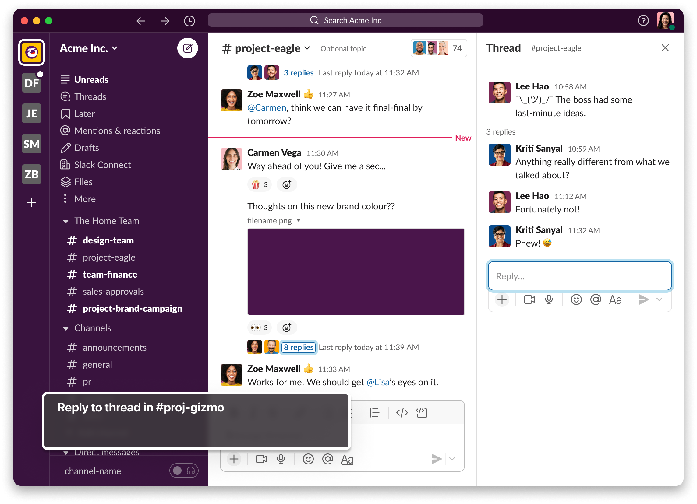
An image of Slack’s UI with keyboard focus on the composer inside of a thread, and a visual depiction of VoiceOver’s announcement “Reply to thread in #proj-gizmo”
Candid feedback from the people who are most impacted by our work is such a crucial part of the design process, we decided to create a more formal “Champions” program and expand our feedback group to include users of other types of assistive technology in the future.
—
Our intent isn’t to design and user test—it’s to co-design with our users.
—
Delight by not surprising
Established patterns are incredibly important, and are a core part of one of our greater design principles: “don’t make me think.” Screen reader users in particular rely on these established patterns to use software intuitively. At Slack, we often talk about surprising and delighting our users through design, but in this area of design, we learned delight can come from things that don’t surprise. Consistency and reliability are especially important for helping screen reader users stay oriented.
Slack’s UI is filled with horizontal rows of buttons. Screen reader users must tab and tab endlessly through them and, paired with the wordy announcements I mentioned earlier, this created a pretty slow and frustrating experience. To address this, my team implemented toolbars throughout Slack’s UI where appropriate, and updated the way they work so that it matches what users expect elsewhere (e.g. Home and End moves to the beginning and end of the toolbar). This was a major “delight” feature for our feedback group—traversing Slack’s UI was made much more efficient as a result.
In another proposed update, we tried to get clever about where we placed a user’s focus when they opened a thread. If there was an unread message, we’d drop them into that first message in the thread. If there were no unread messages, we’d move focus to the message input. We believed this would increase efficiency for screen-reader users. Our feedback group reacted strongly to this. We’d unintentionally deteriorated the reliability of knowing exactly where you would be when you open a thread, and, as a result, we broke the way-finding our users relied on in Slack. Thanks to our group, we reverted that change.
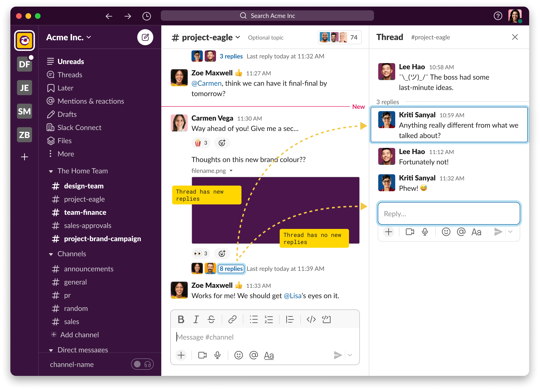
An image of Slack’s UI showing two potential places keyboard focus may land when opening a thread.
Break the rules thoughtfully
Established patterns, consistency, and reliability are all core tenants of designing an intuitive experience for screen reader users, but sometimes you have to break the rules.
Within this space, there’s a concept called Tab Trapping. The idea is that you should never trap a user within any given area (or container of UI), and that they should be able to use tab to navigate freely at all times. For Slack, it doesn’t quite work in practice.
I liken it to an apartment where all the rooms have their doors open. If you’re unable to see, you may end up walking through the door from one room to another without realizing it. When you eventually realize you’re not where you thought you were, you’d probably try to find things that you recognize to help orient yourself. You might even feel more lost, because, well, what’s that couch doing here? I thought I was in my office! But what if every door was closed in your apartment? That would mean that if you wanted to go to another room, it’d have to be an intentional decision. You’d have to find the door, open it, and move through to the next room.
Introducing this “closed-door” idea to Slack through tab trapping was a controversial idea within our feedback group (and our team for that matter). We implemented a new way to navigate Slack via the F6 key (or Cmd+Ctrl+Left/Right), so users could move between regions of Slack (aka the rooms), and use Tab inside of the regions to move through the various elements. After listening to the feedback we received, we realized Slack’s interface has many regions in it and it’s hard to explore and stay oriented without a few good fences in place.
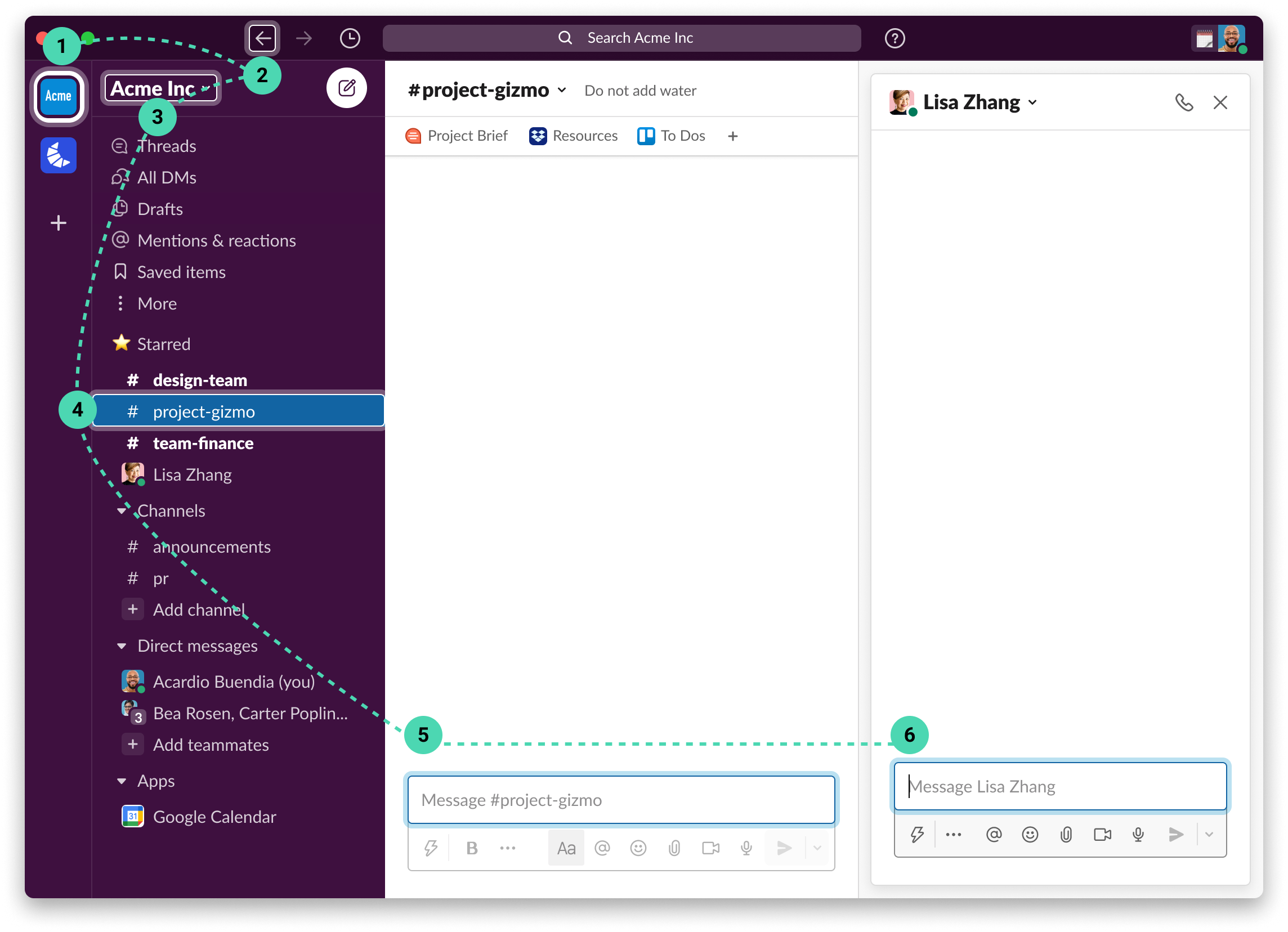
An image of Slacks UI depicting the section navigation order
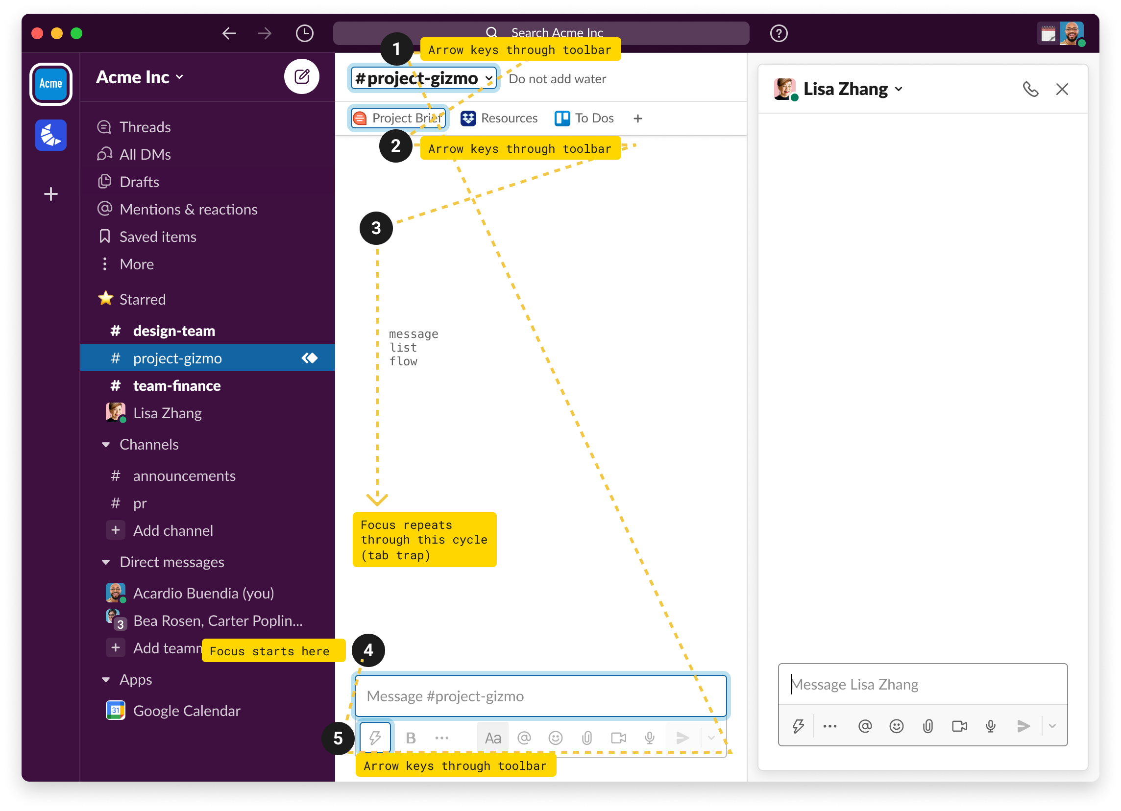
An image of Slacks UI depicting the navigation order within the primary view
While this article highlights three design principles I utilize to create inclusive design, there are many more my team and I learned along the way. I hope designers will feel emboldened to go further than simply designing and user testing, lean into designing with predictability and reliability at top of mind, and remember that intuition around design choices that don’t directly impact you is earned slowly. I hope these ideas help you go forth and create more accessible experiences.
—
Andrew Gosine is a Lead Product Designer at Slack who specializes in accessibility. In his free time, he enjoys climbing mountains and making pasta.