
Just like the world around us, Slack has grown and changed significantly over the last decade. What started out as a simple chat tool is now a multi-modal product that allows for more meaningful collaboration with features like voice clips, video clips, huddles, canvases, lists, Slack Connect, Sales Elevate, and so much more. But with our mobile app’s previous design, accommodating these features without overshadowing the essence of organization and collaboration felt like a tight squeeze.
We didn’t want Slack’s expanding capabilities that cater to diverse organizational needs to turn the app into a cluttered space for our users. It was time to rethink the mobile information architecture.
Tailoring Slack for small screens
From research, we know Slack Mobile is used to catch up, respond to messages or delegate incoming information. Data also shows users open Slack’s iOS & Android apps about fifteen to twenty times per day and spend roughly twenty to thirty seconds each time. But here’s something special about Slack: we don’t chase screen time. We’re on a mission to boost the number of things users do each session. We want people to accomplish more, faster.
Between learnings from research, evolving user needs, and an ever-growing product, we narrowed down 3 key challenges to solve for:
- Navigation: How do we simplify navigation in busy workspaces on small screen devices?
- Scalability: How do we craft an architecture that grows and remains intuitive?
- Recall: How do we assist users in returning to things they’ve interacted with or searching for specific information?
Navigation for small screens
Imagine a workspace buzzing with incoming information. Now think of diving back into recent conversations, DMs, or Canvases amidst all this activity. It can be daunting. Even as people who work at Slack, we felt this too. We decided to innovate and make three big changes:
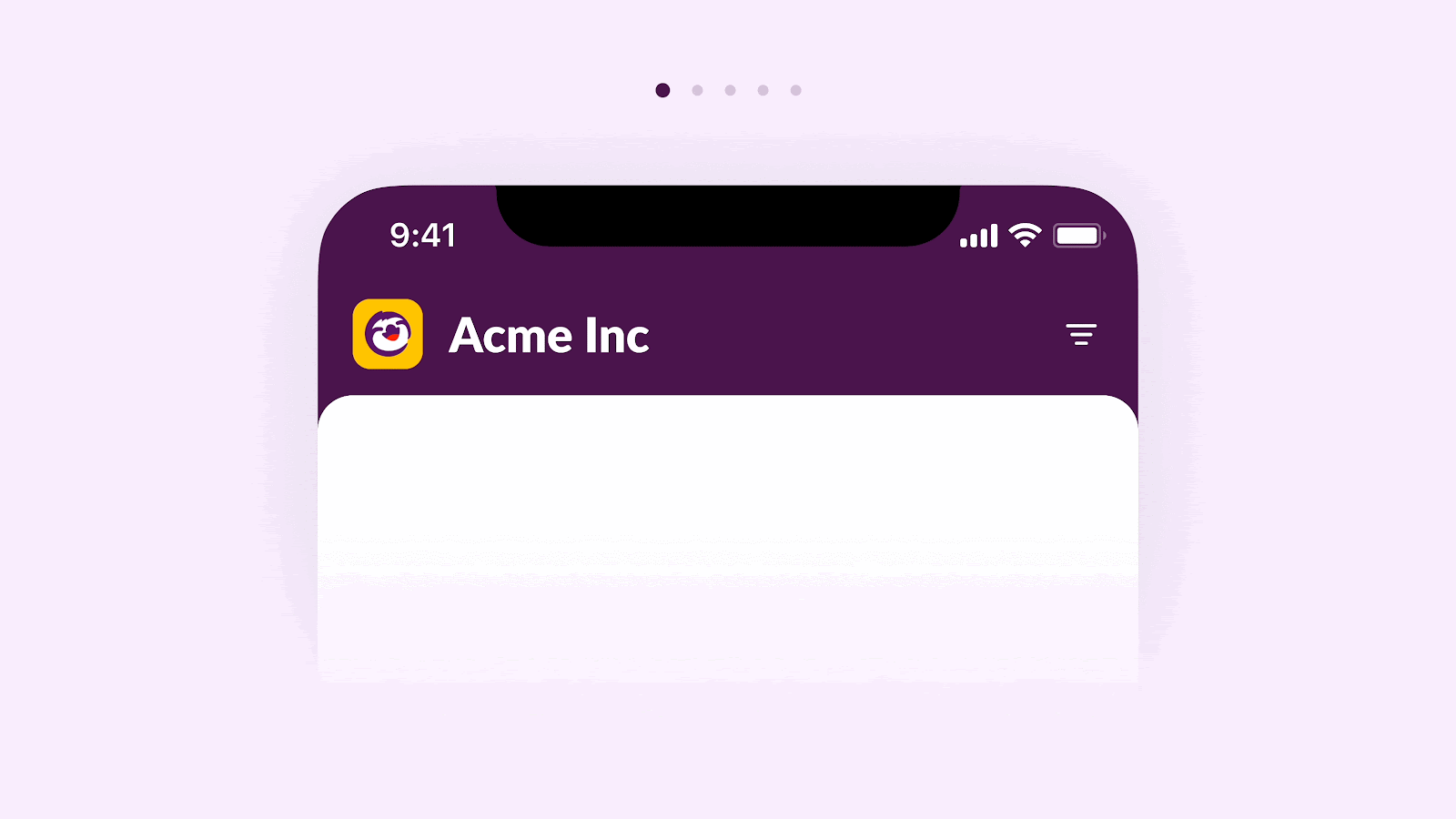
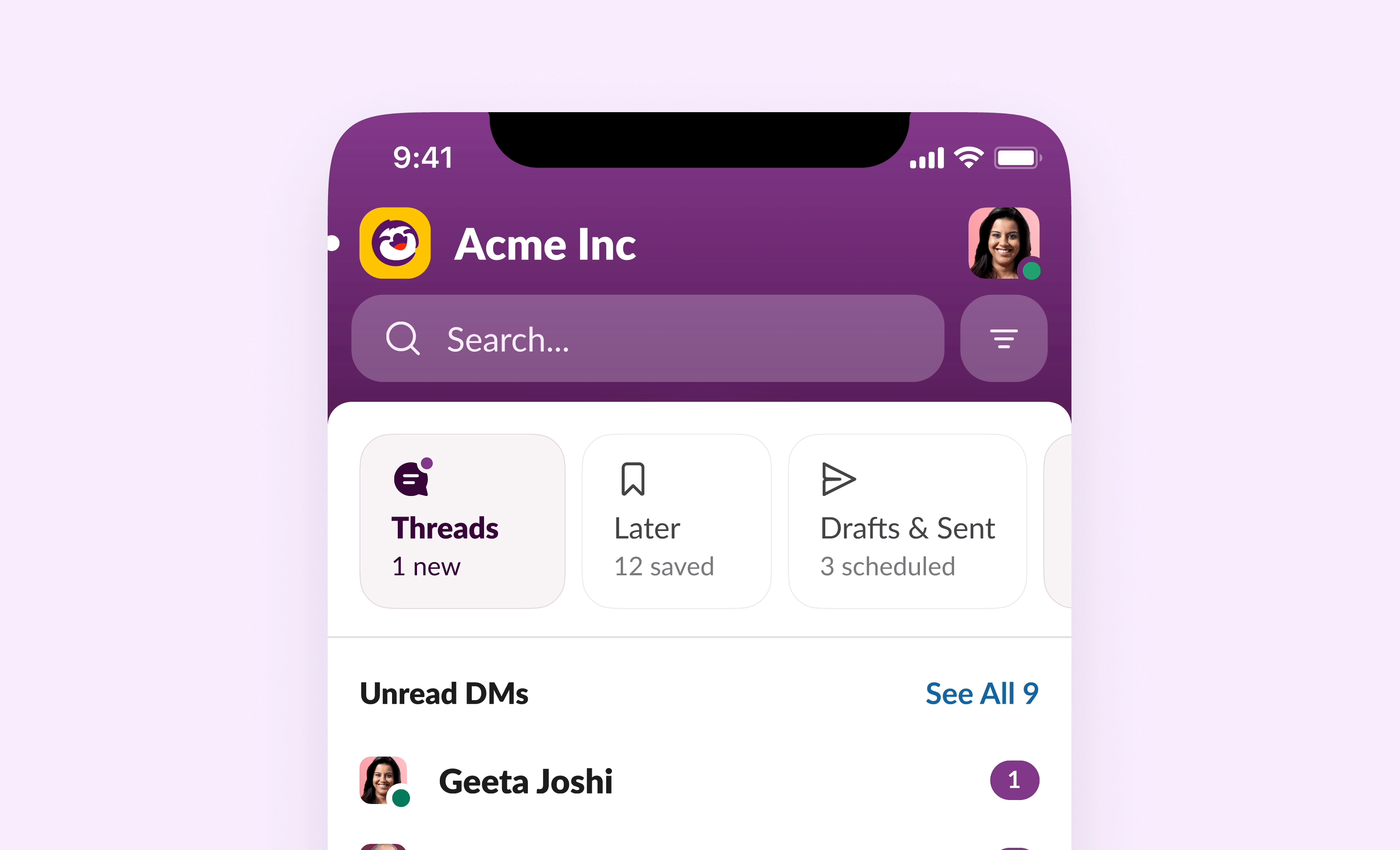
1. Header & Tab Bar Structure
Headers define the personality of the app, and the tab bars reflect the core user jobs to be accomplished. We recognized the first step in our journey needed to be refining this area. We drew and prototyped many iterations, some of which didn’t quite hit the mark.
 For instance, we explored single-lined simple headers, a browser-esqe model, an inverted visual model, and more.
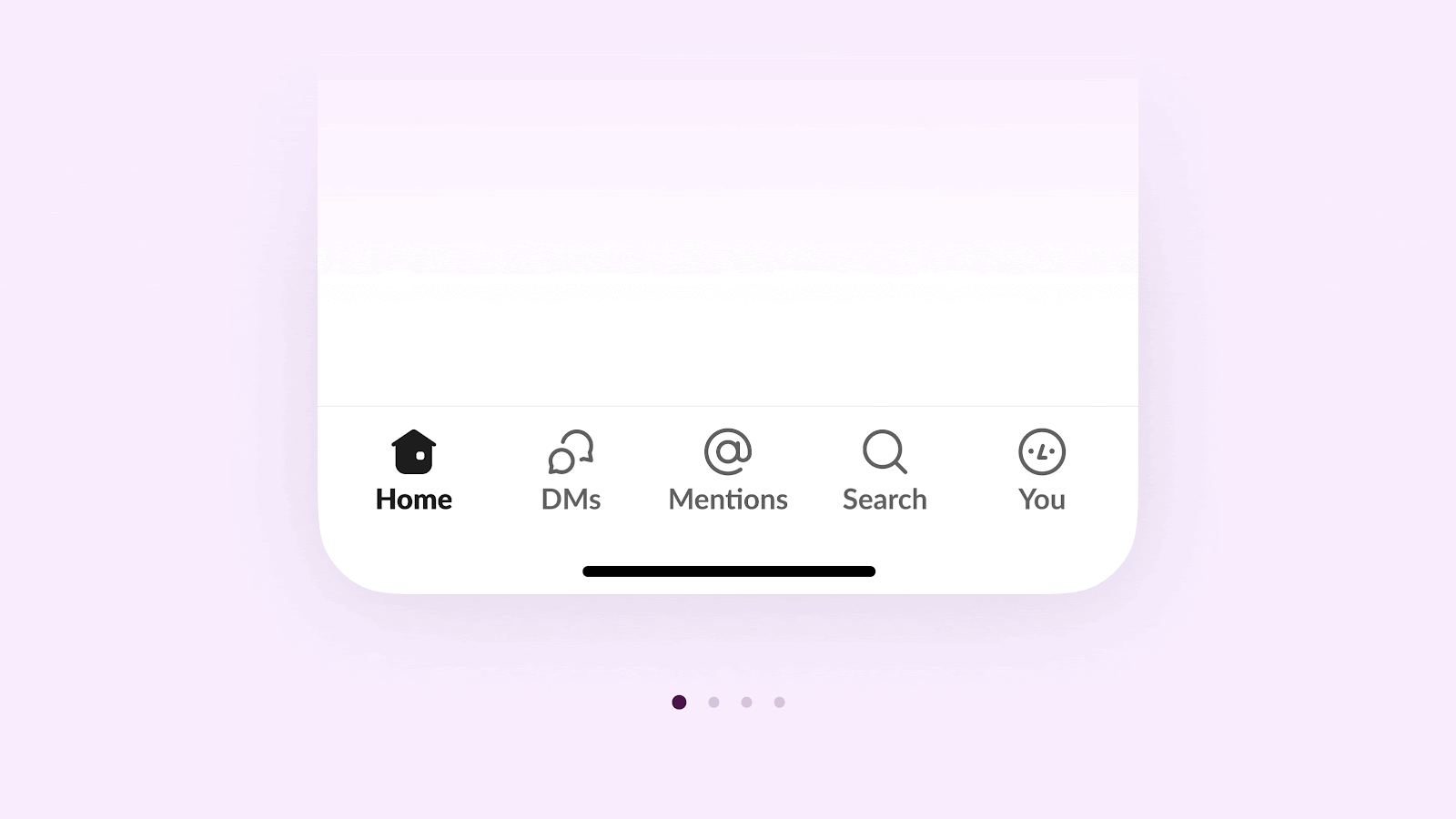
In our pursuit of simplicity, we even experimented with label-less tabs. But we soon realized it came at the expense of two of Slack’s non-negotiables: accessibility and comprehension. The end result was a transition from five tabs to a streamlined trio.
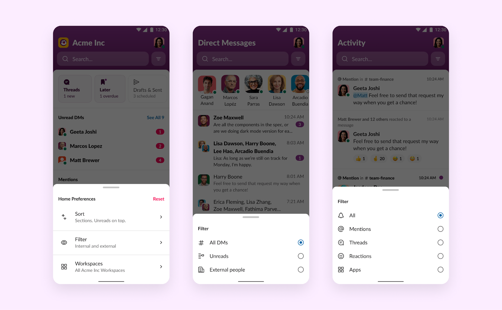
2. Powerful Filters
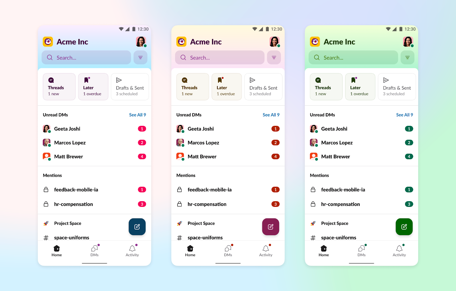
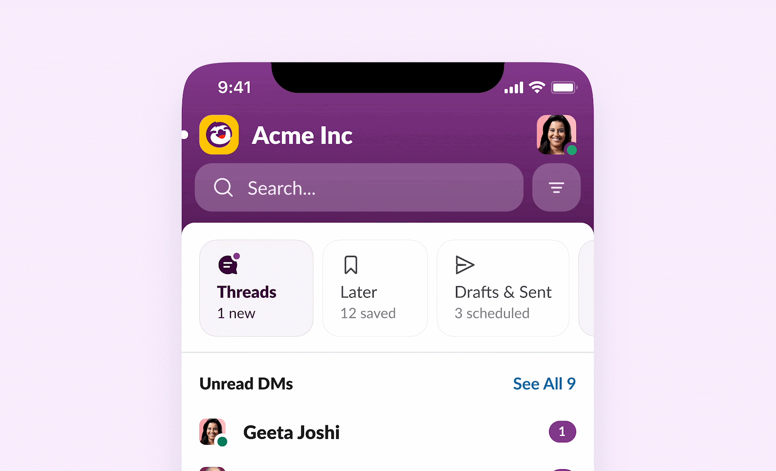
We introduced powerful filters in each core tab. They help users rearrange their channel list, narrow down workspaces in an enterprise grid, filter to all external connections, or even spotlight unread items on top.
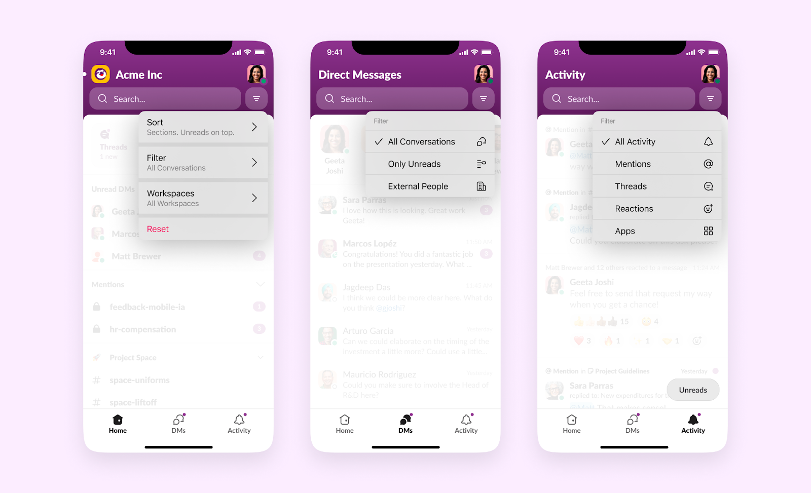
Given cross-platform patterns, we also implemented the same on Android with bottom sheets instead of overflow menus.
3. Ergonomic Gestures
Jumping back to your last chat, a specific channel, a file, or an automation is a breeze now. You can swipe down to get to your recent conversations, or swipe again for other types of content.
Adapting to Slack’s expanding universe
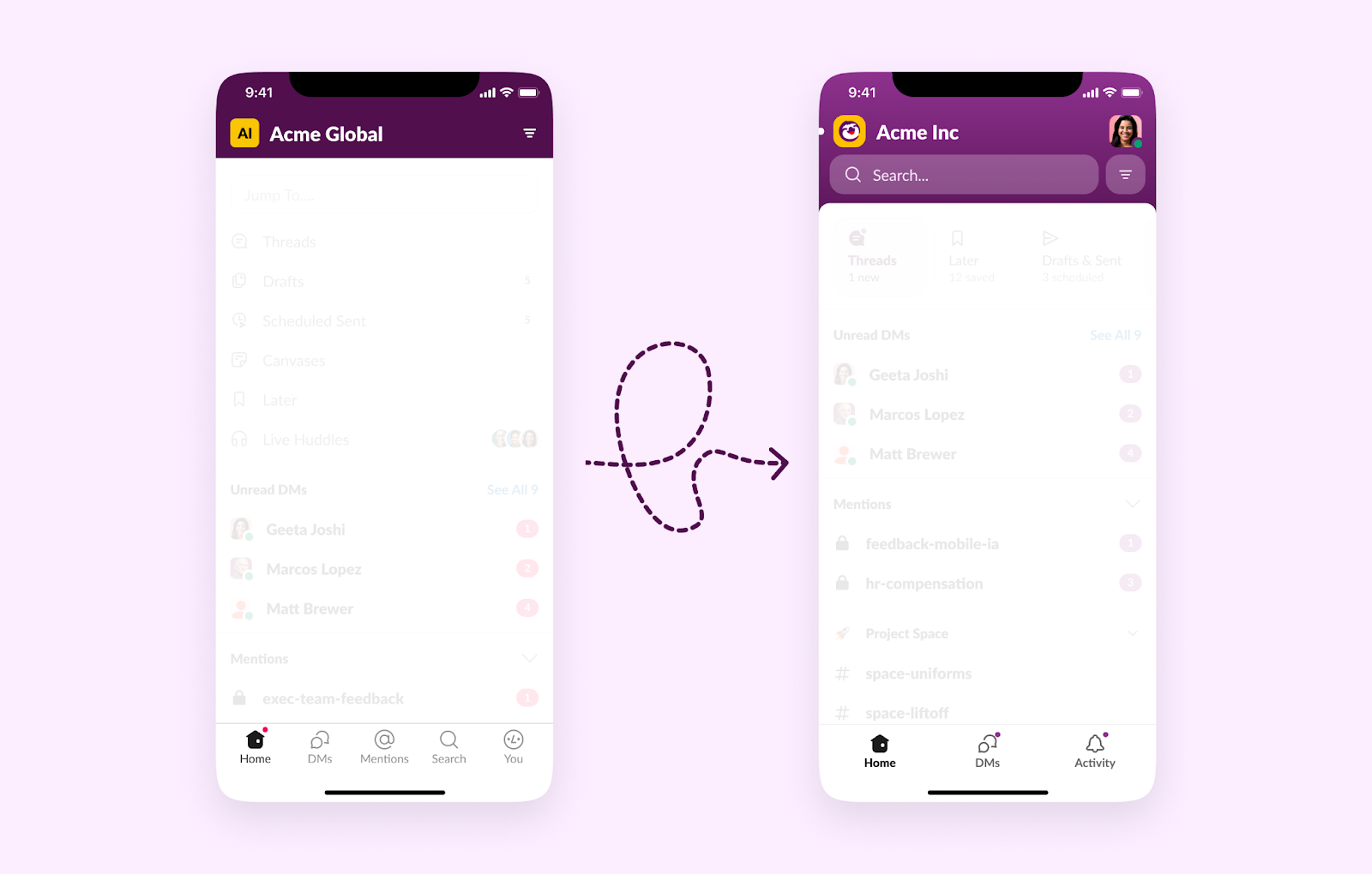
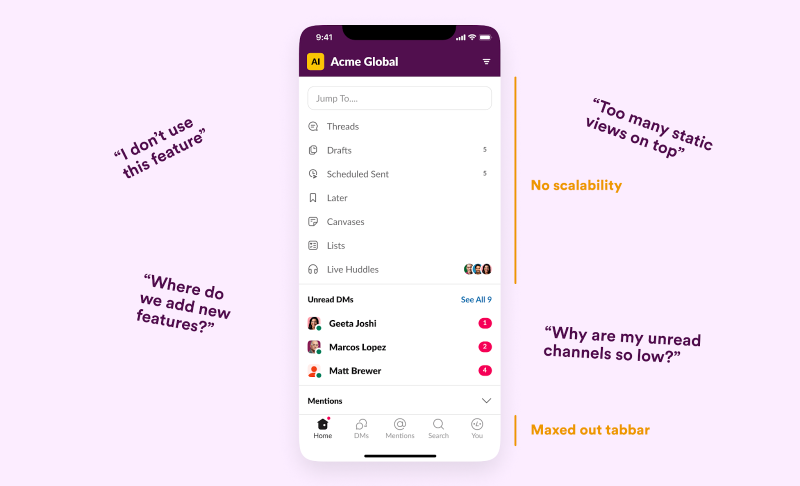
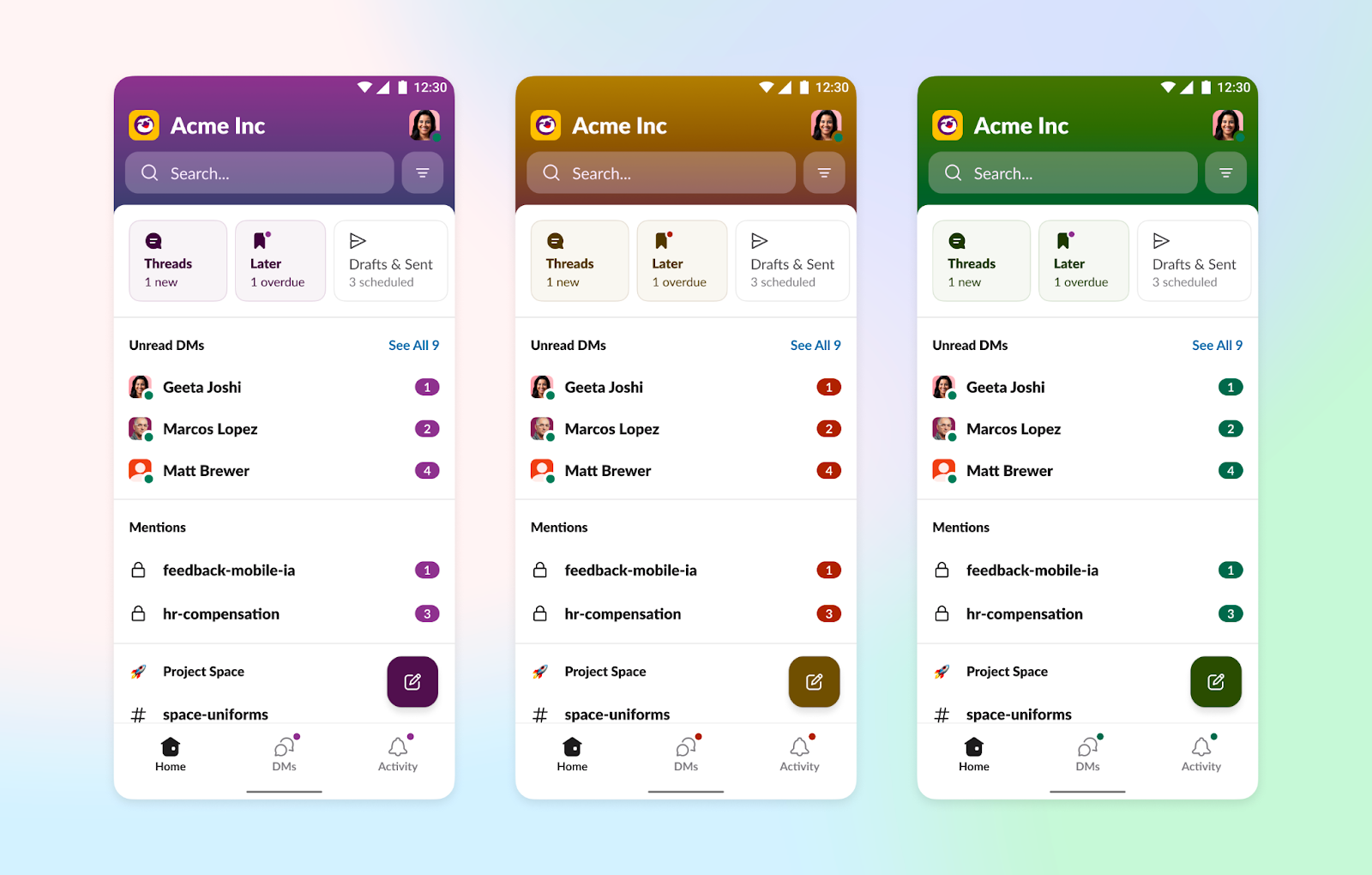
Picture this: You have a widely-used mobile app with five core tabs already packed into the bottom navigation bar. Now add six brand-new features, all equally important. That was Slack in October of 2022.
As we tackled this challenge, we played around with different ways to fit in spots for Later, Drafts & Sent, Unreads (coming soon), threads, and huddles, while also making room for specialized features like canvases, lists, automations, and Sales Elevate. The trick was juggling the essentials users love with the showcasing of new tools.
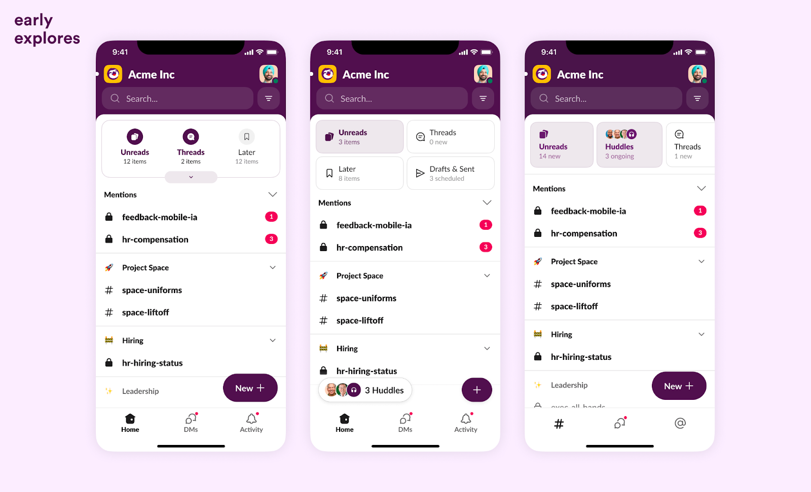
After much prototyping, we landed on a simple bar of tiles that optimized for unread conversations while giving quick access to these surfaces.

All other business needs were spread out on familiar surfaces. For example, canvases, lists and automations are now accessible through Search. Sales teams also get their own tab for when their organizations sign up for Sales Elevate.
Finding your way in Slack
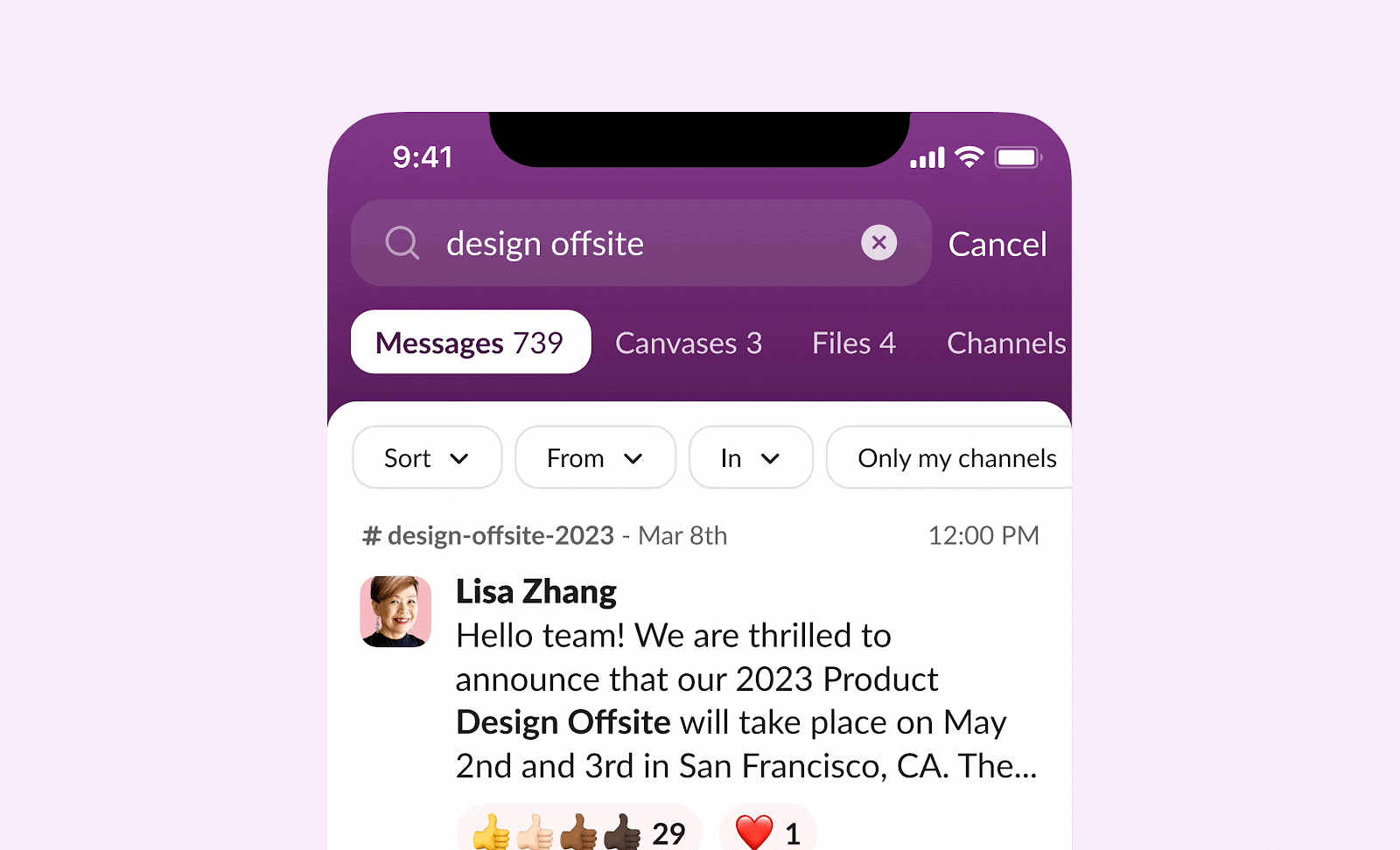
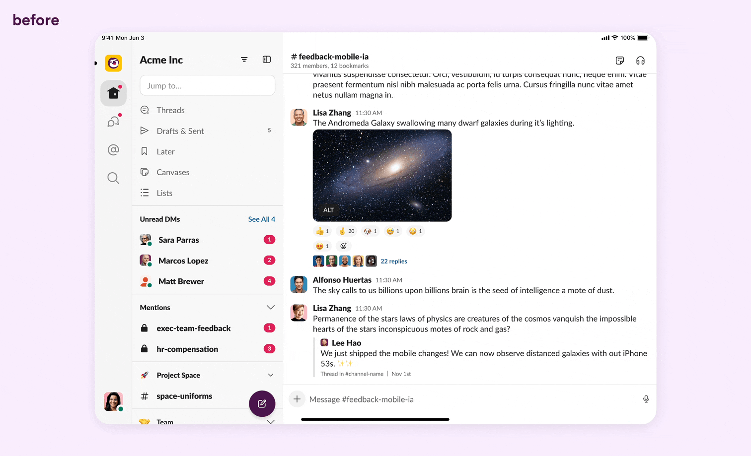
Remember the “Jump To” field in Home? That was our go-to spot for navigating to recent conversations or specific channels. But if you were on a mission to find specific messages or files, you’d have to go through the Search tab. This setup often led to confusion and redundancy, so we went back to the drawing board and redesigned the search experience from the ground up.
While navigating thousands of conversations in Slack, finding that one message or person can often feel like hunting for a needle in a haystack. To remedy this, we made two changes:
1. Supercharged Search
Start with a simple pull-down and voilà! You’re greeted with your recent chats. Swipe right and you’ll glide through recent files, channels, and folks you’ve chatted with, as well as new collaboration tools like canvases and lists.
We also paired these simple gestures with a rich set of filters. Our quick search scours your entire workspace and, with a sprinkle of filters, you can narrow things down by name, channels, threads, dates, or even advanced criteria like the ability to include workflow messages in your search.
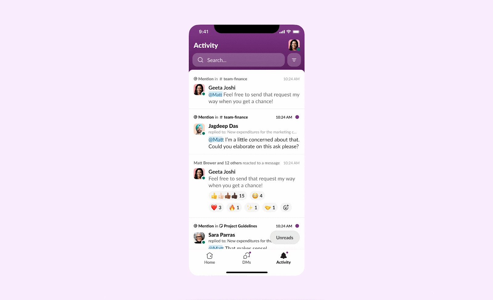
2. Comprehensive Activity
We gave the “Mentions & Reactions” page a rethink, too. It’s now a one-stop shop for all your high-priority notifications, whether it be threads, mentions, app alerts or invitations. This powerful feed minimizes pogo-sticking (the need to continually jump between multiple tabs) and sharpens focus on important activity.
The cherries on top
No redesign is complete without those final touches that make it shine. We went on a spree—cleaning every little corner, providing a wide variety of themes, updating each core surface, every icon, and every button to make sure they were crisp.
We added some fluid gestures. As you scroll up, you’ll see that Slack makes space for your conversations with some smooth animations in the header.
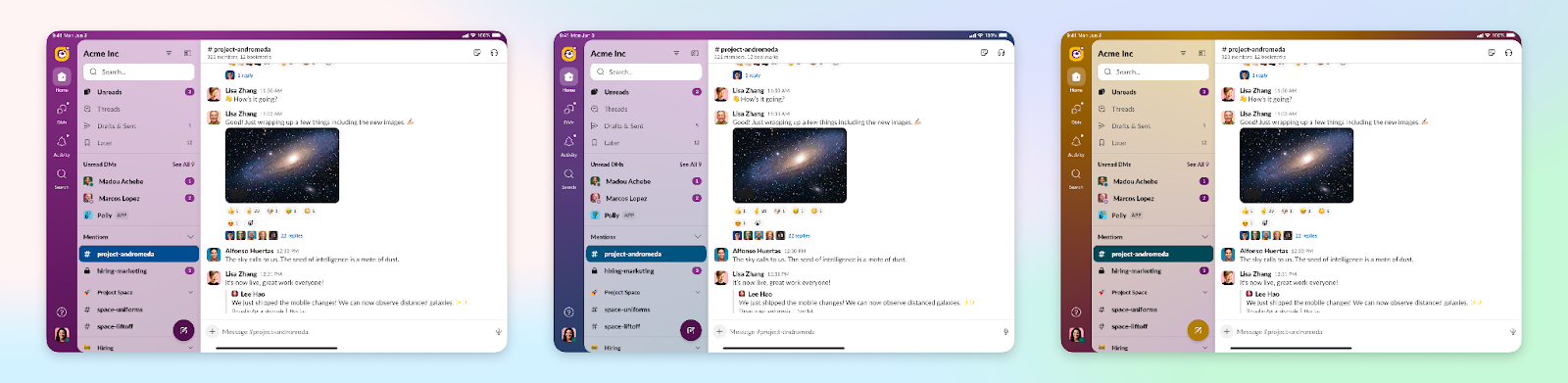
Lastly, one of the biggest pieces of feedback we received after our last iPad redesign in 2021 was the lack of theming per workspace. We’ve now rewritten our theming system to ensure it reflects well on the iPad, too. There’s hundreds of themes for you to choose from.
The power of teamwork
So there you have it. A revamped Slack, sprinkled with love, care, and a whole lot of attention to detail. I feel privileged to write on behalf of dozens of talented humans on the Slack team that made this happen. 🌟