


As we embarked on the largest evolution to Slack’s information architecture, us designers believed it was the perfect opportunity to evolve Slack’s iconic look and feel. While the undertaking would be no small feat, we were inspired to make Slack even more pleasant, more personal, and easier to understand. Make it more Slack-y.
We decided the best way to see how far we could push new ideas and directions would be to conduct a two-week design sprint. We gathered a small team of designers, animators, and design technologists to explore a number of ways we could elevate Slack. From this sprint came proposals for holistic updates to Slack’s visual language, new ways to customize the experience, and novel paradigms for information previews. With a clear focus on brainstorming and pushing new concepts, we explored a range of ideas that were fun, quirky, and practical.
New look, lots of feels
As designers, it’s easy to fall into thinking that our taste is the best taste (queue the chef-kiss emoji) or think we know what the best-looking version of something is. When you’re designing for a tool like Slack, however, this mindset can be a trap. That’s because Slack is a lot like a desk you sit at every day: deeply personal, even with the leftover dishes from lunch sitting on it. Which means what we as designers determine to be aesthetically pleasing may not align with other people’s tastes.
Since it debuted in 2013, the primary interface of Slack has not drastically changed. So much so that the layout itself became iconic. And while we knew Slack needed to modernize, we felt it was important to recognize how iconic it was and to push only where it felt appropriate.
Above all, Slack is a communication and productivity tool, and so whatever changes we make should never come at the cost of productivity. The original design handled displaying varied information in a structured and consistent manner very well and we were committed to keeping all of the information density intact.
Instead, we focused on the changes that would make Slack more approachable and less overwhelming. We added gradients and transparent surfaces to make the experience feel lighter and more playful. We softened the tone with more rounded buttons and avatars and less stark borders. We introduced elevation and depth to help delineate different parts of the UI. All of these changes add up to a more pleasant and focused experience without being too serious or SasSy.
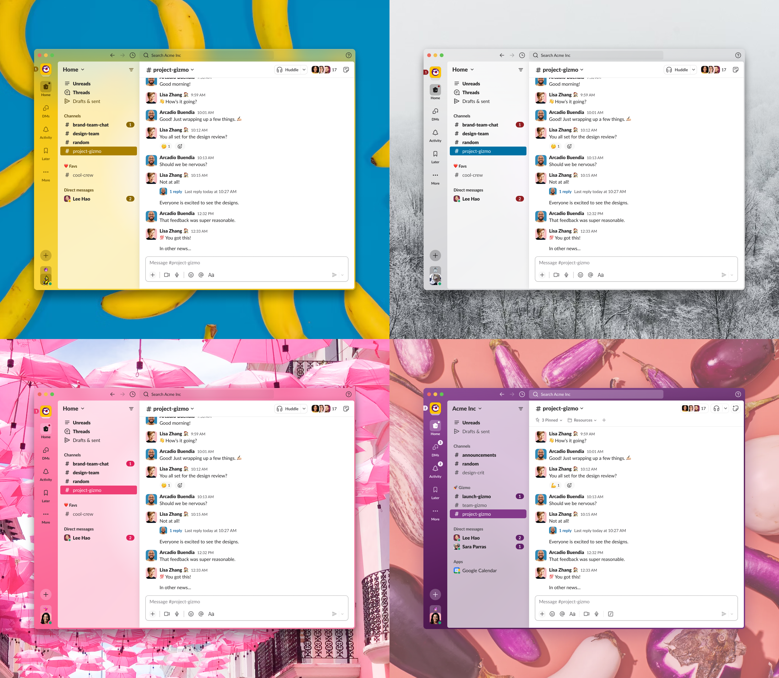
The new Slack design with four different themes applied. Top left features Banana, which showcases a yellow primary color. Top right feature Hoth, which uses a cold gray color. Bottom left is Barbra, which uses a bright pink color. Bottom right is Aubergine, featuring Slack’s classic purple color.
I theme, you theme, we all theme
When we set out to rethink what the new visual presentation of Slack should be, we decided to lean heavily on that desk metaphor. We enlisted the help of our fellow designers, asking them all to take a picture of their desk and post it to a thread. What became clear was people love their desk because it’s just that. If we wanted people to love Slack in the same way, it had to match their individual needs and tastes. That meant that user customization was critical to the experience.
Slack has always had a concept of theming within its DNA, a feature our most passionate users came to expect. But it wasn’t heavily utilized—less than 85% of users changed the default theming preset and even fewer created a fully custom theme. Our theory was that if we could simplify the controls for theming and establish smart controls for factors like color contrast—and therefore creating a more engaging and inviting experience—more users would utilize custom theming. This change would enable them to build a more personal connection to their workspace.
We simplified the theming controls by bringing nine inputs down to four. And instead of hex inputs with boundless options, we mapped the colors to a series of twenty predetermined color palettes. This meant the new colors could be mixed and matched, brightened or darkened in a predictable way. Doing this allowed us to predictably theme more aspects of the product across our desktop and mobile applications, ensuring a high bar of presentation quality.
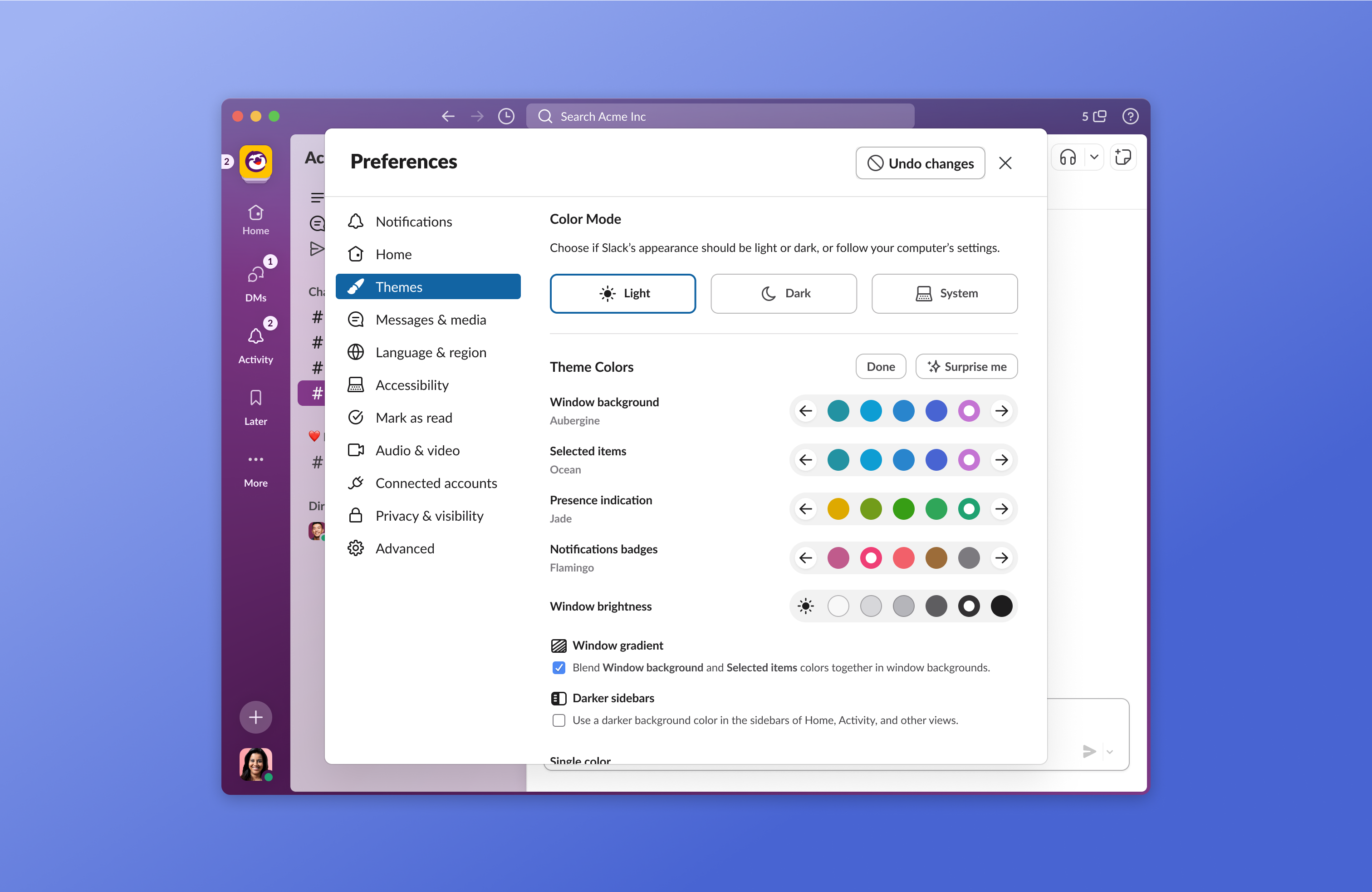
The preferences pane with the Theme tab selected. Users can choose between a predefined set of palettes and themes, or click the Surprise Me button for a completely random color combination
With the new controls in place, we explored how to let people play with their theme (but not have to think too deeply about it). The palette system worked in a way that any combination of colors would work, so we created the Surprise Me button, which picks a set of random colors and brightness automatically.
Some heads up while your head’s down
With this new iteration of Slack’s information architecture, another level of hierarchy was introduced. In an effort to reduce pogo-sticking (what we call it when users jump back and forth between multiple places), we wanted to give people the ability to quickly glance at incoming activity without requiring them to navigate away from what they’re currently doing.
A direct message Bloop. The sender’s avatar temporarily replaces the Direct Messages icon as a real-time notification of the new message.
We wanted to allow people to know about incoming activity like thread responses, reactions, and DMs beyond a badge count. We came up with a convention to create visual indication of the type of activity coming in and where in their navigation that activity would be visible. With added signals about real-time events, we aim to give people the ability to decide if it’s the right time to possibly switch context. We call these little visual signals over the top-level navigation Bloops.
The Activity tab Peek. Hovering over the tab icon shows a preview of the tab’s content.
In addition to Bloops, we also wanted to give people the ability to have a bit more visibility on those incoming notifications without navigating away. When users hover over our tabs, they’re able to see a preview of that specific tab’s contents. So if they just received a DM from someone, they can see a preview of that message by hovering over the DMs tab and not necessarily navigating away. They can also choose to navigate directly to a specific message from that preview. We lovingly call this interaction addition Peeks.
Onward and ever upward
Through design-led innovation, we’ve laid an incredible new foundation for ourselves and provided a path forward for how we will evolve the Slack experience for years to come. While developing this more lively, engaging, and delightful version of Slack, the best part of the new systems and conventions we’ve introduced is that they will scale with Slack as it continues to serve more and more types of workers and improve their productivity. After all, the closer we get to everyone’s Slack feeling as unique and organized as their desk, the better.
And while these features came about from leveraging a design sprint, they weren’t the only ones. We’ve built a considerable backlog of other investments we can make in the future to continue improving upon the Slack experience, so you’ll see more changes down the pipeline.