


Does this look familiar?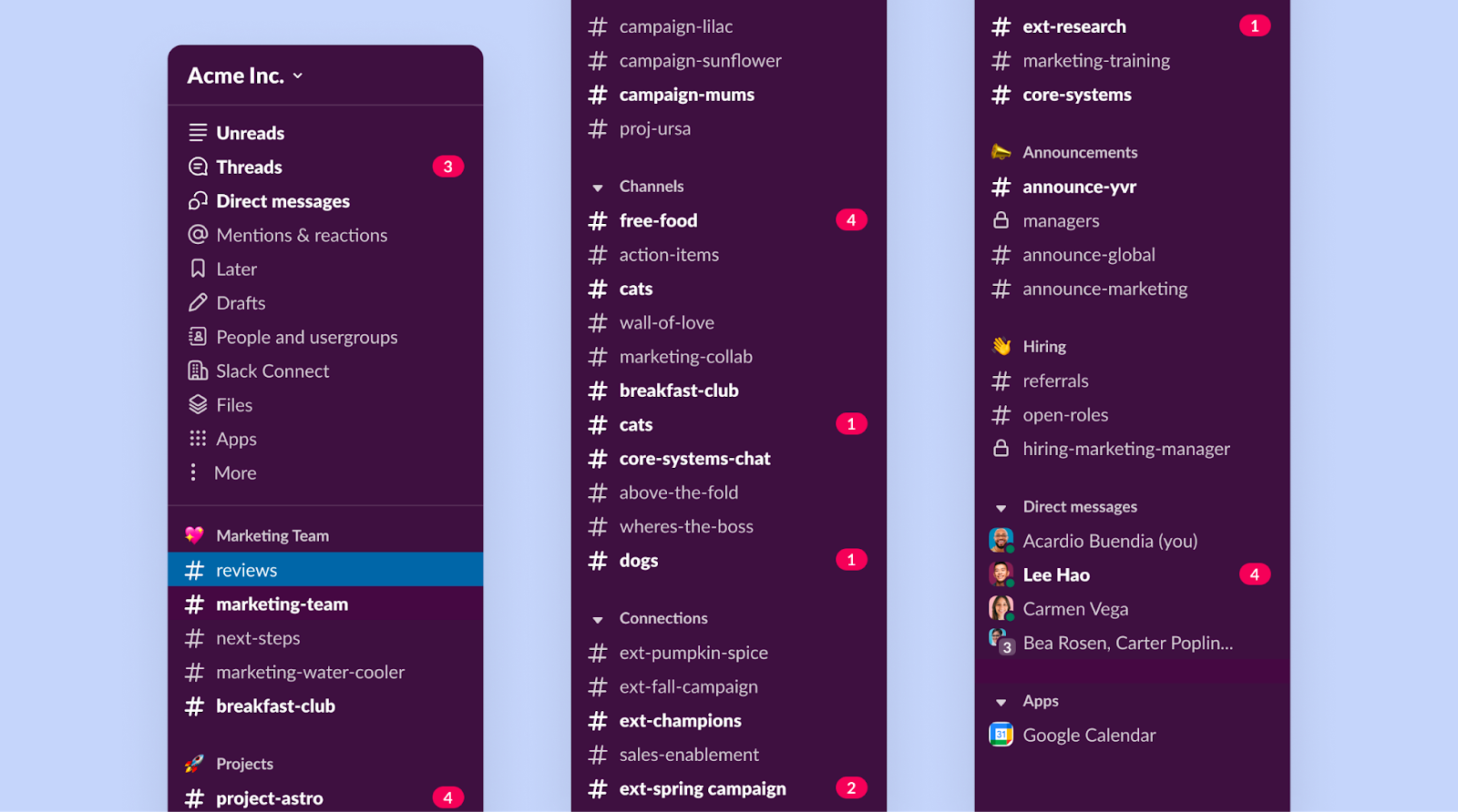
With more types of work happening on Slack, teams becoming larger, and new features like Canvas expanding what Slack can do, our UI was becoming congested. Keeping track of the most important stuff was no longer easy or straight-forward.
As designers, we felt this problem too. New features had to be crammed into existing navigation patterns, regardless of when or how they were used. Customers also told us that seeing unread channels lit up made it hard to stay on task and navigate back to important stuff.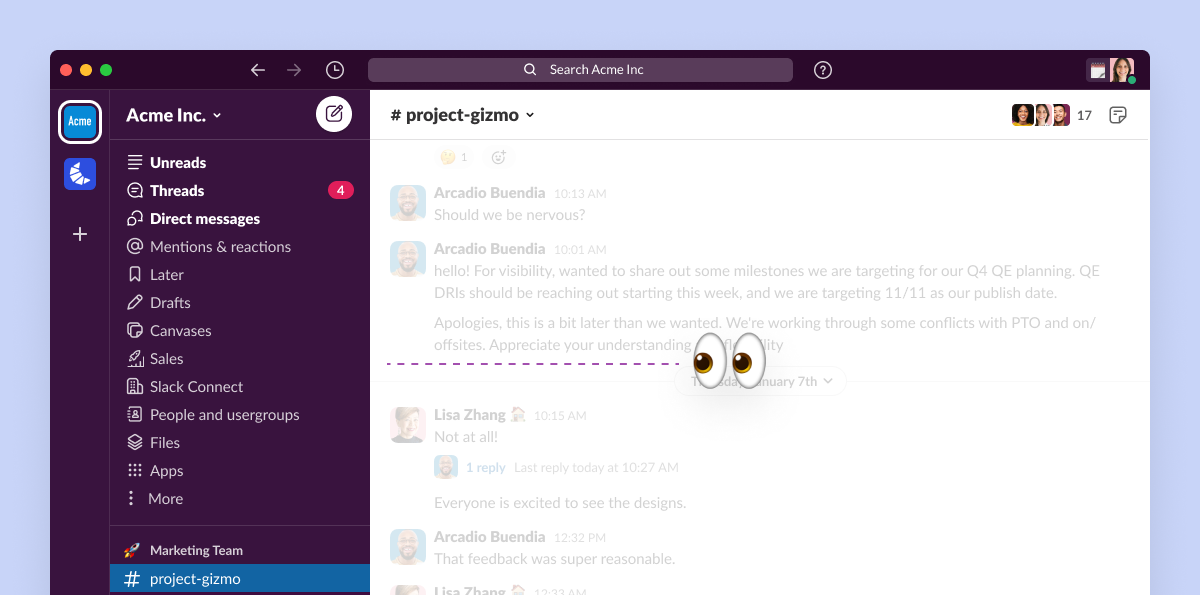 This clutter affected our biggest customers, who use multiple Slack workspaces for a single job. And while the product evolved a lot since our last major design change, the overall design remained largely the same. We needed to step back and reshape Slack as a more focused experience.
A focus on focus
We started tackling this issue with design explorations, taking into account years of customer feedback, research findings, and our upcoming roadmap. We also intentionally explored both desktop and mobile together. As we iterated, the platforms took inspiration from each other.
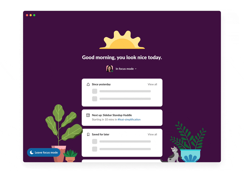
We prototyped many different approaches to focus, including a literal “focus mode.”
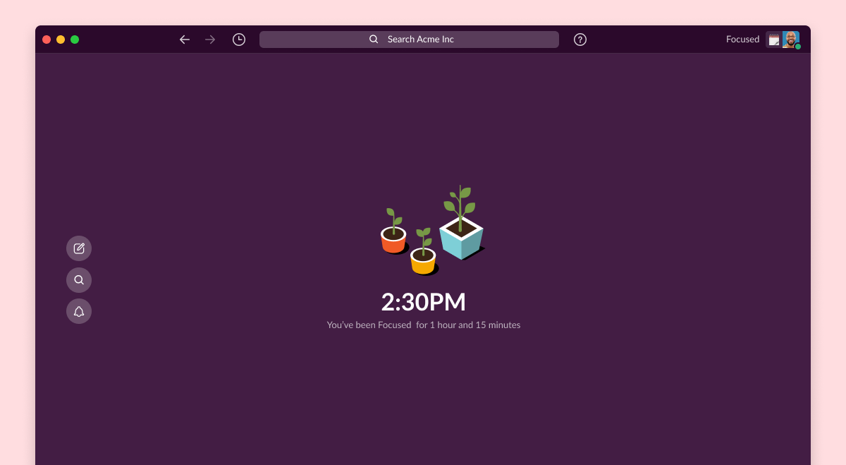
Focus mode was interesting, but required additional effort on the part of users.
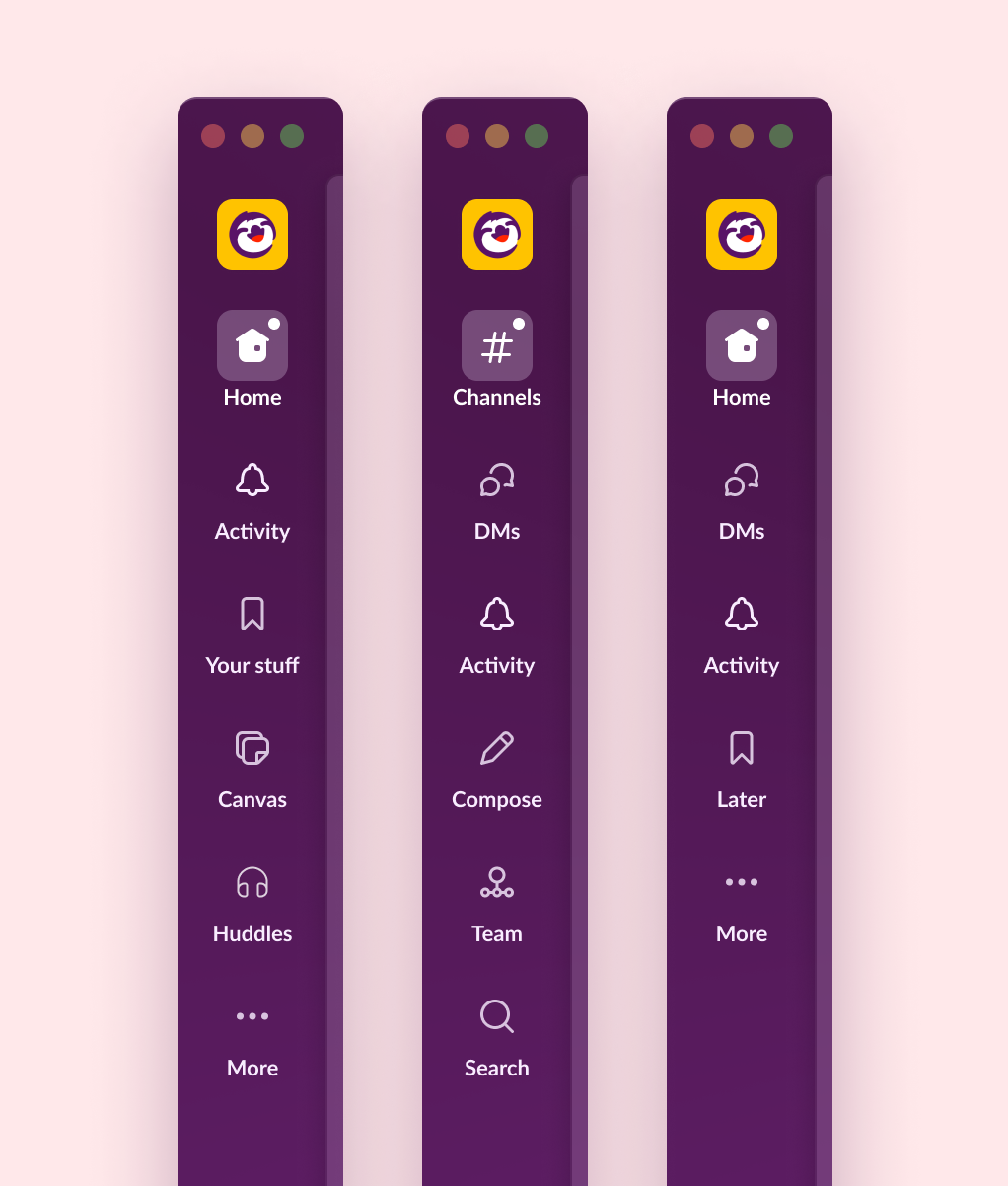
Adding tabs like those on the iPad app gave us more ways to help users organize their Slack activity and capabilities.
 Playing with it was promising, but it needed to evolve to meet the product’s growing needs. So we investigated what the right tab groupings should be.
A job for each tab
We tested many theories. What if tabs were simply features? If DMs were a tab, why couldn’t channels, canvases, or search be tabs, too?
We then asked ourselves: what if tabs represented a mode of work? Instead of having to enter a focus mode, what if each tab was a type of work users engaged in and would naturally help them stay focused on those tasks?
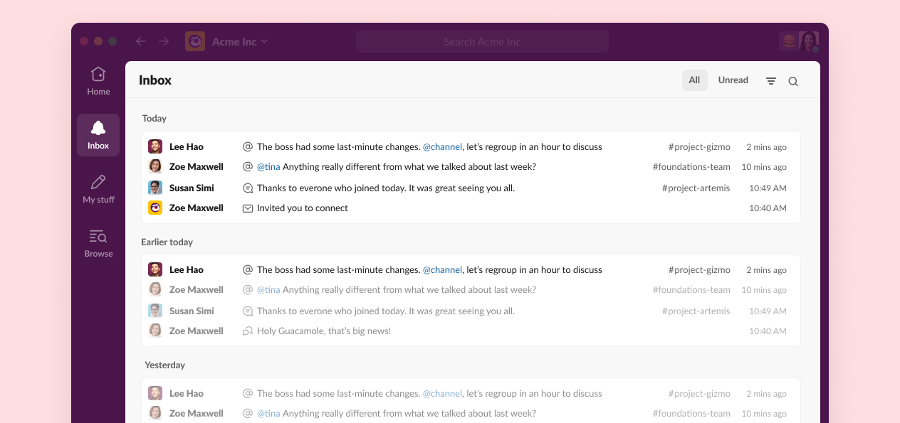
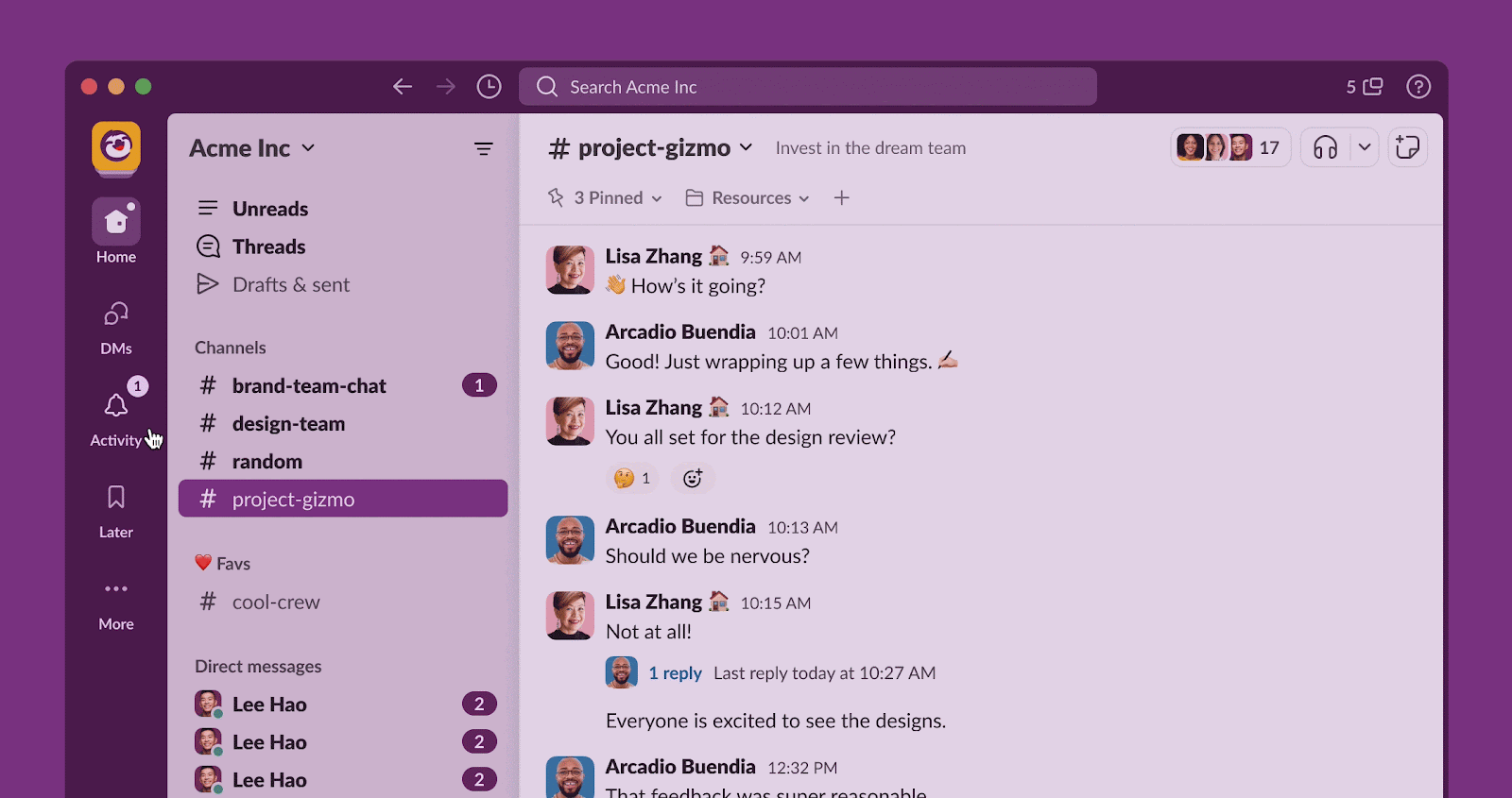
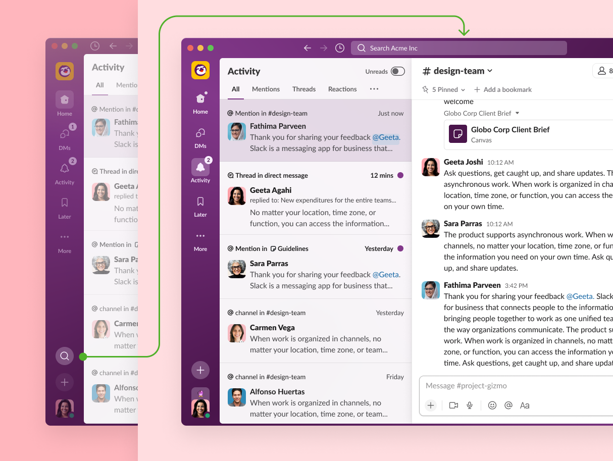
For example, what about a tab for all important notifications, where you can triage the most pressing items first? We revived some old explorations of a unified notifications view (now called Activity) which could merge together anything that created a badge, from thread replies to DMs.
 We also explored a tab where you can focus on work in progress, where you can think and respond without seeing the sidebar light up with distractions.
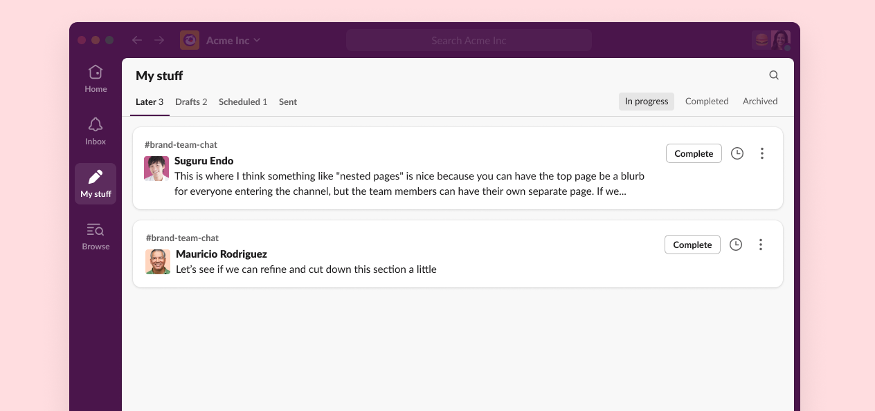
In the end our optimal tab set included DMs, Activity, and Later. We kept the number of tabs as small as possible, requiring that each addition keep true to the principle that each provides a place to focus on a certain task.
New ways to keep context
While tabs provided a calmer experience, they also reduced awareness of other stuff happening on Slack.
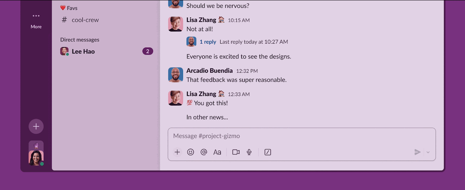
Enter peeks. Peeks began as an experiment in offering a quick way to preview messages in channels without needing to click. While that initially turned out to feel overwhelming, we rebooted the concept for our new tabs.
Peeks became a simple way to get the best of both worlds: creating space for concentration while allowing a glance into more hectic areas of Slack.
With Slack’s capabilities expanding beyond messaging, we also needed a way to start something new from anywhere in the app.
Together, the new design does its best to balance both a need for focused, purposeful space and quick access to all of Slack.
A soothing visual universe
While much of the new design’s emphasis on focus is baked into the structure of the app, Slack’s visual world offered another way to create an atmosphere of calm.
Using a principle of “as little as possible,” we reduced unneeded lines and decoration, like hiding separators on headers (they’re now only shown on scroll when they help define elevation).
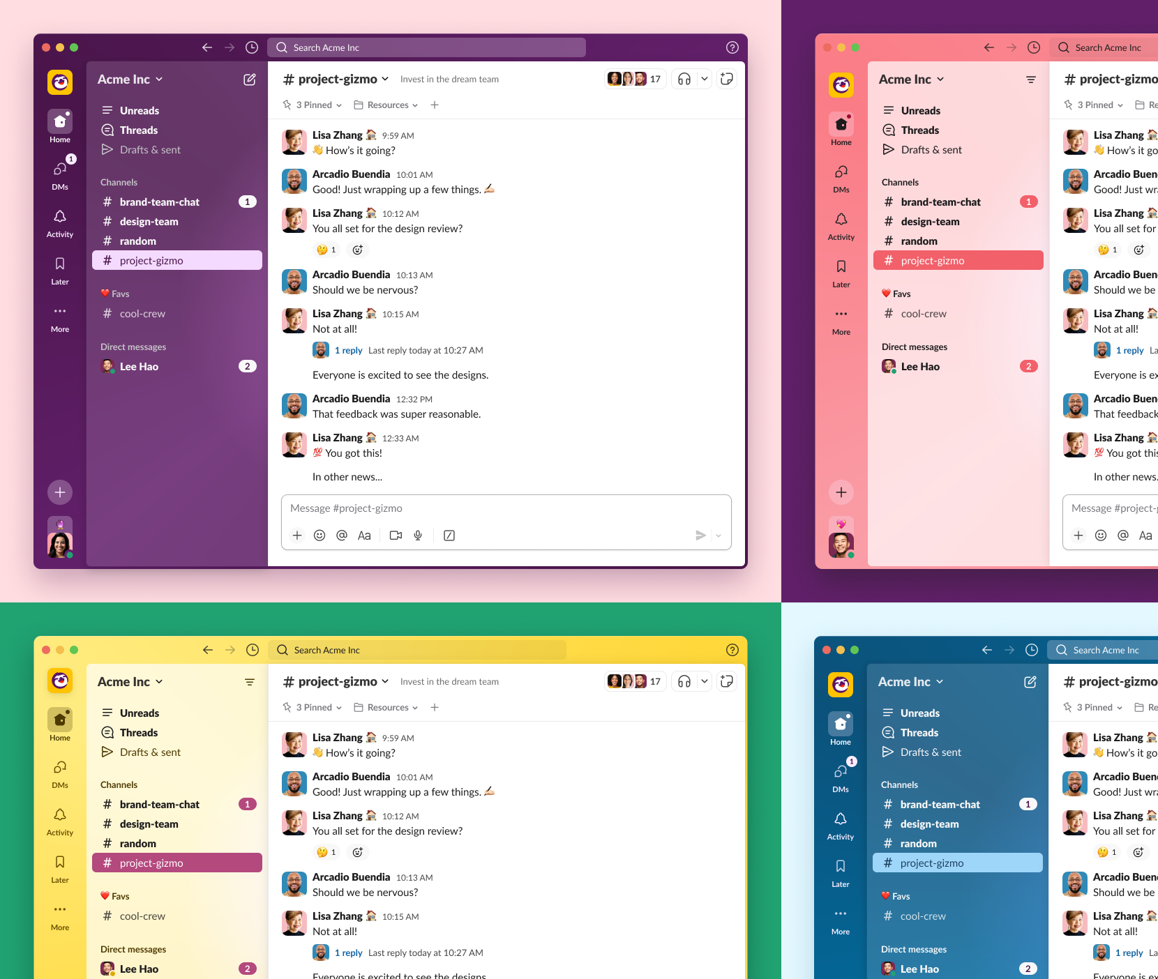 From the corners on avatars to the more dimensional empty states and the subtler shaded theming system, we made an effort to bring a softer feel to Slack’s surfaces, objects and colors.
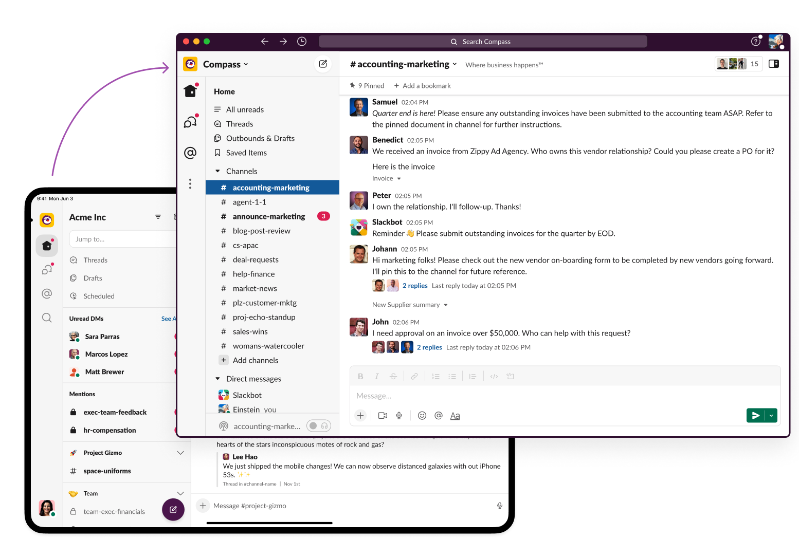
Desktop and mobile, hand in hand
Because of how much the tab design of Slack’s iPad app influenced the work from the beginning, it was the perfect moment to let mobile and desktop become even more united.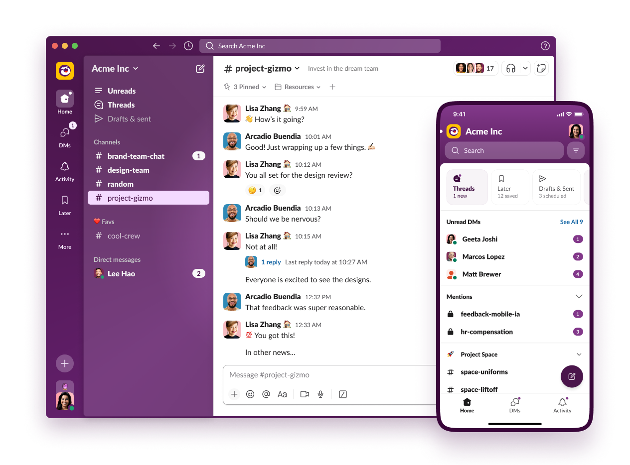
However, the mobile app and the desktop app are frequently used differently. While the two continually influenced each other, we created some purposeful distinctions.
Many people use mobile to catch up, sifting through a list of unreads while saving important items to Later. On desktop, Later is given its own tab as a calm, curated space to do deeper work.
Measuring focus
Throughout the process, we worked with our research and analytics team along with a core group of pilot customers to keep us honest. Drawing on a network of users from a variety of different customers at organizations big and small, we got a huge amount of feedback, which often drove our decision-making.
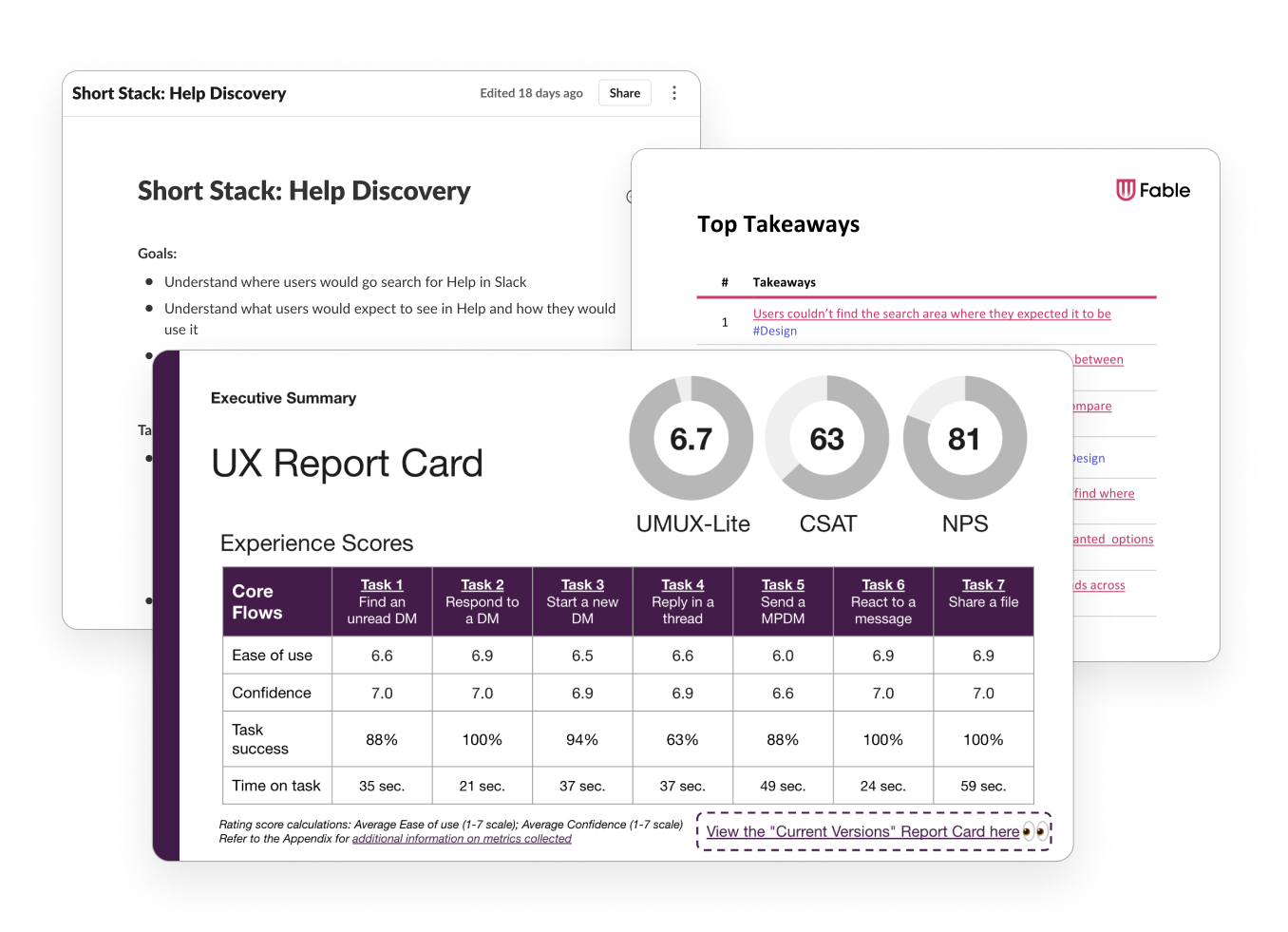
We initially tried moving search to a button with other global actions in our left navigation. But we quickly heard feedback that it made navigating less intuitive.
Likewise, we quickly heard loud and clear that our attempt to create focus by permanently collapsing down other workspaces into a menu was cumbersome for people who need to monitor other Slacks. We revived it as an option, while allowing it to collapse for people who want a more focused experience.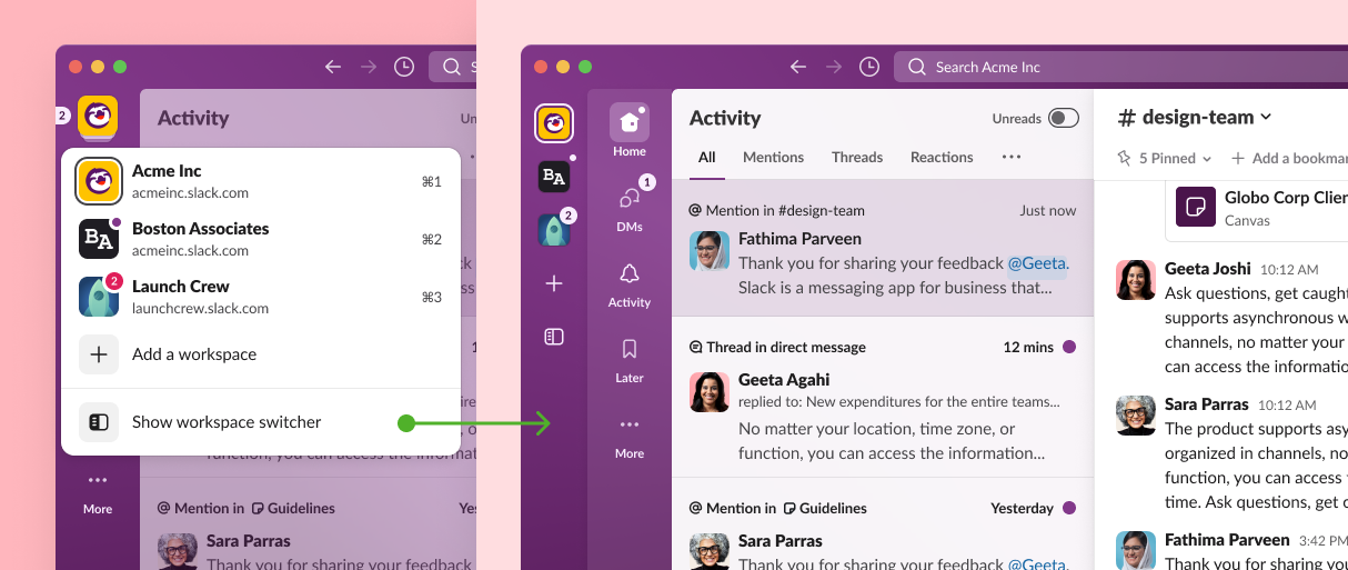 In the end, as we’ve learned again and again, all the experimentation in the world can’t replace user feedback.
The work to create a more focused Slack is far from finished. There’s still much to do, but we’re excited that these changes create a more pleasant, manageable environment where we all can be a bit more productive.