
When Slack’s new website launched in 2017, I felt like a kid in a candy store. As a brand designer, there’s nothing more exciting than having new brand fonts and an entire library of illustrations at our disposal.
However, this creative freedom was short-lived and replaced with frustration. Much like a sugar crash! Our new library—originally meant only for the website—was now being used across the entire organization. Many used these new images without the right context and visual inconsistencies abound—a designer’s nightmare! My team was bogged down with giving feedback and addressing these issues. Soon enough, the new library we were so excited about had lost its intent and meaning. It was as if we’d gorged on our Halloween candy treasure trove and ended up with a stomachache.
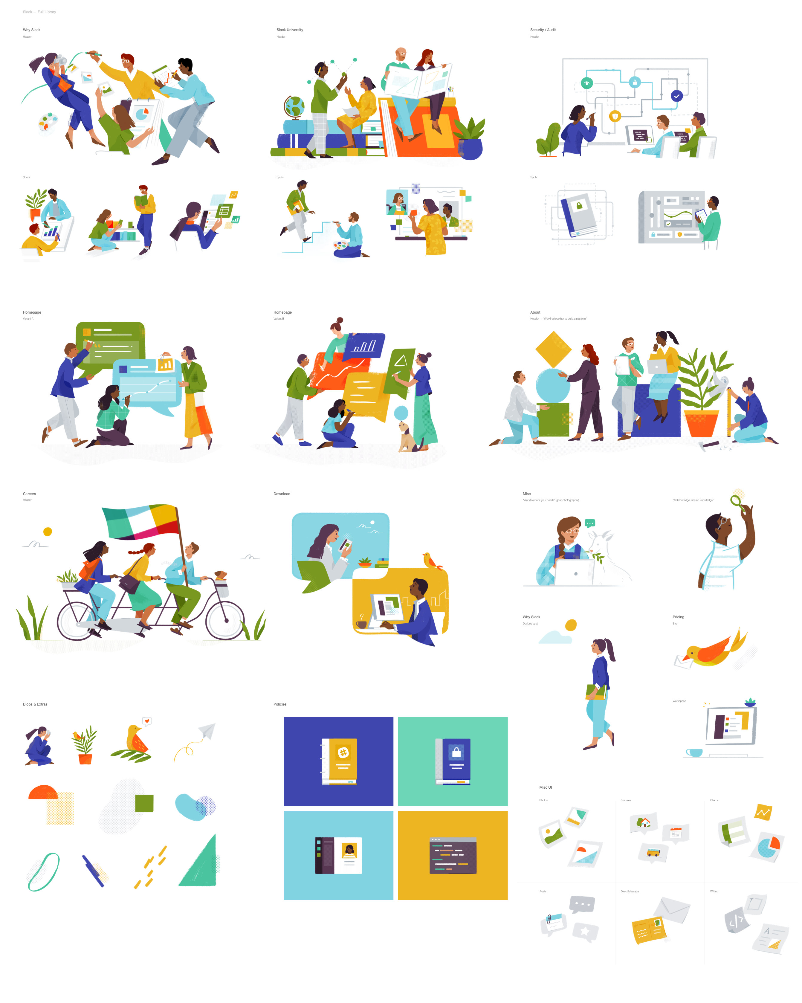
Slack illustration library circa 2017 by Alice Lee
When Slack revealed its new logo in early 2019, we still didn’t have a cohesive way to express the brand through illustrations. It was a big wakeup call. That’s when I put on my illustrator hat and picked up the trackpad. I wanted to take on this challenge.
Getting started
Establishing a new illustration library became top priority. Slack was growing and changing, and our designs needed to change, too. To avoid the issues we ran into in the past, I knew it needed to be easy to maintain and expand and strike the balance between looking “custom” and “generic”—to have enough distinctive qualities to be associated with Slack, yet simple enough for our team members to replicate. My team and I established a few principles to guide our design decisions:
- Bold: Bright, high contrast colors. Not in-your-face, but definitely not timid.
- Elevated: Harmonious color palettes. An effective use of negative space. An overall sense of refinement that is never pretentious.
- Dimensional: Objects, people and environments should evoke a sense of depth. Everything should feel grounded.
- Unexpected: Hidden gems. Pops of color. Playful moments. Not silly, but exuding a warm, genuine sense of humor.
We decided to create two styles of illustrations to be used at Slack:
- Objects: Object illustrations tend to be more literal, sometimes technical to explain product features.
- People: People illustrations work better for marketing, brand campaigns and other external communication materials that need a touch of humanity or a friendly face.
The first iteration
While the object style was shaping up nicely, it wasn’t the case with the people style. The overall feedback was that these personas looked a bit ambiguous. A makeover was needed, and my pen tool turned into a makeup brush (or, in some cases, a scalpel). I decided to add facial and clothing details to evoke a sense of playfulness and personality, hoping to make them look more distinctive.
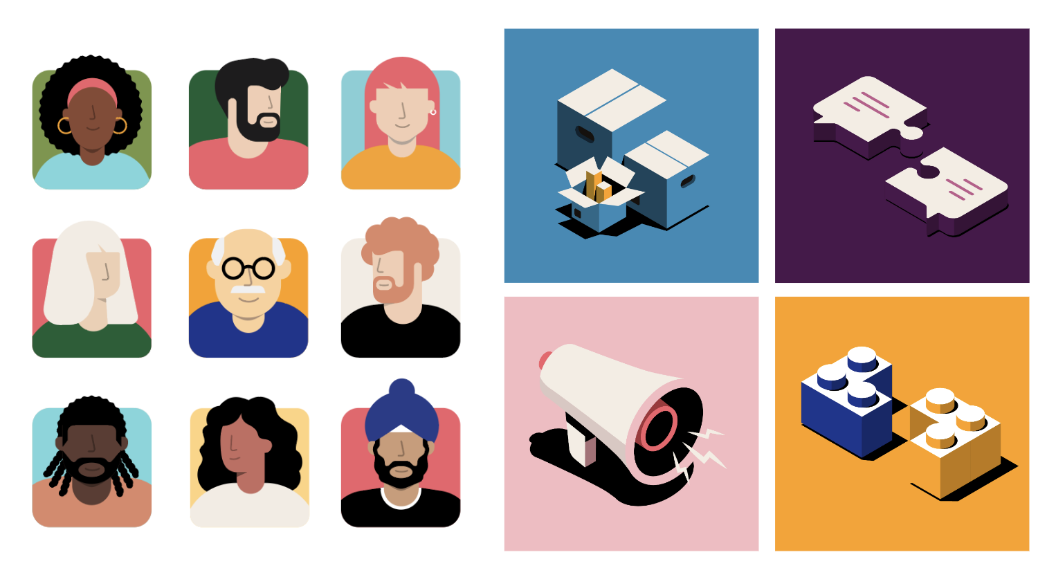
Playful people and dimensional objects in our new Slack illustration style
Take two
The makeover was completed March 2019, right before the Covid-19 pandemic wreaked havoc. Suddenly, Slack’s mission to make work life simpler, more pleasant and productive was more important than ever. Life had become completely topsy-turvy, and our illustrations had to reflect those big changes happening to everyone’s work lives. We needed to keep with the times by creating people illustrations that showed collaboration, celebration and teams working remotely. We not only needed to accurately reflect our brand, but also the world around us.

Before and after our “glow-up”
That was when I realized it was time to call in backup. To really bring these illustrations to life, our team of designers needed someone with a lot of illustration experience who understood that at the heart of good design is flexibility, dynamism and the ability to capture an ever-changing society in real-time.
Teaming up
My manager and I put together a roster of illustrators that fit our criteria and could further develop our People style. We needed someone with domain expertise who not only specialized in drawing people, but also had experience building illustration libraries and could guide us through this brand new territory.
We selected Giulia Giovannini, an amazing illustrator from Italy who’s created beautiful illustrations for Uber, Nickelodeon, T-Mobile, Lyft and more. Her style is bold, playful and versatile—a perfect fit for what we were looking for.
Although it seemed like a daunting task for a small team of 3 (myself, Giulia and my manager), the creative process went incredibly smoothly, despite a significant time difference between Italy and the US. Guilia helped us expand Slack’s people illustration library while collaborating with Slack’s brand design team on Slack. (Pretty meta, if you ask me.)
Building together
While determining how to best approach the construction of this library, we came up with 3 key factors:
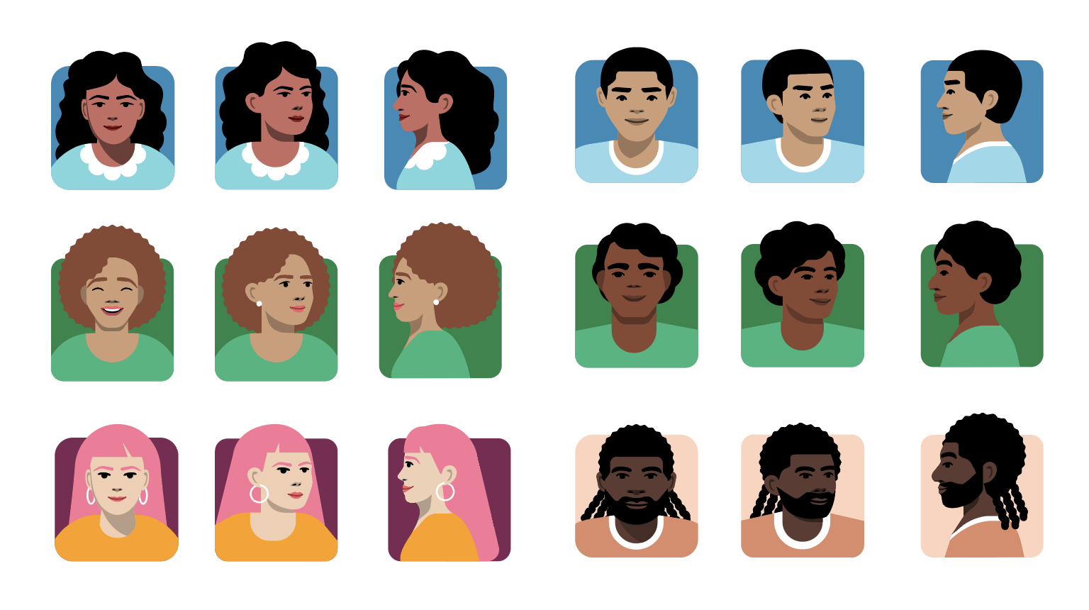
- Modularity: The ability to easily mix and match single assets in a cohesive way that’s user-friendly and easily accessible to non-designers.
- Scalability: The ability to give our team members the opportunity to expand the library independently according to their own needs and the evolution of the product.
- Inclusivity: The ability to represent a wide spectrum of people with all sorts of backgrounds collaborating worldwide (the new industry standard).
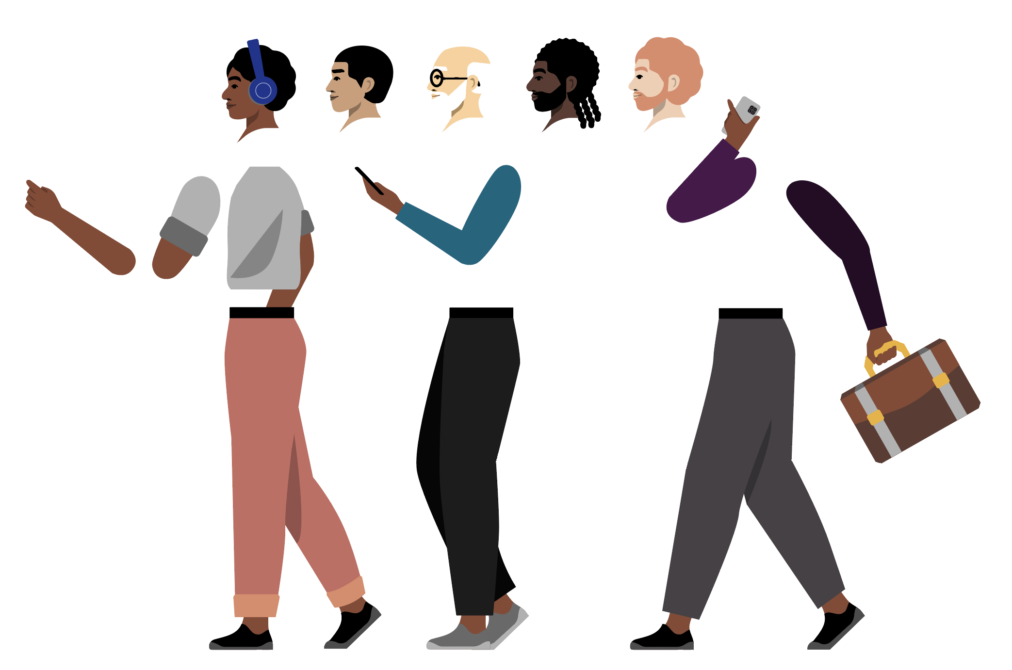
Example of modularity in our library—mix and match what you need
Since this was an enormous task, we split it into phases to make sure we could test it along the way. Each phase was a response to our team’s needs at that time.
- Phase 1: illustrations depicting collaboration and remote work
- Phase 2: illustrations portraying people working in different industries
- Phase 3: basic poses (sitting and standing), full profile views, facial expressions, and regional-based personas
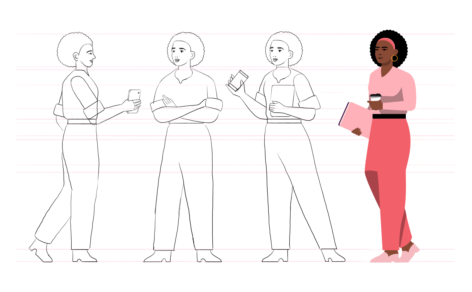
Example of a few basic standing poses
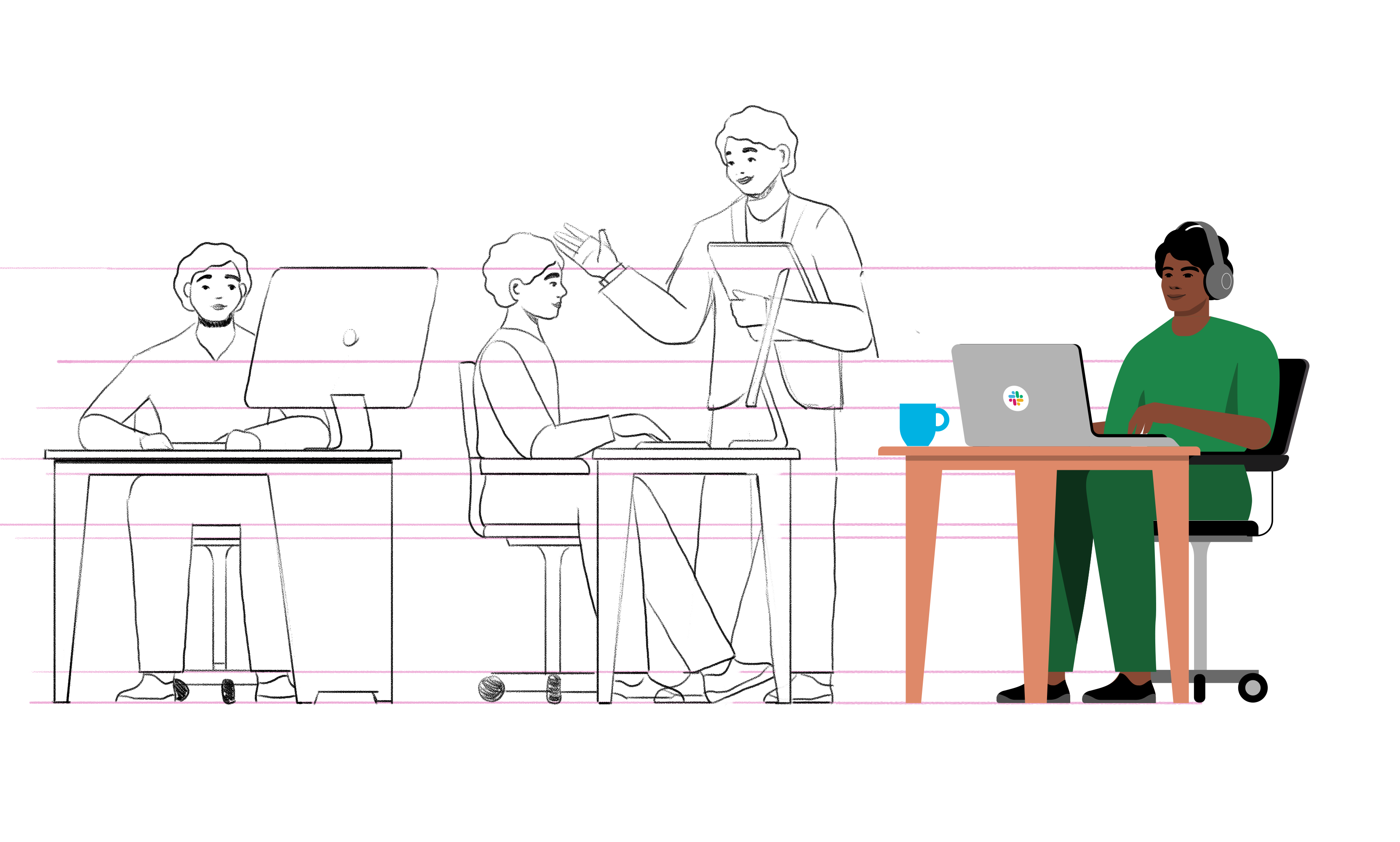
Example of a few basic sitting poses
Example of full profile views for personas
After almost a year, the library was up and running and quickly became a vital tool for other departments at Slack. Like Mary Poppins’ carpet bag, teams could reach into the library and pull out exactly what they needed. Product designers were able to iterate on design more quickly with illustrations in their mockups—providing helpful context to their design decisions.
Marketing could tell better stories about Slack to our customers, who, thanks to a comprehensive library of assets created for specific regions (AMER, APAC, IND, JPN…), could now see themselves represented. Best of all, across the entire organization, we finally had a way to create visual consistency across our brand touch points.
Looking forward
The importance of having a robust design library that anyone at the organization can easily use really came into focus once this project was completed. Not only does my team no longer worry about illustration misuse or visual inconsistency across the brand, we’re proud to have a toolsthat enable our customers to see themselves accurately represented in our product.
To make sure the library still reflects who we are and who are customers are, we built a workflow called Figmagination in Slack to collect feedback and requests for new illustrations from internal teams. We also share updates on what’s being added to our illustration library with the quarterly [ill]ustration Digest. Our world is constantly changing, and so our illustration library will continue to evolve as well.
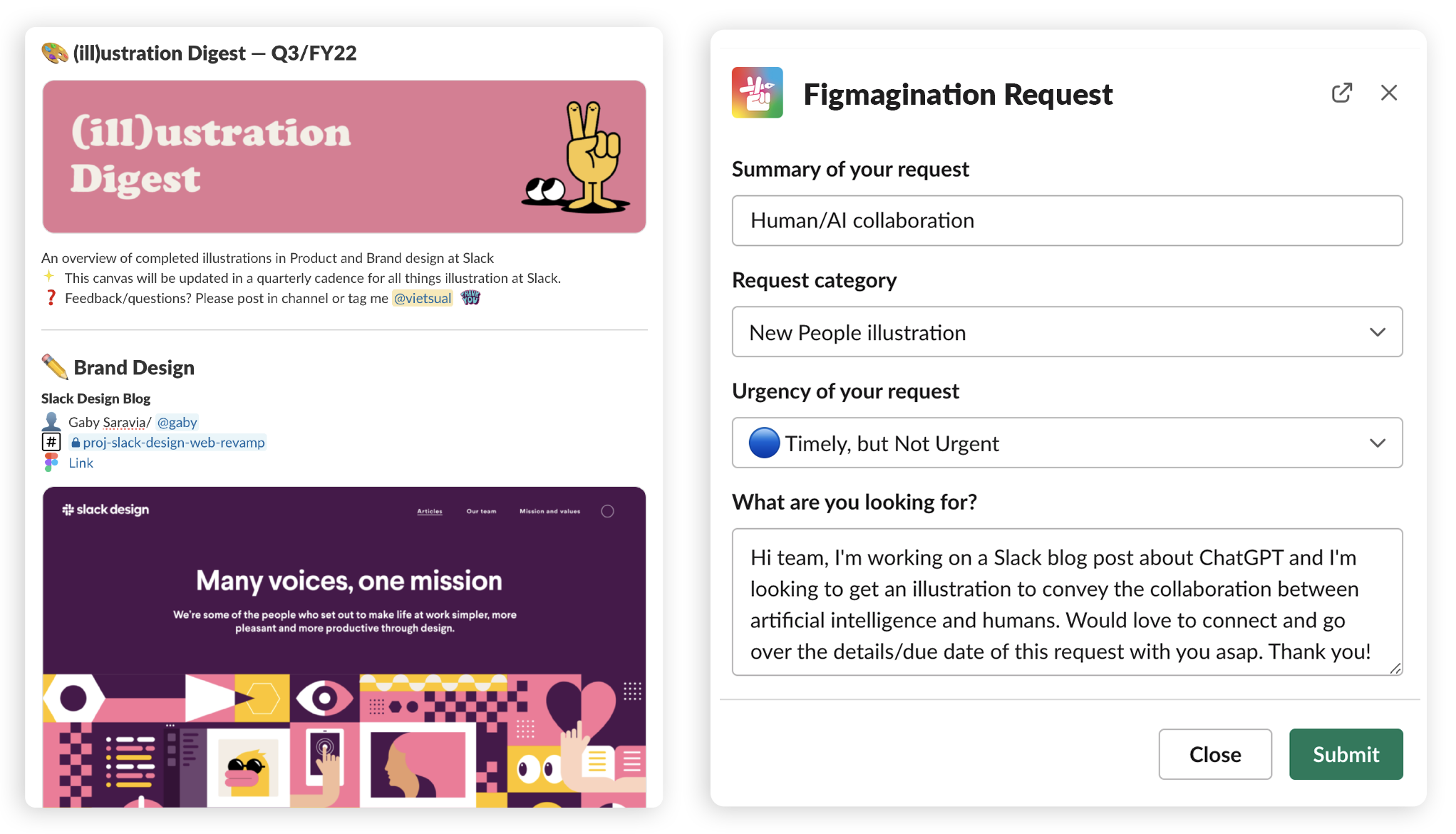
Quarterly illustration update via [ill]ustration Digest / A screenshot of a new illustration request via our automated workflow Figmagination
Viet Huynh is a brand designer at Slack. Graphic design is his prison passion.